HOME | DD
 meskalin5 — db poster need help

Published: 2002-12-16 15:13:40 +0000 UTC; Views: 1679; Favourites: 21; Downloads: 269
Redirect to original
Description
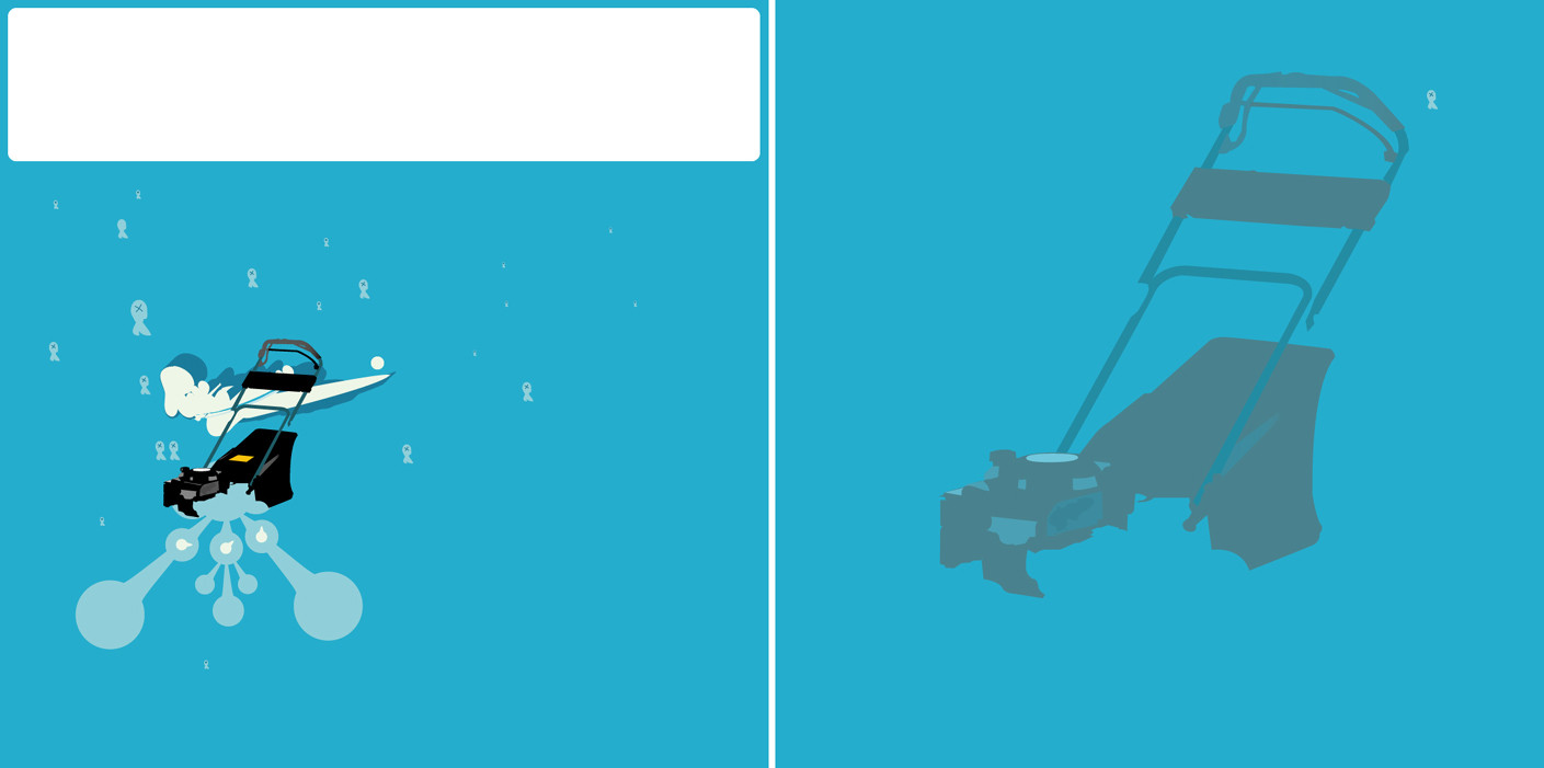
hey made these to poster they are not complete but I need your help which one do you think is bettera: with the eagle
b: without the eagle
tell me what you think please
you can also say what you think about
the whole piece
(its made for fun this drum and bass festival doesn´t exist ;D )
Related content


Comments: 40

Really good vector work. Do you use Illustrator?
👍: 0 ⏩: 0


Definately w/o the eagle. Its a cool bird, but the way its put in there it seems so....un intergraded, specially for the way the poster is.
On the other hand you could leave it there and have the posters printed like the JPG
👍: 0 ⏩: 0

without the eagle fo sho. But both pieces are damn hot. Goood job man. I love how you placed the things
👍: 0 ⏩: 0

without the eagle but i think it would be cool to put the eagle in below the where the white circle meets the typo scquare very cool btw
👍: 0 ⏩: 0


awesome wrk.
i'd say the 1st is better, but you could still try to squeeze n the eagle logo, but smaller and dont let it be a focal point, since you wana get ppl to look at the poster as a whole and not jus the eagle.
👍: 0 ⏩: 0

I am going to saw without the eagle. Great work though.
👍: 0 ⏩: 0

you could have used the eagle, but in another place insted.
great work!
👍: 0 ⏩: 0

i like it better w/o the eagle, just work it in somewhere ese or something
👍: 0 ⏩: 0

yO yO..
I like the one without a eagle...... Everything else is dope. Great job kid..
DC
👍: 0 ⏩: 0

definitely better without the eagle, but maybe if you moved the eagle somewhere to an area not directly on the main part of the poster (like a corner), then it'll fit nicely.
Excellent design I envy you
Merry x-mas dude !
👍: 0 ⏩: 0

I need to say A, it gives it a bit more feeling as a "unit", but I do like the eagle too. mabey you can place it on the wite thingie that the brown thingie holds? ohh well. sweet work!
👍: 0 ⏩: 0

Sorry I didn't comment earlier on this....
I think the one without the eagle has a better composition to it, but I still think the eagle itself looks pretty cool, so maybe just place it somewhere else where it doesn't cover up the rest of the design.
Oh and I really love that color scheme. Your vector skills fucking own me
!
👍: 0 ⏩: 0


Although the eagle design is very pretty, it doesn't seem to fit. So I'd go with the first one.
As for the rest, it looks really neat. Very nice vector work. I like it a lot.
👍: 0 ⏩: 0

i like the left one.... :cough: we work for them :cough:
👍: 0 ⏩: 0

It think the eagle is nice, it may be framed a bit too much by the white circle. Maybe it could be on top of the brown poop or have the brown poop stuff fade out behind it a bit. Anytime you can do a logo design for these things is good though becuase it gives something thats easily reproducible on all the 2d promotions for the party.
👍: 0 ⏩: 0


die linke seite ist besser als die rechte.. obwohl der Vogel ganz nett ist.. also würde ich den vogel in das linke poster packen und zwar..moment..links unten.. oder rechts unten? aarrgg.. must du selber probieren.. auf jeden fall.. RESPEKT.. alles sachen die du machst sind unglaublich und ich weiss nicht wie.. doch ich weiss wie.. aber das dauert doch immer oder.. hast du ein trick? ich sitze maximal 2 stunden an einer arbeit.. wenn es länger dauert habe ich kein bock mehr.. naja.. viel spaß weiterhin.. Regie
👍: 0 ⏩: 0

DRUM N BASS FOR LIFE!!! ANOTHER BASS HEAD HELL YES!!! Hit my page quick, this design is awsome!
👍: 0 ⏩: 0

very sleek.
love the composition of the text and the vector work.
and yea , i like the one with the logo better. it has more balance on the peice.
👍: 0 ⏩: 0

Def. without the eagle thingy, as i think it has been mentioned, if you want to use it (the eagle thingy) maybe you can work it in some place else.
👍: 0 ⏩: 0

I like the first one on the left, but the logo is awesome! I would say make it smaller and find somewhere to add it. I dont know about that reddish pink color but hey thats just my opinion great design.
👍: 0 ⏩: 0

incorporate the dual headed eagle elsewhere on the piece
👍: 0 ⏩: 0

too bad, that would be the fuckin sickest drum n bass festival
with eagle, i love those stylish logos, but maybe choose another spot for the eagle cuz it blocks the sweetness behind it
👍: 0 ⏩: 0

without the eagle...
i like it, but i'd try to tune a little the colors (i don't know in which way)
👍: 0 ⏩: 0

the eagle looks nice, but out of place... maybe make the circle its sitting on look like it is part of the design and not sitting on top of the rest of the design...
👍: 0 ⏩: 0


Yeah, it definitely looks better without the eagle. I think maybe those blocks at the bottom want something in them though, they seem like they just take up space. Other than that, I think this looks really nice, I love the futuristic feel of it.
👍: 0 ⏩: 0

very nice man, i think it looks better without but I think maybe you should incorperate the eagle elsewhere.
yea.
👍: 0 ⏩: 0


i like one on right best, that logo kinda makes it feel more complete
bad company rox \o/ seen em live a cople of times :>
👍: 0 ⏩: 0

really nice
but i think you should move the eagle to the corner. top left corner maybe?
👍: 0 ⏩: 0

hmm touch choice, looks good with both but i think im going to say without it.
👍: 0 ⏩: 0

the one without the eagle, thoose eagles are totally mainstream nowdays ... nice work!
👍: 0 ⏩: 0

look at thhhhhhheeee full view the colours are totally wrong in the thumbnail !!!
👍: 0 ⏩: 0