HOME | DD
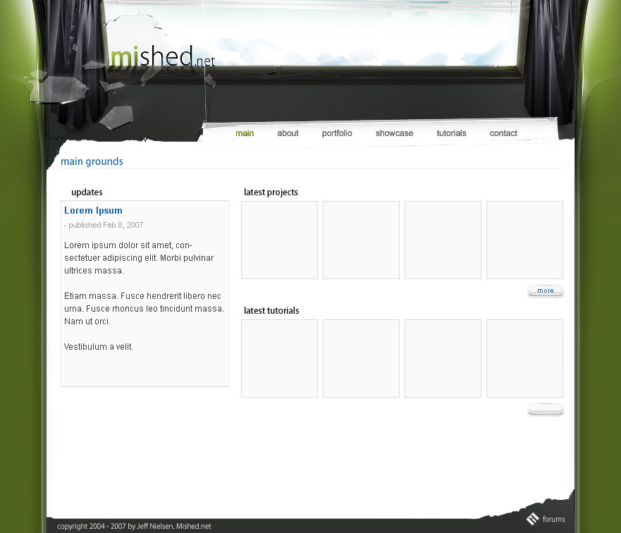
 mest — Shift

Published: 2006-09-04 11:56:37 +0000 UTC; Views: 12117; Favourites: 89; Downloads: 242
Redirect to original
Description
I went through some folders, came upon an unfinished brushed layout and figured, "Hey i'll work on it some". So yeah "Shift" , I had CS: blue shift on my mind") . Any who here's some work from me, since I haven't done any interfaces in awhile or posted any on DA for sometime now.
. Any who here's some work from me, since I haven't done any interfaces in awhile or posted any on DA for sometime now.Brushed. I know there was an older .PSD of it just brushed as a draft, I'll try and find that and get a picture of it. KEY WORD: try.
Critique if you will.
UPDATED: Smoothed out some areas, and removed the title. still deciding on a good logo for myself atm. Don't worry much about the mished at the top-left. it's just there.
Related content


Comments: 69

I was looking through the daily web interfaces, and i though, this one better be jeff.  (Smile)")
👍: 0 ⏩: 0

I don't like the 'Mished.net' text at the top, but the rest is sexy.
👍: 0 ⏩: 0

Nice work but the thing is annoying is what you used default font on the header, make it more creative and chrome along with the interface, NJ Jeff
👍: 0 ⏩: 0

sexy, it's a little pixelated in some areas but still sexy
👍: 0 ⏩: 0

Very sexy design. I'd love to bust that into Flash and make n interactive interface with that!
👍: 0 ⏩: 0

looks pretty good jeff.. definally one of the best interface designers.. but its too boring with time
👍: 0 ⏩: 0


nice work jeff
ur brush skills are great
 (Wink)")
👍: 0 ⏩: 0


Looks very nice bro its a gj for sure keep it up
cheers!
👍: 0 ⏩: 0

dude... omg ur crazy... as i always say, Jeff owns.
...and about that psd...
👍: 0 ⏩: 0

Whoa this is insane bro , the brushing so good... the design , the shapes i looove it .... FAVE !
👍: 0 ⏩: 0

You really need to start designing these so the bottoms are COMPLETELY different from the top; they're starting to look crappy.
👍: 0 ⏩: 1


I can not trust my eyes. Beautiful work
👍: 0 ⏩: 0
<= Prev |