HOME | DD
 mindgamez-420 — mindclipse

Published: 2003-03-19 21:17:27 +0000 UTC; Views: 442; Favourites: 4; Downloads: 43
Redirect to original
Description
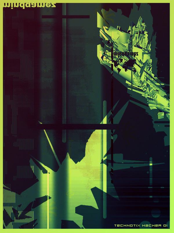
i have a fever and shit. this didnt turn out at all the way i wanted it 2. oh well just more practice i guess.Related content


Comments: 17

Nice image man, its been a while sinc ei have seen any of ur works and i tell ya, ur gettin better, but that render could use a little work. The text is just sweet tho, i love how u did it, u keep up the great work man.
👍: 0 ⏩: 0


Render could do with a bit more work but other than that, this amazing! The 3D text is very different, i don't think i've seen it in these kind of pieces before...
Keep it up.
👍: 0 ⏩: 0

the render is choppy, and the text does take away from the image, but the colors cannot be topped. I love how you set up the atmosphere in this.
👍: 0 ⏩: 0

awesome brushing and the render is the shit. however i dont realy like the 3d text, for me it sorta takes away from the image...
good job though!
👍: 0 ⏩: 0


that render is tight as hell, the rings are kinda blocky though. other than that this is fuggin awesome, good job
👍: 0 ⏩: 0

I love it man only thing that i think could be better is the lighten on the 3dpart but the rest is great hope you get better
👍: 0 ⏩: 0

and meh lol...but anywayz its pretty tight..like that one dude said text thing is original...the round tube thingys look kinda umm...squarish =/..cant find a word but its still tight..good job man..i think ill fav this
👍: 0 ⏩: 0


It looks great dude
The 3d text is original
nice colors and airbrusing
👍: 0 ⏩: 0


hey, this is great man!
I just think the composition is a bit off, it looks like a cutout of a bigger piece..
other that that its amazing
👍: 0 ⏩: 0