HOME | DD
 MiraKHall — Test Flight - Revamp

Published: 2008-05-11 06:15:23 +0000 UTC; Views: 3669; Favourites: 124; Downloads: 0
Redirect to original
Description
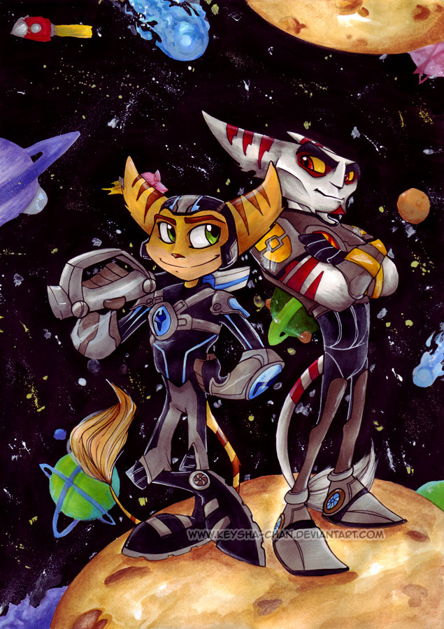
The previous one, believe it or not, was not pee'd on by the cats, but it was most definitely messed up beyond repair. I've forgotten how opaque pinata paint can be without deluding it with alcohol and white opaque when I was doing additional touch-ups.So I needed to start from scratch (I didn't keep a copy of the foreground and background sketches, so I had to retrace from the ruined one with alterations based on previous critiques and personal tastes).
This turned out a lot more better, especially since I knew what I was doing this time. Took me three days to complete this. I don't think I'll have the time and luxury to feature this at CaliFur (one week left to prepare, and I prefer Mom to help me with the xerox copies). But it will show u at AnthroCon if all goes well between me, my agent and the postal service.
Once again, advanced critique desired. Compare it to this old one if you like/need to.
Media Used: Copic Multiliner SP Pigment ink, Copic Sketch Markers, Prismacolor Pencils, Acrylics, Piñata Paint, Hybrid Gel pen white
Character Ratchet (C) Insomniac Games/SCEA
Image (C) Lady Rumplestiltskin
Related content


Comments: 31


Love your style, it's really nice! Ratchet looks cute!
👍: 0 ⏩: 1


Wait 'til you see the Mercedes treatment 
👍: 0 ⏩: 1

The colors are great! And Ratchet's expression is certainly something... xD
👍: 0 ⏩: 0


Heeeey, I remember this one!
All right, since you asked for an advanced critique, but just like last time I'll just separate them for you to read as you please:
Good points:
Definitely looks better with the purple sky!
Love the bold outlines of the buildings, it definitely brings it closer to Rachet/ Rachet closer to the background!
The eye can follow the swoop lines much better and the dark green really goes well with the green wings.
Definitely liking the new set of eyes, it really carries his surprise/shock/amazement very well.
I like what you did with Rachet's kneepads (colorwise and defining the individual strips that much more)
I like the better definition of the internals of the wings.
Things that could be improved:
Stars (if that's what the white dots in the sky are), unless they're very bright (which, in reality, there aren't so many that're that bright), wouldn't appear in the lighter purple parts of your sky, and there's also a LOT of them (to be honest my first impression was that it was snowing).
The background still has lack of depth. Yes, buildings overlap, showing that one building is in front of another, but *how far* are the buildings behind or in front of each other? My suggestion would be to put a wash of blue to dampen the intense coloring of the 'farthest' or 'backmost' buildings, and to soften the outlines of those particular buildings.
I like the eyes, but the mouth seems a bit too wide for Rachet's rachet's or for how wide his nose seems to be, and the mouth makes his top teeth look really big. I'd take some of the mouthspace from the teeth and give a smidgen of it to some bottom teeth.
The swoop lines directly underneath Rachet's ears (I know you were concerned about those the first time around) should be somewhat the color of his ears, since the swoop lines are indicators of motion. I would also put some swoop lines underneath a couple of other things--namely his gloves, feet (brown or darker brown swoops) and tail (almost bronze swoops).
Summation: Definitely a lot better than the first one!! And like I said before, you can ignore a lot of this post if you want.
👍: 0 ⏩: 1
No, it was most helpful and most encouraging ")
 (Wink)")
👍: 0 ⏩: 1
Glad to be of help, and considering what I said is all I could ask for
Oh, did you try the whole square-block idea I suggested on the original version? I was just wondering since I was perusing comments on the older version of this before.
 (Smile)")
👍: 0 ⏩: 1
Did it help at all/ help a lot or little?
👍: 0 ⏩: 1
It helped quite a lot.
👍: 0 ⏩: 1
Awesome--you got a little book to put the squares in or anything so you can use 'em for future projects?
👍: 0 ⏩: 0

Ooooh I LOVE this. 
👍: 0 ⏩: 0

This is badass. It was one of my favorite parts of the new game!
I love Ratchet's expression, too. He's like "Woooah wtf!" XD
👍: 0 ⏩: 0

Sure thing this one is better. It has more color and Ratchet's expression is a lot better (I mean more dramatic)! I see you also corrected his tail to point to the right direction.
👍: 0 ⏩: 1
It's not just 'more color' -- your eyes are actually tricked by the complementaries of yellow and purple,or orange, purple and green. I tried to achieve that effect, since I've taken color theory before (and not being able to use it properly would be sacrilege 
👍: 0 ⏩: 1
that's what I meant! When I said more color, I said you made them strong and vivid and that brought your drawing to life!
👍: 0 ⏩: 0

awsmoe job
👍: 0 ⏩: 0

Wow great use of complimentary colours, boldness and jus completely awesome cell shading!!!
👍: 0 ⏩: 0

Awesome revamp.^^ Looks much more detailed than the original. Love how the coloring looks here!
👍: 0 ⏩: 0


