HOME | DD
 MisterPSYCHOPATH3001 — Frustration level line graph chart
Published: 2023-07-16 18:24:09 +0000 UTC; Views: 970; Favourites: 7; Downloads: 0
Redirect to original
Description
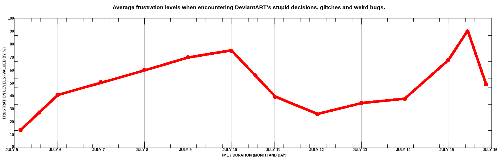
This is my frustration level line graph chart depicting the average levels by day and percentage.I had many difficulties compiling the data into this line graph but i managed to get it done.
As you can clearly see my highest level peaked around between 90% and 91%.
Please don't expect this chart to be updated in real time, i'm only doing this just to show how frustrated i am with this website.