HOME | DD
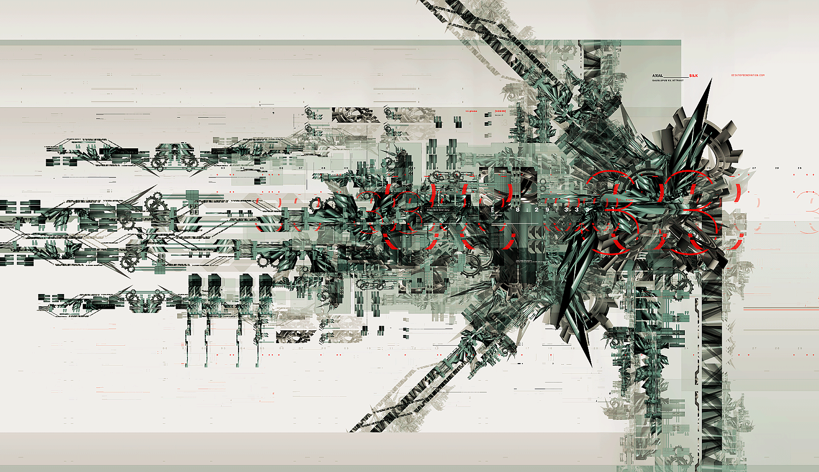
 monowaste — cycle2

Published: 2003-04-14 22:36:43 +0000 UTC; Views: 9868; Favourites: 59; Downloads: 1893
Redirect to original
Description
cycle.2Related content


Comments: 75

 (Smile)")


Very cool, I like the colour scheme a lot. And the detail in the corner is great.
👍: 0 ⏩: 0

nice dude.... love the color theme. what application did u use here ???
👍: 0 ⏩: 0


@_@ holy...................
lovely render, and Awesome 2d ! Great job !
👍: 0 ⏩: 0

Yeah! The structure at the bottom right is so complex and this is what makes it cool.
👍: 0 ⏩: 0


woa man, you ahve crazy modelling skills.
that 3d form is just soo madd..
great job as always.
👍: 0 ⏩: 0

WOW! Amazing!! One of my favourite colour combinations, brown and orange. Absolutly fantastic render. Going straight to my FAVS!! By the way, what program was used to create this peice?? Max, C4D ?? Take care ...
👍: 0 ⏩: 0

Wau! Thats awesome.... New wallpaper for my friend
Love the plain simple sorta background to it, and the colours. Funky thing in corner too is cool
👍: 0 ⏩: 0

Super human graphics skills.
It never ceases to amaze me how the quality of such work is limitlessly abound in the european countryside.
You're a 'craftsman'.
👍: 0 ⏩: 0

Great work, but a pure white background (or a very light shade of gray) would have made the contrasting and shimmer of the piece much more vibrant. I still think the whole thing is amazing though. Great work, really.
👍: 0 ⏩: 0


very nice. Color scheme is a break from the norm -- a nice refresher. Very industrial but clean look to it -- very hard to get. Theres so many novel ideas in the 2d - i love it. Nice 3d architecture. I like that there is orange and grey mixed in the model, and that its not overdone.
Very nice balance that is hard to acheive
👍: 0 ⏩: 0


looks great but why did you put the abstract at the bottom where it gets cut off? you should've made it totally viewable imo.
nice work though man, really dig the typo.
👍: 0 ⏩: 0

i love it!
cuz i myself am making something like this...
i mean exactly like this!
the same colors and 3d...
i got my inspiration from gmunk, you?
hey and it would be better without the polkadots at the bottom...
ill remove them myself for my use...
👍: 0 ⏩: 0


your technical skill and use of color are both superb. technovector renders are all too common these days, but this stands above the rest. congratulations.
👍: 0 ⏩: 0

great color, great, minimalistic design, great image, for sure
👍: 0 ⏩: 0

Very nice, the only thing I would add to it would be some 2d overlays infront of the render. It's a bit clean for my taste as it is The colors are really nice though.
👍: 0 ⏩: 0

woh.. thats nice.. love the 3d and 2d work.. and the color choice is very nice too
👍: 0 ⏩: 0


Ah, a fellow Forsberg.
Great work on this piece man. I love the amount of intricate detail that went into the modeling and the grays and oranges work great together. Terrific wallpaper!
👍: 0 ⏩: 0

Wonderful piece of architecture. The coloring is great, especially the orange which reminds of rust. Awesome 2d work and the render is god like, must have taken a long time! Good job!
👍: 0 ⏩: 0

Nice use of minimal colors, great balance A great wallpaper.
👍: 0 ⏩: 0


Very ncie 3d, and very good for a wall. I love these minimalistic kind of wallpapers. The colors are nice too. Keep the best up.
👍: 0 ⏩: 0


It's almost too natural, but not natural at all at the same time!
👍: 0 ⏩: 0

I like it, but I've seen a lot of these industrial box-shapes.
👍: 0 ⏩: 0


nice work I love the 2d and the 3d. My new wallpaper
👍: 0 ⏩: 0


i like this a lot.. wut program did u use to make it? ive been wanting to make something like this with bryce for awhile now
👍: 0 ⏩: 0


now why didn't this show up on my devwatch??
great stuff of course.
👍: 0 ⏩: 0

looks great! I like the detail level and the color selection ... also has a good sence of movement. gj!
👍: 0 ⏩: 0

| Next =>