HOME | DD
 mrjezus — The Myth

Published: 2002-03-06 04:23:35 +0000 UTC; Views: 2874; Favourites: 14; Downloads: 373
Redirect to original
Description
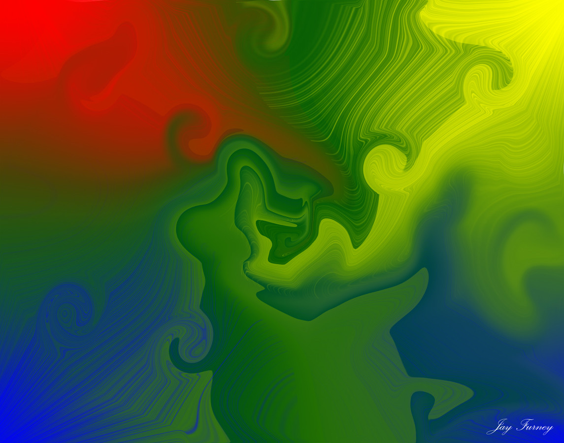
Well i wanted to try diff colors so i chose red besides blue (my fav). This is the myth of "the light break" supposed to symbolize somekind of a light breaking throughLIKE iT ?
LOVE iT
Omg im gonna hang this on the wall = Add to devwatch
Speacial thanks to my gf for the lovely support
Related content


Comments: 29

really nice, both 2d and 3d. maybe the red glow around the white parts should have been smoother but great after all.
-----
Jacquard
Intraspinal Designs
www.intraspinaldesigns.mediasite.de
👍: 0 ⏩: 0


More basic than what I'm used to seeing from you, but the design is still kickass.
-----
----------------------------------------
Yes, this little devious deviant needs to get some.
👍: 0 ⏩: 0

best wallpaper i've seen in awhile on deviantART
i'm addin u to deviantwatch right NOW! very good wp....
..:: s-f ::..
👍: 0 ⏩: 0

i must be the only one here who doesen't like it ...
i must be weird or something ...
question of taste i guess
-----
👍: 0 ⏩: 0


lol this is just a boring extruded object rendering, and I can't stand why people are so impressed by this average piece.
It looks clean, but nothing more.
-----
Gott weiß ich will kein Engel sein
👍: 0 ⏩: 0

Great work!
-----
------------
[-+ SFX2 +-]
------------
From the depths and heights of the Shield, the Creater made the System...
From the lights and shadows of the System, the Creator made the FX...
👍: 0 ⏩: 0

its pretty eye catching but it doesnt have much detail, or depth. trendwh0re is always good but spend a little more time wh0rin it up
-----
~.:i²:.~
👍: 0 ⏩: 0

I love this, and i cant see why ppl complain about it being trendy.
Guess im a trendwore too!
Anyway a Great piece, and a new favourite!
-----
- pluttrik
👍: 0 ⏩: 0

I think it needs a bit more depth. . . it's got some good work put into it but give it that little something. . . then it will be great, mate.
-----
Yes
Maybe
http://femstyle.net/saige
👍: 0 ⏩: 0

it's pretty cool, But there is still room 4 improvement
👍: 0 ⏩: 0

Its trendy, but its not that nice. If you gonna do trendy you gotta make it look good. Its a nice start though.
-----
I mah
s!
👍: 0 ⏩: 0

Cant Say i like this
I dont know, it just doesnt work for me. Im not a trendy person =/
👍: 0 ⏩: 0

u r already on my DA watch cuz ur stuff is kool!
-----
=-justin-333-=
Life Is But Another Way To Torture ones Soul, But A Soul Would Not Exist Without Life
👍: 0 ⏩: 0
i like it d00d i think i might have a new WP!!! but i do know this i do have a new fav! *favs*
-----
=-justin-333-=
Life Is But Another Way To Torture ones Soul, But A Soul Would Not Exist Without Life
👍: 0 ⏩: 0

Trendy but it looks very nice.
-----
Hell is for children !
👍: 0 ⏩: 0

and you were starting pretty well. too bad the not-so great chosen font ruins it a bit. try to use something more stylized and corporate - not all the sci-fi fonts should be blocky and monospaced. (even VAG rounded would do fine).
hint - try to shift the center a bit lower and more to the right. it leaves more room for a well-defined focal point, and it won't clutter up the icons. for the rest, very neat.
-----
--------
*BONK!*
👍: 0 ⏩: 0

grr.. don't get too trendy with your stuff.. but a cool pic anyway.
-----
-+-+-+-+-+-+-+-+-+-+-+-+-+-+
wax on, wax off. focus daniel-san!
👍: 0 ⏩: 0

cool... like the color and the white in the center... also those little box in the left... great job
-----
Even God would stop the world every now and then to fix his mistakes
👍: 0 ⏩: 0

you are welcome sweetie... i'll keep on supporting you...
and you know i would hang it on the wall, but it's full of your pictures already
I LUUUV THE RED COLOR, but it would be much nicer in pink! hahahah! btw check out the notes that babyj wrote to me..AND KILL THAT MOTHAFUCKEEEEEERRRR!!!!!!!
👍: 0 ⏩: 0

i LVEO how your telling people what to do.. your such an authoritarian... hehe.. but these things that come straight out of the center are gettig a bit old..
-----
+Sometimes Its Story Time+
👍: 0 ⏩: 0

Nice, love the color, and I'm a sucker for grid-like backgrounds. I also like the use of mini windows over there on the right.
-----
keepin it real in 2k2
splat
👍: 0 ⏩: 0

I like this lots, however my printer is broked at the moment so I can't print it and hang it on my wall..... I would tho.......
-----
Bringing the
revolution to the masses
Colt 45 and two Zig-Zags.......
👍: 0 ⏩: 0

get away from the trend!! u wh0re!! nice
-----
https://www.deviantart.com
http://www.wastedyouth.org
👍: 0 ⏩: 0

Awesome. I don't really know what to say. It's just kind of perfect.
👍: 0 ⏩: 0

Like the thumbnail = open full size
Like it = save picture
Love it = comment
-----
Godfather Productions
Website: http://el.bikepics.com
Online Resume: http://el.bikepics.com/resume/
👍: 0 ⏩: 0

love it
-----
Genus Carchardon
Species carcharias
-=[Nitsuj-EX]=-
👍: 0 ⏩: 0

love this man.. ill print it and hang it on the wall... and add u 2 my devwatch... sweetness!
👍: 0 ⏩: 0