HOME | DD
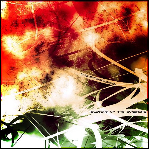
 myduckofdoom999 — Blowing Up The Sunshine
Published: 2005-06-17 00:29:41 +0000 UTC; Views: 155; Favourites: 5; Downloads: 22
Redirect to original
Description
Title from a system of a down songi actually spent some time on this, not much but a bit more then others.
Related content


Comments: 15


very well done. attractive piece. -BUT- the text you throw in there... it takes so much away from the actual artwork. now, if you incorporated the text in an artistic form it could actually enhance the look. if you are merely trying to label your piece, but leave a lil white space on the bottom and put it there. please.
👍: 0 ⏩: 0


-Wyandotte

👍: 0 ⏩: 0

i love the colours, textures and lines in this its really eye catching, it would amke a brilliant cd cover in my opinion!
👍: 0 ⏩: 0

Very cool blend of shapes and colors. I really like the way the clean with curves play off of the green... The varied depths add a lot of interest. Nice work!
👍: 0 ⏩: 0

very intresting peice. there is alot gowing on, the white zig zagging through creates the motion of a caos. and with the green below gives the illusions of the ground. wit hall the red, orange and yellow mixed with the spots it feels as if the something is exploding. i can tell you put alot of work and effort into making this. so defently keep up the work.
 (Smile)")
👍: 0 ⏩: 0

wow nice, this is cool, great shapes and colours in it.
BADASS is right
👍: 0 ⏩: 0


Nice constrast of styles, textures, and colors.

👍: 0 ⏩: 0


this is cool i like the use of colors in it. The title fits it very nicely
")
👍: 0 ⏩: 0

dope..
I like this piece a lot.. its got a very jackson pollock feel to it..
👍: 0 ⏩: 0

intresting use of colour and shape combinations work well to give you this effect well done
👍: 0 ⏩: 0


after taking a look at your gallery, i think you should try breaking out of the square format. abstract pieces like these usually require space to breathe and somehow rectangles from looking at many give this kind of space. also, this piece displays a good use of colour. red and green are complementary colours and they are use well here.
maybe it's your style to use squares, so i won't bother you with that. but i think that given more time and practice plus looking at a lot of other abstract pieces like this will help you a lot.
hope you don't think i'm trying to look down on you, just giving my two cents. kudos!
👍: 0 ⏩: 0