HOME | DD
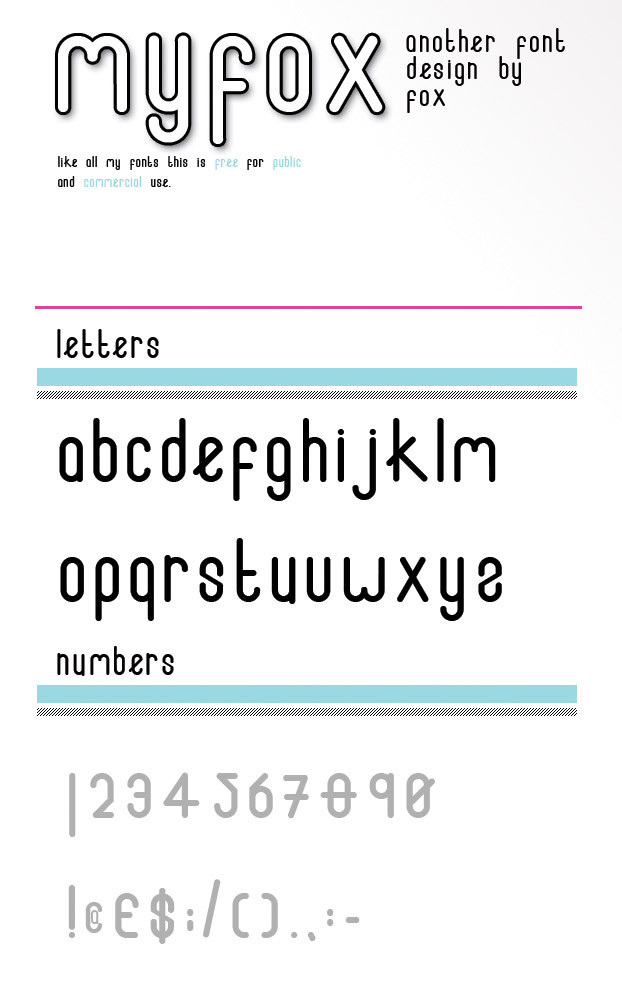
 MyFox —
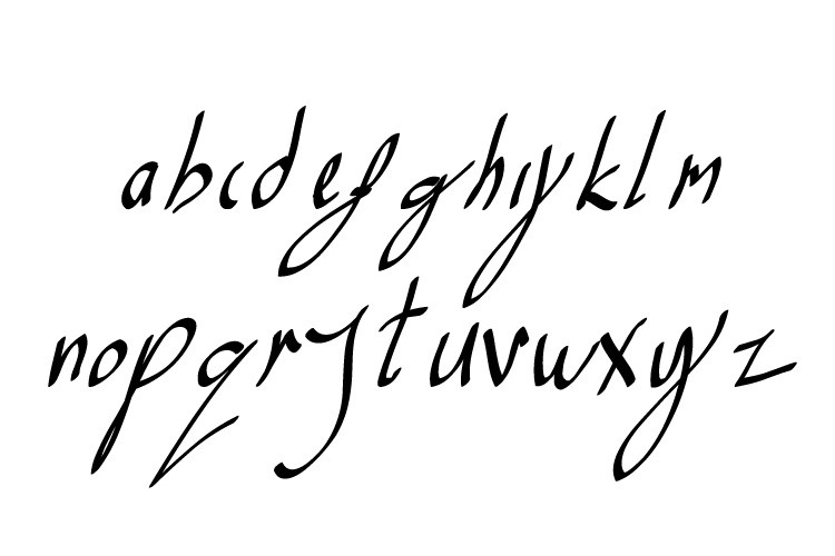
ABC - Font Typeface Version 2
by-sa
MyFox —
ABC - Font Typeface Version 2
by-sa

Published: 2008-08-26 04:28:42 +0000 UTC; Views: 336526; Favourites: 1071; Downloads: 170838
Redirect to original
Description
I would like to say a gigantic "Thank You" To everybody that left me comments.***UPDATE V1.1*** Change V
***UPDATE V1.2*** Change Letter Spacing in lowercase
***UPDATE V2*** All letters redrawn, Numbers Added.
Yes, V.1.2 contained a few mistakes, I was aware. I was planning to change them when I obtained some free time.
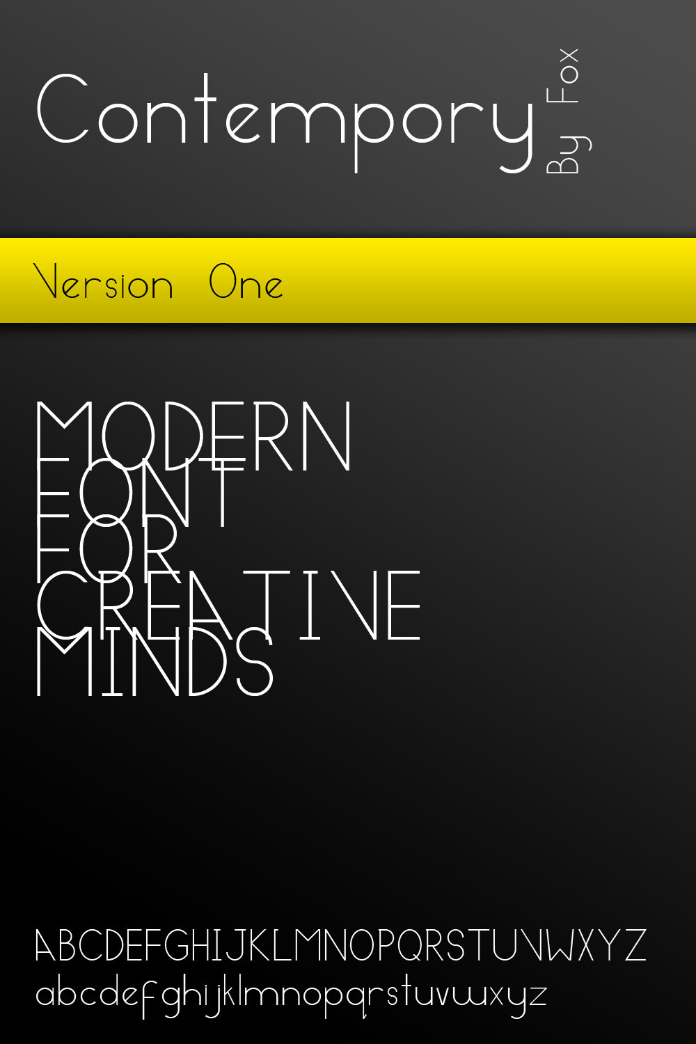
Here is V.2 You will find some new letters, along with adjusted old letters. This font contains roman numerals as numbers. This font has a Sci' Fi' futuristic feel, so i thought i would use roman numerals as a play on future to past.
All my fonts are free for public and commercial use. I received a lot of comments about using my fonts outside D.A YES YOU CAN, you do not need to credit me. You can use my fonts any way you want too. I feel artists should be able to create artwork without fear of "Copyright" restrictions.
I will also be creating other resources such a "Brushes, Swatches, Shapes, Logo parts" all will be free from any restrictions additionally can be used for public and commercial work.
Related content


Comments: 190


this is so cool!
can't wait for ver 2.
thanks for sharing n__n
")
 (Smile)")
👍: 0 ⏩: 0

Your rounded shapes are very imbalanced and clunky.
👍: 0 ⏩: 0

I like this font, it's sorta interesting and curvy. X3 Now if only downloading fonts and stuff didn't confuse me all to heck and slow down my laptop down to a crawl!
👍: 0 ⏩: 0

i respect ppl like u, who help ppl and design fonts or brushes or anything and give it for free.
thank u very much!
👍: 0 ⏩: 1


Great typography, im a fan of rounded fonts so this one suits me great. I like how you solved the S and the Z, very creative.
👍: 0 ⏩: 0

I really like this font. It has a lot of personality. Good job.
👍: 0 ⏩: 0

this looks so much like the eight one font, sorry but this not creative at all
👍: 0 ⏩: 0


what a cool font... I like how the letters look like other letters when slightly altered.
👍: 0 ⏩: 0

Wow, the font looks awesome and you're very generous!!!

👍: 0 ⏩: 0


That is a great typo!!! Well done 
👍: 0 ⏩: 0


Nice font! great work! I might just use it in something
👍: 0 ⏩: 0

nice font. Ill donwload it, ya never know when it can be good to have this. x3
👍: 0 ⏩: 0

uhm... s, z and x... not my favorite ones. the rest is really adorable. but these three you just can't read it fast/well
👍: 0 ⏩: 0

Oooh this is fabulous. Always a fan of rounded fonts as such, and that's quite the awesome stylisation you got there, where a lot of the letters resemble symbols or hieroglyphics

👍: 0 ⏩: 0

Nice font... love the shape
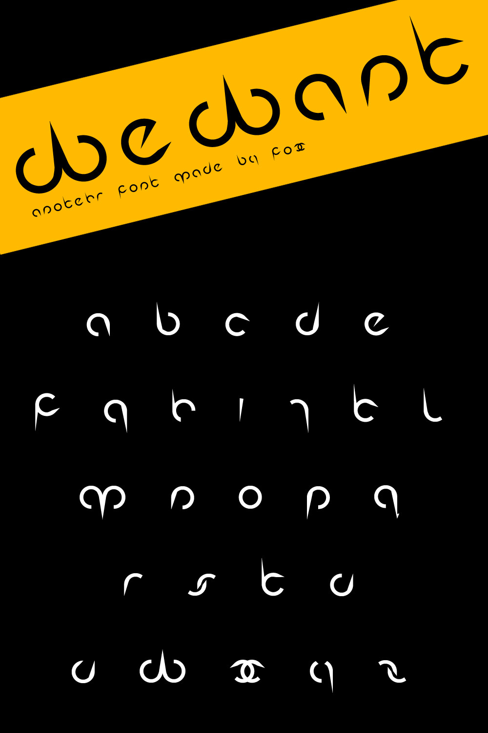
Try to include special simbols and letters form other languages like the ñ...
👍: 0 ⏩: 1

I have added what you request, unfortunately I am English and completely forgot about them letters. I will be including them in all of my fonts from now on.
Have Fun Be Creative
~Fox
👍: 0 ⏩: 1
Don't feel sorry... It's a good thing that you remember this, And that you did what I requested... Thanks!
👍: 0 ⏩: 0

WOW fantastic font, i MIGHT use this for an upcoming DnB album cover if that is alright? ill probably modify it a bit but ill send it by you once its done
great job and congrats!
 (Wink)")
👍: 0 ⏩: 0


Hmm, there are much mistakes in it....
But still one of the better ones!
👍: 0 ⏩: 0

first. nice work.
you need make a little adjust int the "J" "K" "V" "X"
you can make it betther, and the Type going to gain a lot.
nice job,
👍: 0 ⏩: 0

I don't like "gyj" think it should be just round, would suit it better. other than that nice ^^
👍: 0 ⏩: 0

excellent, i sure will use it
thanks you very much!
i like this kind of round letters! u did a great font man
👍: 0 ⏩: 0

brilliant!
u must have put so much of hours into it!...
👍: 0 ⏩: 0


Hey Fox. The letter "i" looks like it's thicker than the rest. why?
👍: 0 ⏩: 0


Wowsers! Saw your font featured in Znow's Journal and had to take a closer look! Glad I did.

👍: 0 ⏩: 1
Thanks for your comment, Im glad you like it. Watch out for more font that i create. ~Fox
👍: 0 ⏩: 1
<= Prev |