HOME | DD
 MyNameIsMad — Compromise: Page 1

Published: 2009-09-15 01:20:31 +0000 UTC; Views: 5772; Favourites: 50; Downloads: 0
Redirect to original
Description
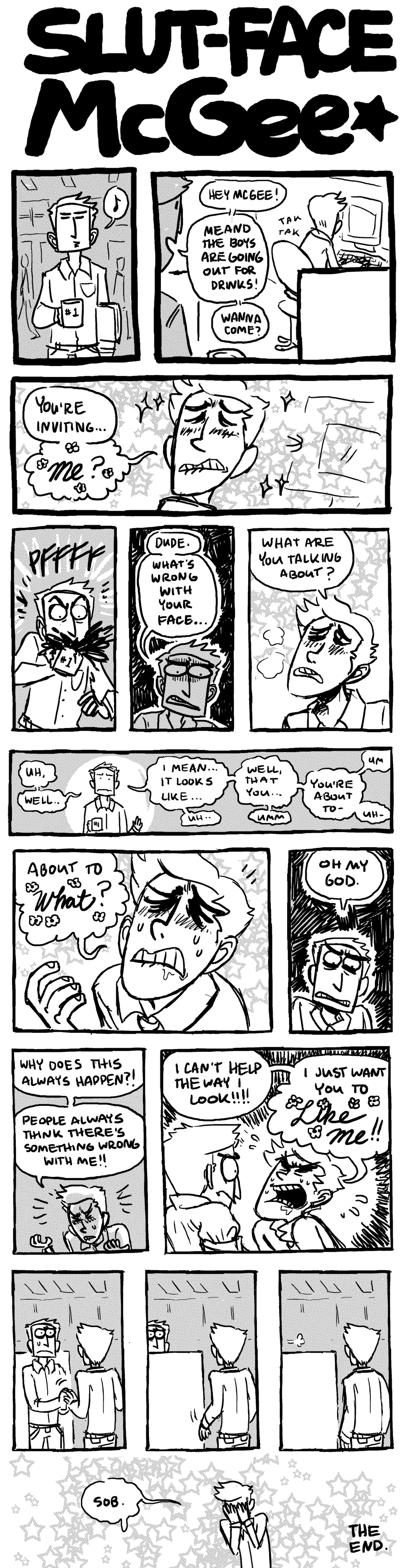
Page 1 of the comic ~ToxicToothpick and I are working on together. I'm going to upload the pages to DA for now, at least until I figure out what else I'd do with them.I plan to try toning or coloring this (or possibly both) but I can't decide on a style yet so you're going to get the bare bones, freshly brush-inked look. Basically this is a page purely un-fiddled-around-with, save for a few minor corrections.
I am trying a lot of new things with this so critiques are welcome! Expect updates on Mondays and Thursdays. I'll try to be as regular as school permits.
LEMME KNOW WHAT YOU THINK.
Related content


Comments: 116

i think im jealous of you and david working together!! both of your minds and talents would be so detrimental to this planet, so much N.O. would be released causing a black hole of infinite power to swallow the planet in awesomeness!!!
...
cool picture
👍: 0 ⏩: 1

WE ARE TOO COOL FOR THE INTERNET
👍: 0 ⏩: 1
how about the universe. (not ?)
👍: 0 ⏩: 0

The Shading on the rock is lovely, it adds a nice contrast to the rest of the page. also the inking is beautiful, I always have a problem with inking. This looks amazing!
👍: 0 ⏩: 1

Haha, it's a nice opener. I love your inking. Not sure about the hand done text though. Have you tried typing it? If your looking for a free comic server I suggest Smackjeeves [link] .
👍: 0 ⏩: 1
I thought about typing it but i wanted more of a hand-done feel. I'm still debating though. (I know my hand lettering tends to fluctuate in quality :I)
👍: 0 ⏩: 0

Even though a pug was blocking most of the view, I fell in love with that pic because of how well you drew the landscape :3 Can't wait to see more
👍: 0 ⏩: 1

YES UPLOAD THEM ALL
Hmm, I can't really find any way to critique...I'm liking the style of shading, though.
👍: 0 ⏩: 1

Lovely lovely, I especially like the hatching on the rock. I think color would look very nice with this, and if you plan on hatching this way through the entire thing I think you could get away with just doing flats.
👍: 0 ⏩: 1
flats was the way i was going to go, but I don't think i can keep the hatching up all the way through. tried it on some people in the comic and it didn't jive as well.
OH WELL THIS IS A LEARNING EXPERIENCE.
👍: 0 ⏩: 1
Well perhaps then color and shade the people, but hatch and flat the backgrounds. It could help make the people stand out against them more.
👍: 0 ⏩: 0
<= Prev |