HOME | DD
 nameless — dexrypt-v1
Published: 2000-10-16 15:33:32 +0000 UTC; Views: 831; Favourites: 0; Downloads: 183
Redirect to original
Description
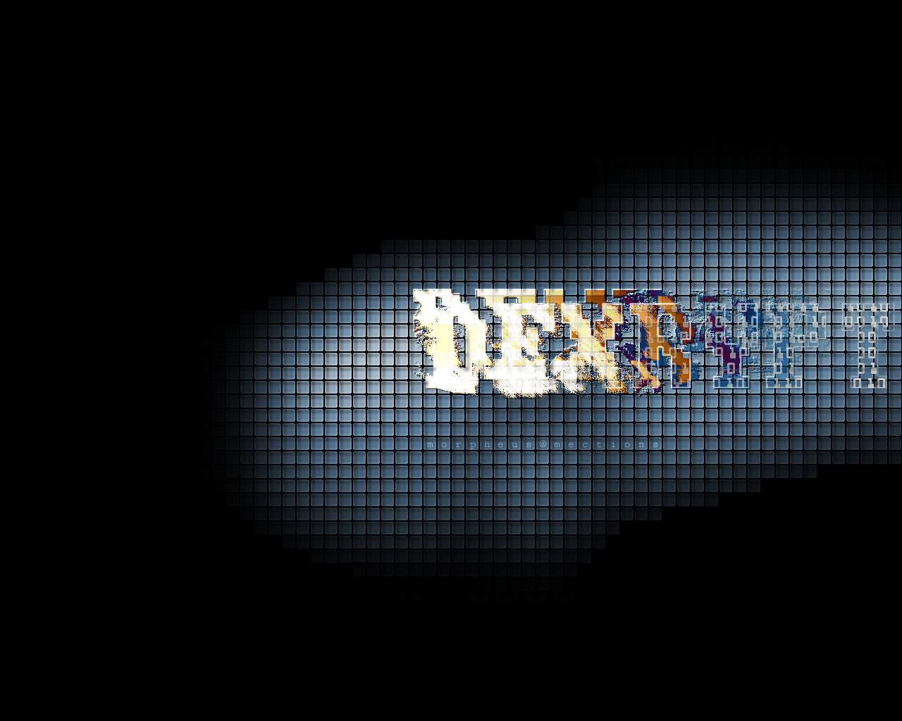
1280x1024.I know there's too much black space, but I preferrred that to using meaningless filler.
Related content


Comments: 6

Very nice.
Probably should make the text a little cleaner though.
👍: 0 ⏩: 0

nice looking deviation there. i like how you did the text. probably more IndyArt than a Wall though.
--[ jark ]--
👍: 0 ⏩: 0


Heh, it isn't really a logo, more like instructions for the picture.
The tiles form an image...
👍: 0 ⏩: 0

Its creative... whatever it is.... So you get your high marks there... But i find when you personalize a desing with ur name or logo, it kinda isnt gonna be used for other people...
👍: 0 ⏩: 0

I think this one has too much black around it. The text is a bit messy as well. Not saying thats a bad thing, but its just hard to read.
I like the tiles, they kool.
[.bin]
👍: 0 ⏩: 0