HOME | DD
 narmio — basicdesign

Published: 2002-09-12 05:56:36 +0000 UTC; Views: 669; Favourites: 0; Downloads: 64
Redirect to original
Description
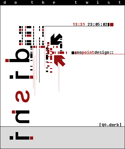
hmm. havent posted anything in a loooong while so i toughed its about the time. heres something i've done recently.kinda like it now but probably hate it like in two weeks. heh.
Related content


Comments: 12

great design here as well, just not digging the grainy feel to it
👍: 0 ⏩: 0

I can see your trademark there.
very nice concept you always have in your mind.
waiting for your another submission. we all miss that.
👍: 0 ⏩: 0

NIce design looksmore than basik, im diggn the celshaded style, Later!
👍: 0 ⏩: 0

Beautiful design, I like the texture you used. Wicked stuff.
👍: 0 ⏩: 0


yO..
Always gotta love da grainage! Good layout too..!
DC
👍: 0 ⏩: 0

finally . . long awaited . .
love the colors and the textures . .
👍: 0 ⏩: 0


finally some more narmio!
it's a pretty strong layout, combining the soft colours with black and white, i like that. nice idea to use this grain on the pastels
good work!
👍: 0 ⏩: 0

Haha! i like it. Simple and stylish. The font used to " BASIC " reminnds me of a logo.
👍: 0 ⏩: 0

simple and clear. Reminds me of mid 30-40 outdoor commercials. the typo is basic, yes. Batllestars or something? ... but why shouldn´t it be there? some will say...I say, being basic doesn´t mean your work is passive. It means you go and have a try with different styles, combinations and the result is the experience you get. Keep it up!!
👍: 0 ⏩: 0