HOME | DD
 NathanFowkesArt — Rio2 Confrontation

#rio2 #animation
Published: 2016-08-28 15:35:44 +0000 UTC; Views: 3522; Favourites: 130; Downloads: 0
Redirect to original
Description
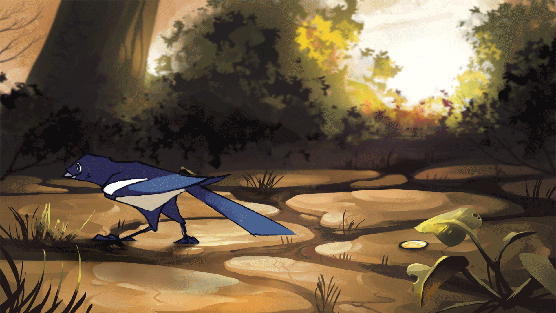
Here's the final from the Rio2 roughs posted previously. We went with the less saturated choice because it allows the bird to be the main focus of the moment.
The idea is to carefully control the value contrast, hue contrast and saturation contrast to properly emphasize the story moment. I also have the ground plane tipped to add drama.
If you'd like to learn more you can checkout the new inexpensive subscription program www.schoolism.com/school.php?i… for my online concept art classes.
Related content


Comments: 9

👍: 0 ⏩: 0


Rio 2 kinda used to be a darker film, i guess.
👍: 0 ⏩: 0


Wonderful work of art! The bird's vibrant color contrasts against the grayed background, yet there's always something to look at.
👍: 0 ⏩: 0

This is amazing.
I love your final decision but I believe a complementary contrast would've emphasised the contradiction between bird = nature and machine = destroyer.
 (Smile)")
👍: 0 ⏩: 0

oh XD i thought it was the scene from the overwatch short for a moment XDD Great piece of artwork though!!
👍: 0 ⏩: 0


great moment capture, thanks for explanation in description too.
the $15 plan on schoolism sounds like a great investment.
👍: 0 ⏩: 0