HOME | DD
 neiro — -Retral-Rexa v3-

Published: 2001-09-27 22:59:39 +0000 UTC; Views: 582; Favourites: 2; Downloads: 97
Redirect to original
Description
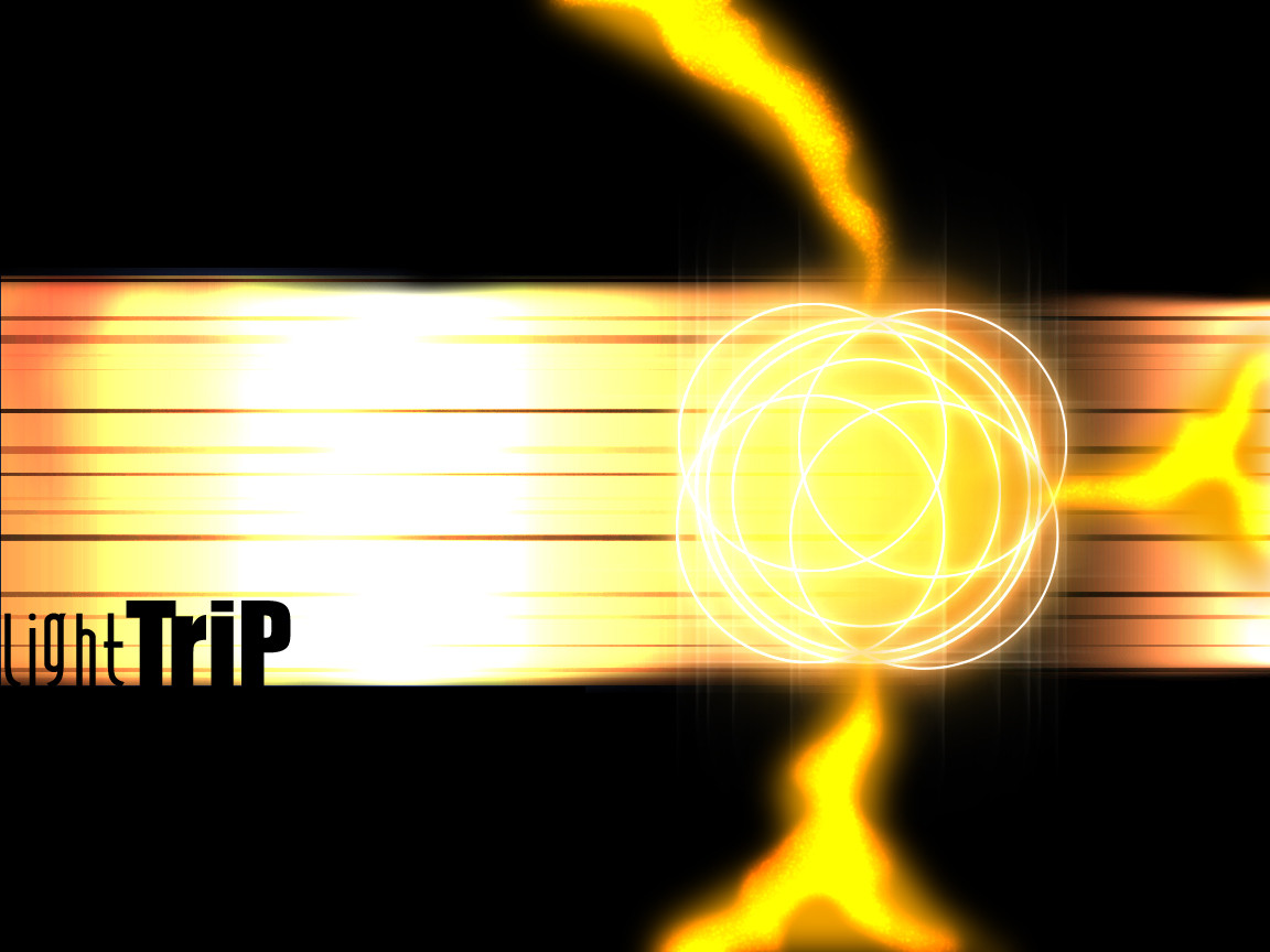
Uhh...Hola! Lets see, this didn't start as a Wallpaper, but Hey, it kinda turned out eh? It was actually gonna be a logo, but I don't use my logos, cuz I don't have a website, and I don't know anyone who would host me, too bad, that would be fun.Back to my wp, I used the wacom to make the inside, and I just played with that for abit, I got the idea for that from another wallpaper I saw at one of those popular sites, i forget the name sorry.
Nothing much to say, other than I obviously like colordodge
Uhhh...Other comments are welcome, this one's 1152x864. Have fun
Related content


Comments: 10

awesome! so damn clean.
i'm addin this piece to my favz.
👍: 0 ⏩: 0

cool techincal look i like the lines and colors you choose, the text is great and the effects on the circle are super b, good job, try it in orange
-=ReTrO=-
http://www.optico.f2s.com
👍: 0 ⏩: 0

Great technical look and the lights thing are great.
A wonderful color choice too.
the
will bite your toe whahahahahah
👍: 0 ⏩: 0

THATS COOL!!!!!
Geek? Yes, but at least I got social skills!
-Dark-
👍: 0 ⏩: 0


I really like how you overlapped and blended the colors in the middle. It's a great design.
👍: 0 ⏩: 0

like the overlaping in the middle ... great job.
oOo .im scared from orbs. oOo
👍: 0 ⏩: 0

the effects are great, the only thing that bothers me is the bg, i can't help but think it'd look bettter against white, but that's just me. Great work
👍: 0 ⏩: 0

Looks sharp. . .
Stay Deviant!!!
A few samples of my art...
https://www.deviantart.com/deviation.php? id=79214 Alien Abstract: Indyart: Sci Fi
https://www.deviantart.com/deviation.php? id=26098 A Fighters Fate: Poetry: Lyrical (Fantasy)
https://www.deviantart.com/deviation.php? id=30904 Demon Storm: Poetry: Dark (Fantasy)
http://www.geocities.com/nyjokerman/meta lfantasy My Website: Metal & Fantasy
Jokerman
I AM SOFA KING WE TALL DID!!!
👍: 0 ⏩: 0

This is pretty nice, the colours are really dead on. I like the blue and the light in the middle. Almost cyclone like in nature
Normally I don't like tags, but if the point of it is a design it works really well.
Cheers
Cam
--------
Sir|Morphix -- Asuka and Blue
AIM:Sirmorphixx
--------
Blue Prophecy http://www.theblueproject.net
---------
👍: 0 ⏩: 0