HOME | DD
 Neizen — RvCfe-Srt Keegan vs2.0

Published: 2005-01-11 16:28:23 +0000 UTC; Views: 11488; Favourites: 453; Downloads: 1238
Redirect to original
Description
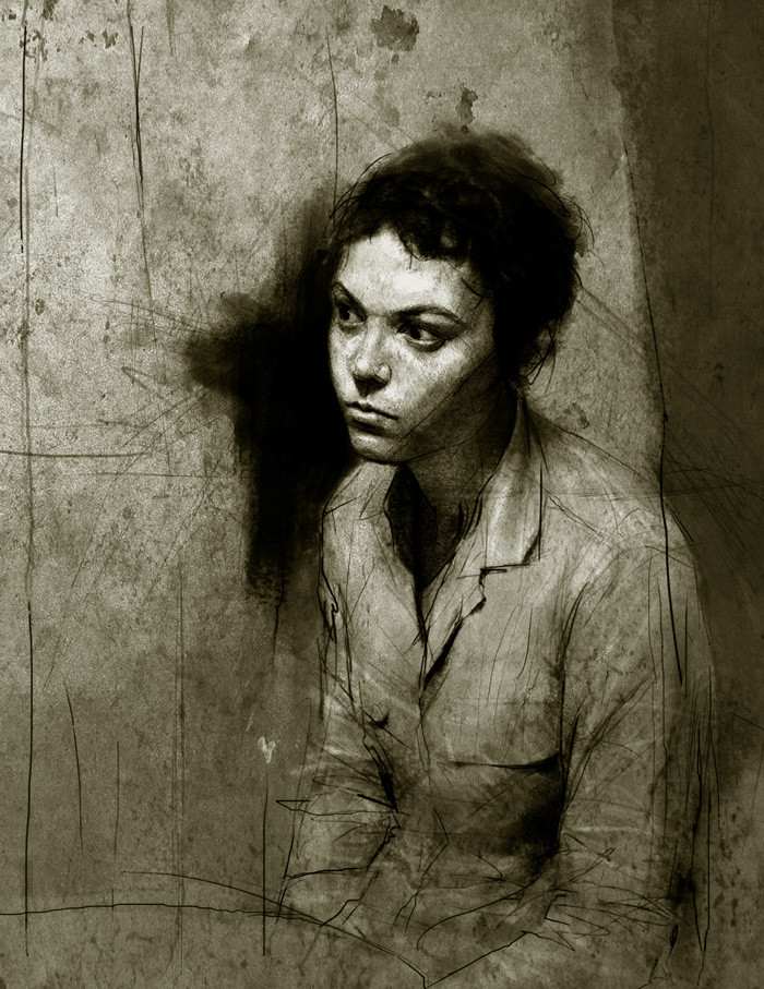
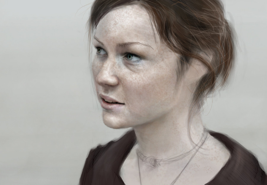
adobe ps7.0 about 1hr after the last oneI started on page constructions only to see that Im in deeper shit than I expected.. The large empty spaces around the portraits do not mesh together on the page.. -peh! Im pretty much redoing the sequence..
anyway this is an alternate vs to [link] : a bit more time spent and different palette..
check out the other one I would like to know which one most prefer?
Related content


Comments: 85


It's really very good......I like your style.....keep up the good work!!
👍: 0 ⏩: 0

better color scheme definitely, more detailed work,
harder freckles, i personally dont have a problem with them
i would like to see a smooth curve of her chin, thats what i miss in both versions i think
👍: 0 ⏩: 0

I very much prefer the other one...the lighting iss so subtle...that pure white early morning light...very gentle...& a dove grey sky...it has a wonderful atmosphere. This one is too heavy & lacks that delicacy that I admire so much in the original.
👍: 0 ⏩: 0


i love the use of the neutral colours rahter than the primaries, or secondaries...
👍: 0 ⏩: 0

The details, especially the freckles are unbelievable. Wonderful job.
👍: 0 ⏩: 0

I think it's really good. It's really realistic and I think you did a great job!
-fP

👍: 0 ⏩: 0

Excellent
(And, hum, do happen to like it more than the other.)

 (Wink)")
")
👍: 0 ⏩: 0


I love this, it's absolutely gorgeous.
oh, and i prefer this to the other one

👍: 0 ⏩: 0

oh my god, she's beautiful...
And the work youve done there seems so ... alive? dont know, cant explain it really in a foreign language but what i can tell is, that in my eyes youve done a unbelievable great portrait... i just love it
")
👍: 0 ⏩: 0

woah - that's amazing. really realistic and the lighting on the face is really good. its also got a melancholic mood that works great. the forehead looks a bit strange shading wise...but that could just me and my bad eyesight.
👍: 0 ⏩: 0


Unbelievable detail!
Amazing and stunning is all I can say.
👍: 0 ⏩: 0


I prefer this one.
Both of them are absolutely amazing.
👍: 0 ⏩: 0

You're phenomenal.
--I like the bit of blueish-grey on the inside of the eye especially.
One bit of critique: some of the freckles over the highlighted portion of her face (forehead and nearest cheekbone) are a little too contrasted or hard-edged. They look more like texture on the face instead of part of the skin.
She's amazing... Astonishing work.
👍: 0 ⏩: 0

Photorealistic...wow. I really love how her freckles look...
👍: 0 ⏩: 0


i prefer this one, the warmer tones and such

👍: 0 ⏩: 0

I'd say the freckles in her face are a bit heavy in this one versus the last one, almost too much so. I love the general constrast in the face, the eyes especially.
the thing I adore most about this is not the anatomy, or the detail in the face, or the beauty of the girl, the thing that I'm most attracted to are the colors chosen. very realistic and haunting. not a color scheme you see every day in portraits, but it's very true to real life (given the appropriate lighting obviously) and I like lighting deviance.
it looks good neizen, you've got a style I've yet to find paralelled, and I like that in an artist. you free your mind when you draw, and it shows.
👍: 0 ⏩: 0

really nicely done, think i agree with frail about the lighting fo the first, the darker, moodier pallette works really well, conveys much more emotion, but a few brighter highlights like the first version on the skin would make it pop out more, but, all in all, it's this version for me
👍: 0 ⏩: 0

In terms of mood I prefer the sickly green lighting, as it better foreshadows what is going to happen to her.
I think that you need a little bit more of the structure that you have in this portrait in some of your "in the city" panels, while keeping the delirious "whatever you call it" rendering style. Of course, I recognize that you aren't done with most (any?) of them...
Anyway, another + fav.
👍: 0 ⏩: 0


I love this version. I love the eyes and the cubtle colours, very soft. Great work, almost photgraphic, but I like the fact that it isn't and you can see some brush strokes.
👍: 0 ⏩: 0

I like the darker backgroud, but I prefer the lighting on the subject in the other one.
Aside from that, this is fantastic.
👍: 0 ⏩: 0

Excellent work on both..
It's difficult to pick but I think I prefer this one.
 (Smile)")
👍: 0 ⏩: 0


I prefer this one but it's difficult to say why... it just has more depth to it somehow. The skin seems more real... especially around the eyes, where the shadows add some character I think. Obviously the ears are better. Anyway this is the best portrait I can remember seeing on DA or anywhere else. It really, honestly looks as though the head is emerging from the monitor and staring out into my room.
👍: 0 ⏩: 0

i think i prefer this one.. either way both are impressive..
👍: 0 ⏩: 0

<= Prev |