HOME | DD
 netghost — DigitalGenesis-TechnoOverload

Published: 2001-07-21 09:47:24 +0000 UTC; Views: 3053; Favourites: 15; Downloads: 870
Redirect to original
Description
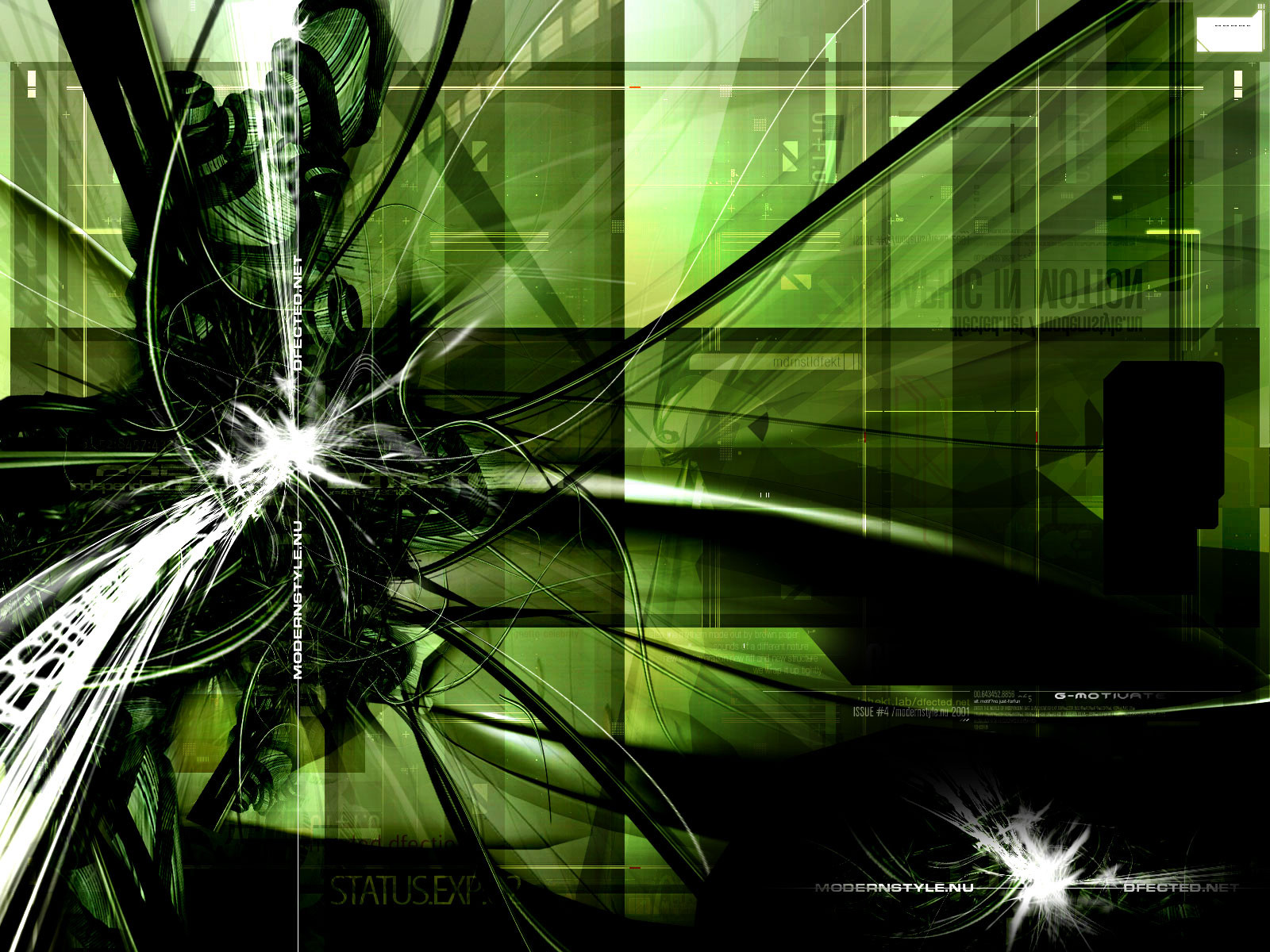
DigitalGenesis:TechnoOverloadMixInspired by nothing in particular except the desire to use my tablet for something neat
Oh by the way, the source code is included. Enjoy
Related content


Comments: 14

¡¡FANTASTICA!! ¡¡IMPRESIONANTE!!
Ya esta en mis favoritos
FANTASTIC!! IMPRESSIVE!!
Already this in my favorites
👍: 0 ⏩: 0

nice. I like how the hand illuminates parts of the image to that awesome blue color.
👍: 0 ⏩: 0

Wow you have a special gift.
I can't accomplish half of what you have done with my tablet
👍: 0 ⏩: 0

Wow, such an amazing piece...I can't believe it hasn't received more attention. Again, the colors work incredibly well together...very creative, very artistically disciplined.
👍: 0 ⏩: 0


That is very nice, great work.
-----
~ Kea
Pickledilly!
👍: 0 ⏩: 0

Very special!!! Nice is the blue reflection on the wall.
Jankin
http://www.jankin.com
👍: 0 ⏩: 0

Yowza! This one is really bad. It looks like the hand of God coming through the wallpaper.
You did a fine job on this. Everything from the textures to the colour choice. And that nifty little code-snipplet that'S blended in to the right matches the feel of the wall perfectly.
👍: 0 ⏩: 0

Now that my friend is wicked.... I love that hand!!!
www.thekrayz.cjb.net
👍: 0 ⏩: 0

both versions are kick ass, this one is my favorite of the two.
KrasH
~DeadEnd Designs~
👍: 0 ⏩: 0

major difference from the first. good job
.·:·.shr00m.·:·.
👍: 0 ⏩: 0

wow, i like this version a bit better, it's got more stuff to look at great job
👍: 0 ⏩: 0

yea.. I like the minimalistic version better. but this is pretty alright just as well.
@}---;--babysista-
👍: 0 ⏩: 0

Sweet as always NetGhost.
Nice depth in there.
::Breed:: » http://www.breedart.org
::Exordium:: » http://www.exordium.f2s.com
Arts Longa I|I Vita Brevisis
👍: 0 ⏩: 0