HOME | DD
 netghost — glitchscape

Published: 2002-10-21 09:40:08 +0000 UTC; Views: 2079; Favourites: 18; Downloads: 588
Redirect to original
Description
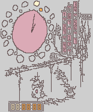
;glitchscape:.I have reason to believe that my traditional lanscape painting has undergone severe corruption. This is what I was able to salvage.
1oo% photoshop + tablet + bit-corruption
.netghost
Related content


Comments: 28

i've only just found this little piece of genius but i am very impressed with your style. nicely done
👍: 0 ⏩: 0

Mhhh, very nice colors and idea, for me only that small lines and dots take out the "clean feeling" of this piece...
nevertheless, congrats
👍: 0 ⏩: 0


Changing the style a little, huh!!!
Great work here!!
Very nice colors.
👍: 0 ⏩: 0


The 'bubbles' in the pink toned section look excellent they seem to be breaking away from their clusters. I think the 'techy' aspects are dominating the trees a bit too much. perhaps a larger tree somewhere would've looked nice.
I'd be interest to see some of those burnt and shimmering colours you use incorporated into this new style. and that scratchy texture you use a lot.
👍: 0 ⏩: 0
I like this better than the modified version of it. The line down the centre didn't look very good. I think your heading in the right direction here. Your great colours and the contrasts of organic and vector styles is good. I was gonna say more but i gotta eat.
👍: 0 ⏩: 0


Where has this style been hiding all this time? What have you done!
It's beautiful. I would never, EVER have associated your work with a style that is so conforming and "straight" at times. But true to form, you don't fail to impress.
The composition is extremely interesting. Makes for a great background concept with all the busy activity and still uncluttered feel. Though the colors are what makes it really special. The rosy reds and muted creams are marvelous. Fantastic work.
👍: 0 ⏩: 0

one of the strangest, most interesting and eye catching things i have ever seen
👍: 0 ⏩: 0

This looks great, Ive tried do something like this before but failed, you made an incredible wallpaper.
👍: 0 ⏩: 0

although i just realised i have to cut down the 16x12 version to 1280x1024 for it to fit my desktop it still rocks.
👍: 0 ⏩: 0
incredible work - i've never seen this two styles merged so well before, and the colours are perfect. adding to faves, setting as wallpaper, and recolouring my entire computer to match.
👍: 0 ⏩: 0

a highly original take on the design trend. i love the connection with landscapes. great vision.
👍: 0 ⏩: 0

That is friggin' awesome sheee0it. It's an original version of your original style. Great job.
👍: 0 ⏩: 0

Woah, like nothing I have ever seen - which makes it kick even more ass!
👍: 0 ⏩: 0

whoa. wow. this fucking kicks ass man. the style just oozes talent
👍: 0 ⏩: 0

wow, this is a change for you, in terms of style. while i am a huge fan of your old freehand style, i must admit, i really like this. your brushwork mixes so well with the trendy 2-d elements, especially with the color range you used. Experiment more with this. i'm really looking forward to what your work will look like from this point on
👍: 0 ⏩: 0


oohhh this is VERY interesting, something really new (for me at least ) keep experimenting, its really great!
👍: 0 ⏩: 0

this is something else indeed. a mix of modern and what seems to be like oldskool japanese art. I really like this, i'll save it to my HDD, and use it as a wallpaper at some stage defently. by the way i love the colour scheme
grade A work, really.
- vinnie + peenut's nemesis = peenuty goodness
👍: 0 ⏩: 0

oh my, this is gorgeous. seriously. the two dimensional design skills you display here are a sort that i don't see often. the colours are amazing, and the hand sketched parts make this something very unique. any chance you have a 1600 x 1200 version that i could use?
👍: 0 ⏩: 0

amazing work! great mix of styles you should do more like this
👍: 0 ⏩: 0

Wow. This is why you're on my devwatch. Not exactly your normal and average style, but I really do dig it. The trendwhorish style combined with your own wonderful brushwork is nice to watch, to say the least.
👍: 0 ⏩: 0