HOME | DD
 niteangel — Internal Castigation

Published: 2002-06-05 01:32:07 +0000 UTC; Views: 4226; Favourites: 40; Downloads: 630
Redirect to original
Description
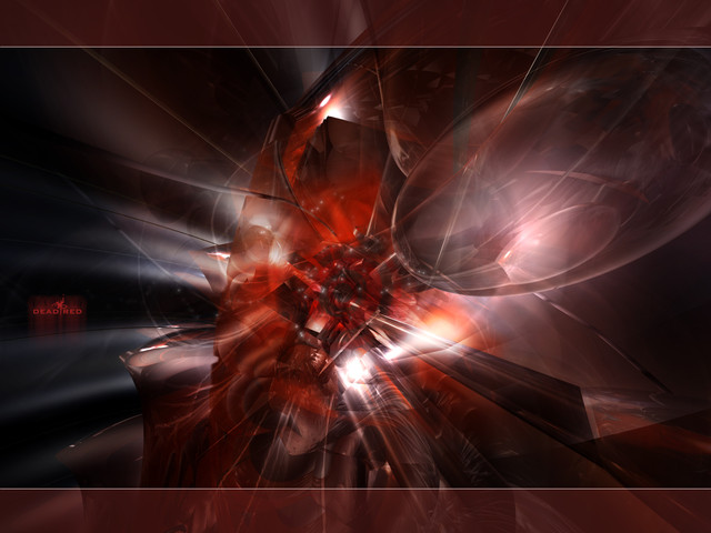
Part two of my previous work Penalty :: Penalty IIZoom in NOW to view the details Thumbnails suck...
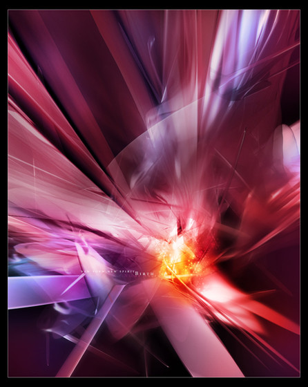
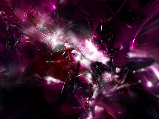
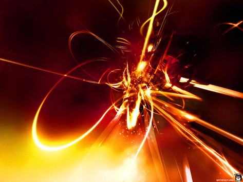
A perhaps bloody piece from mine, I personally think this is the view of some organs, yuck... anyway I like this very much because I think I do something quite different from my usual pure and clean things...okay, it's up to you to say that...
I posted only 1280 version, but 1600 is HERE [link] (fixed) You can also find other wallpapers at my website Angelworld. (If you haven't been there you should go now )
Sorry, miss this, this image is partially airbrush, not all 3D things
Those who hurt me before will be dissected like this for the tormenting castigation...
Related content
Comments: 40

Wow I really like this *___*!!
This caught my attention 'cause it's all red, red be my fav. color! Gawd this is awesome e___e!
--
"Purple can be a flavor!"
Love Wolfwood? Join!
👍: 0 ⏩: 0

Awesome...
Very beautful!!!
A professional image as well...
Lots of congrats!!!
👍: 0 ⏩: 0

looks good but a little tooo blurred and those over-dodged blobs really bring my attention
👍: 0 ⏩: 0

wow, what can I say... you do some of the best wallpapers around here and I so much love to see your work. This is amazing and I like the venture into a different colour. Excellent design ! OK, now do a damn green one !
👍: 0 ⏩: 0

i love the colors... very intense
-----
an eye for an eye, a tooth for a tooth and a comment for a comment
Nope
👍: 0 ⏩: 0

Wow, wow, and wow.
-----
Just remember, Alana lubs j00 all!
👍: 0 ⏩: 0

wow this is aweosme... the subtle reds and everything... wow
_ _ ___delicious___[link] ______________________ _ _ _
" you laugh at me because i'm different, i laugh at you because you're all the same "
👍: 0 ⏩: 0

Ooh..reminds me of a candy apple . Great work.
-----
-amphex (Dan)
👍: 0 ⏩: 0

Not really liking for some reasons..the airbrushing is too bright..and does'nt really do this piece any good...the material for the render alsolooks a bit dark or maybe just cluttered so you can't really see the detail within this..the typo is smooth and nice though..
-----
[sig][link]
[Link] [link]
👍: 0 ⏩: 0

very cool! great colors, form, and lighting. i love this. this is as close to 3d abstract perfection as it gets. keep up the excellent work.
👍: 0 ⏩: 0

That is nice and spacey, what prog do you use to get that?
👍: 0 ⏩: 0

fantastic piece, the use of intense colors really enhances the 3D shapes. very nice design, *fav.
NAXZUL
👍: 0 ⏩: 0

I could hug you right now.
Great work as usual. Always amazing. My new desktop wall.
-----
e v o i c e
you dont have to listen just hear me out
👍: 0 ⏩: 0

I love that hot feel it has, and very bright, like something ignited. Very awesome coloring and work.
-----
___________
+ + + + + [link]
👍: 0 ⏩: 0

nice na
although that bright thingie to the left should be moved, but otherwise nice
👍: 0 ⏩: 0

damn this is nice, good colors
-----
:: deus designs :: [link] :: [link] ::
👍: 0 ⏩: 0

Some parts r 2 bright.
-----
-----
Follow the [link] to see my fellow deviant.
👍: 0 ⏩: 0

damn thats GREAT. I only wish it was a higher resolution... *sob*
-----
👍: 0 ⏩: 0

i agree with snowy, does look like a heart...which was why i was attracted to this in the 1st place
MADness this is, *hearts starting to race..
beautiful!
👍: 0 ⏩: 0

lovely color explosion there. Feels so warm and nice
-----
[link] | abnorm thinking
[link] | my comics dev. pack
👍: 0 ⏩: 0

hhmmm..nice wall,but not ur best..i find the "fire-effect in the middle not needed...4 me,i like ur other style more !!!!
.......but ,hey new icon ?!!
👍: 0 ⏩: 0

ah.... does look like organs... but in a beautiful way..
sort of like... portraying pulsing life....
the bright light in the middle looks like a heart...
and the red pieces look like tendons... veins.. capillaries and arteries racing towards the heart and feeding it... making it glow bright with life
there's so much energy in this.....
oh and I like how u made the text sort of fade away in such a subtle way...
heh but this is YOU.... can't be less than amazing...
-----
SnOwMaSk
. . . close enough for me . . .
mystuff@[link]
👍: 0 ⏩: 0

this is just beautiful! the color is awesome! love the reflections of light too! great work!
👍: 0 ⏩: 0

Wow excellent piece. Thats a sexy 3d job you've done there. Keep it up man.
👍: 0 ⏩: 0

just looking at this piece makes me hot. it has such an intense feeling to it. the stuff twoards the bottom of the piece gives it a great sense of depth. great work.
-----
👍: 0 ⏩: 0

I love the 3d.. but cut down the contrast on the airbrush....
-----
BIN LADEN SUCKS [link]
👍: 0 ⏩: 0

your pieces are so vibrant- it's like those blobb'ish tentacle things are melting together- keep up the wonderful work, although i prefer your lighter pieces- this is, as always, terrific
👍: 0 ⏩: 0

holy shit...the details are the best part...full view needed...i like the hot areas...nice i can feel the light
-----
::the new state of design::
are you ready? [link]
+
=
👍: 0 ⏩: 0

perhaps i should go into more detail: not bad doesnt say much
the smallish flares you have in the lower half would be better brighter
also, i feel the piece is too glossy, there's not enough contrast IMO
-----
{++trendwhorekud.com :: [link]
👍: 0 ⏩: 0

Yeah, you're right, a bit bright, but I like that as it makes a good contrast there~
Thanks for the comments!~
-----
Night Angel- - - - - - - - - - - - - - - - - - - - -
From Angelworld, version 7 now :::
visit now the most angelic place on the net
:::>>> [ [link] ]
👍: 0 ⏩: 0

Wohooo this is great +fav, btw like the way u kinda "intigrated" the text, so it fits in perf.
👍: 0 ⏩: 0

nice render, in my opinion some of those "flares" are a bit bright, but other then that pretty cool
-----
// fusion[4] // [link] //
👍: 0 ⏩: 0
