HOME | DD
 noahbradley — Ghere Thau

Published: 2013-10-02 18:20:09 +0000 UTC; Views: 23427; Favourites: 1283; Downloads: 787
Redirect to original
Description
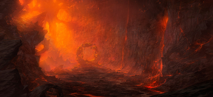
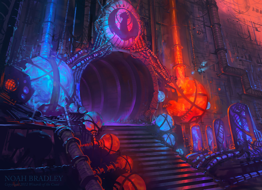
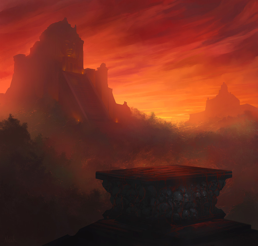
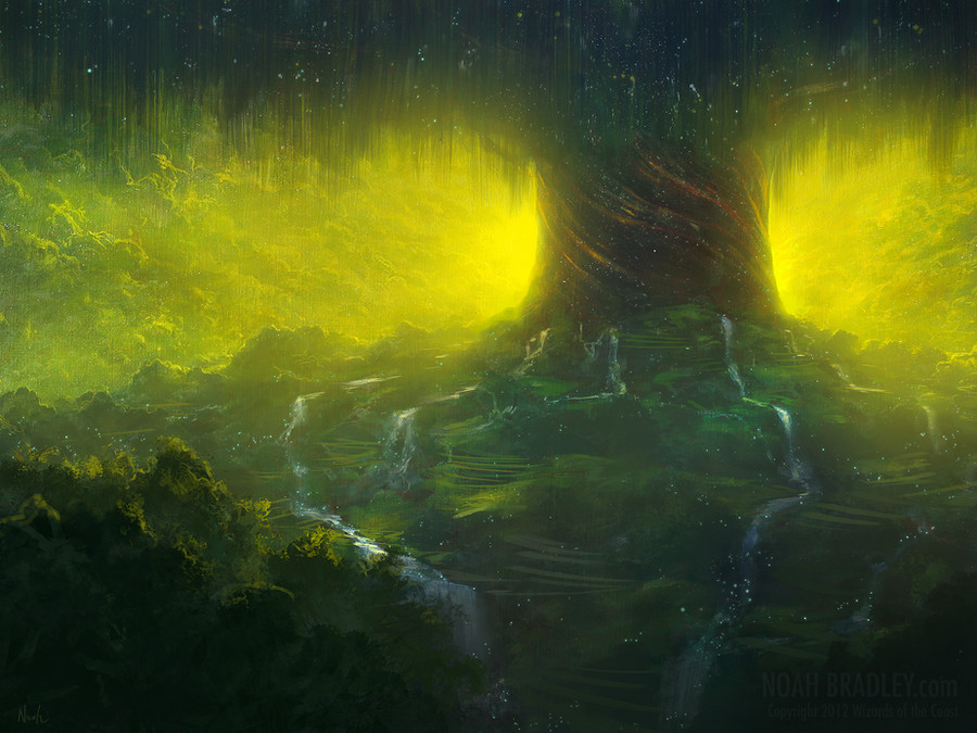
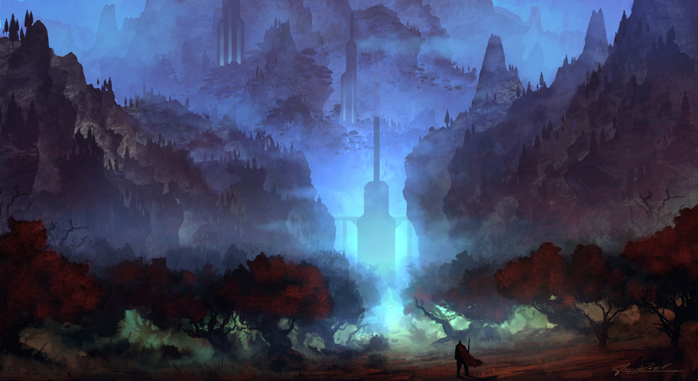
Some newly published D&D work.Related content


Comments: 40

👍: 0 ⏩: 0

Am i supposed to see the shape of a dwarf character in the clouds on the top?
Its wonderfully subtle in that case, and it makes a lot of sense visually
Great pic
 (Wink)")
👍: 0 ⏩: 0

This reminds me of Simon Bisley. I love the red against the black and that obscure and hautingly silent door in the middle, begging us to approach. The blues make the red stand out, and the red makes the mountain stand out, and the mountain make the tiny door stand out. A great work of contrasts and allusions!
👍: 0 ⏩: 0


I really loved the colours on this one.  (Smile)")
👍: 0 ⏩: 0


Such superb use of color and lighting... so inspiring... the clouds just look like they are about to move...
👍: 0 ⏩: 0

Oh! This is so great! It's like you somehow saw stuff in MY head. So epic
")
👍: 0 ⏩: 0


Reminds me of Mordor... Great piece of work here.
👍: 0 ⏩: 0


Gorgeous! I always love your use and mix of colors.. Always been a huge inspiration, thanks for that!
👍: 0 ⏩: 0


I always stop by your profile for some inspiration. Thank you Noah!
👍: 0 ⏩: 0


Beautiful colors! I love the blue highlights -nice and subtle.
👍: 0 ⏩: 0


There is something about your work that always grabs my eye and I can't look away until I've zoomed in an analysed it. Amazing piece, as always.
👍: 0 ⏩: 0


I like this piece, it has a "classical painter" vibe about it in the composition and the mood. Love the colour, and the sense of scale. I didn't recognise at first what the creature in the air was (I thought it was some kind of angel) but I see it now. Great work.
👍: 0 ⏩: 0


Absolutely fantastic I've got to use this for my campaign.
👍: 0 ⏩: 0

In my opinion the colour sheme is the complete opposite, it is a bit too high contrast for my taste because the rock and clouds have a similiar colour brightness, I think it could look deeper if the cloud brush strokes were more soft and the saturation different for the clouds, but I am not sure if this would fit your idea and composition of the image. I just did not noticed the drake in the sky because of it, but maybe that was your intention and than I am completely don't say anything critical here
👍: 0 ⏩: 0


