HOME | DD
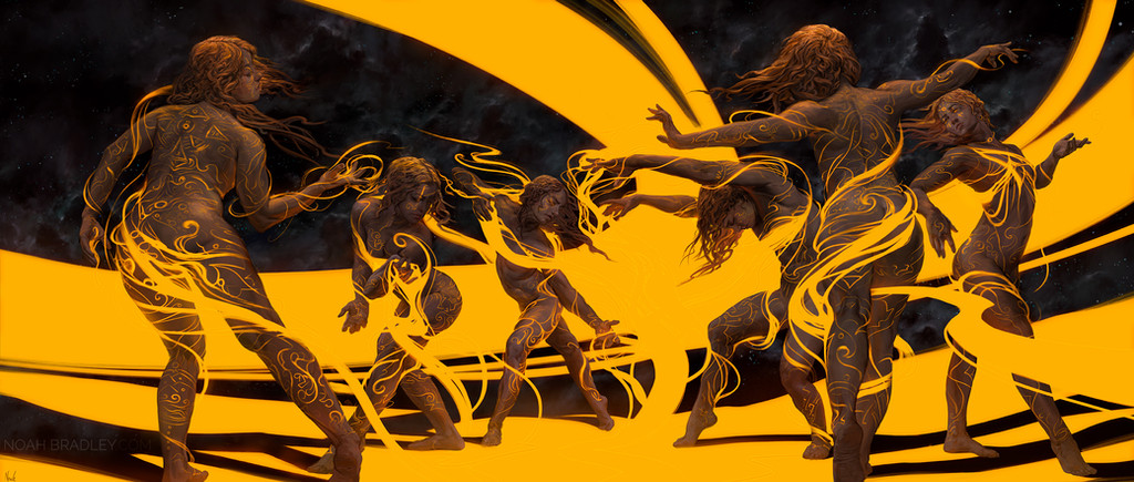
 noahbradley — Through Whatever Comes

Published: 2014-06-25 15:34:07 +0000 UTC; Views: 15254; Favourites: 370; Downloads: 383
Redirect to original
Description
thesinofman.comRelated content


Comments: 11

It looks like an illustration for the Bible you know  (Smile)")
👍: 0 ⏩: 0

My favourite part is the look on the female's face. It's very Renaissance in the way she's looking up, very angelic like, which reminds me of those old depictions of Mary. So there's a ton of symbolism right there already! Your background is insane as well!
👍: 0 ⏩: 0


How uncanny that this shows up in my inbox at the same time as I´m listening to you and Chris Oatley talk about Illustration and Freelancing XD
I think what I love the most about this is the part where the feet are. I love how they fade because of the dust, they look so dynamic.
👍: 0 ⏩: 0


good stuff Noah, I like what you did here.
like some already mentioned the legs for the male are too short and in my opinion the females angle is too expressive, you went for the feminine walk but her head is tilted too much to the side, tilting her head to the right instead of left would work better composition wise as they would both lean towards the center which would signify more of the unity they both have and it would lead the eye eventually to the beam of light behind them.
keep it up mate.
👍: 0 ⏩: 0

Alright, allow me to rephrase since you sought to hide my criticism instead of respond to it. You might want to take another look at the proportions of the torsos compared to the legs. The legs look very short on the male figure, almost cartoonish and it really hampers the effect of the overall piece. I like that you are trying new things, figures and creatures seem to be a particular weak spot for you. A smaller nitpick is that the eyes are more stylized than the rest of the figures, causing them to standout in a negative way, especially compared the excellent rendering on the arm of the male. Perhaps more information beyond a link to your site would help the viewer understand your design choices.
👍: 0 ⏩: 0

Wonderful piece here, Noah. And it may be just me, but her right leg and how it connects with the hip looks a bit off. Otherwise everything is stunning! The colors are superb as always.
Thanks for sharing!
👍: 0 ⏩: 0

wow. i love their expressions and all that detail work. this is one of your best yet in my opinion.

👍: 0 ⏩: 0

Looks like they've been through a lot recently...
👍: 0 ⏩: 0

Very nice. The background is really cool. And those tattoos/runes on the man is very neat.
👍: 0 ⏩: 0