HOME | DD
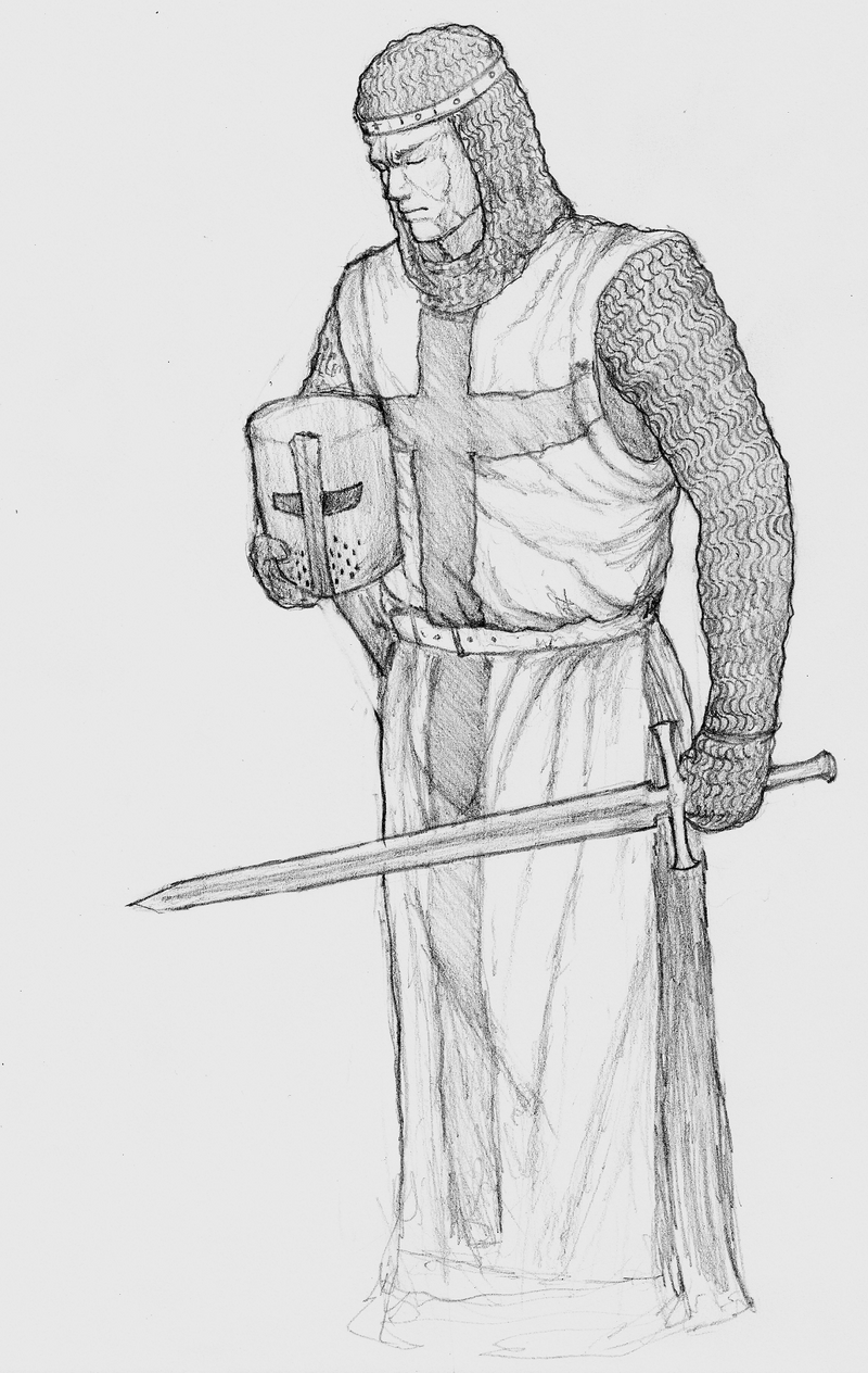
 NobodyX7 — Crusader

#crusade #crusader #knight #pencildrawing #knightarmor
Published: 2019-04-28 22:17:33 +0000 UTC; Views: 305; Favourites: 16; Downloads: 1
Redirect to original
Description
This is an old drawing I did for a friend a while back. Enjoy.Related content


Comments: 9

Hello! I’m here from with some constructive criticism.
First of all, I like how detailed this drawing is. You clearly put time and effort into creating the textured armor the crusader is wearing. There’s also a good balance between light and dark hues in the picture. I especially like the heavy shading on the back of the shield.
The anatomy and proportions look good as well. If anything, the head might be a little small, but it’s possible that it only looks that way because the helmet is covering the edges of the face. However, I do think the hands would look a lot better if you drew some clear distinction between the fingers.
I also think the presentation of this piece could be a lot better. The photo you uploaded looks grainy, which makes it difficult for me to zoom in to see the fine details. The background also looks really dark around the edges. I’m not sure whether you used a camera or scanner to take this picture, but if you have a smart phone I recommend the app CamScanner. It has a lot of helpful filters that allow you to whiten the paper and darken pencil lines if you want to for better contrast.
I also think it looks a little strange that the image suddenly cuts off at the knees. If you don’t want to draw the rest of the legs and the feet, I suggest cropping the picture so that there’s no white border visible underneath the edge of the drawing.
Furthermore, the gray shading looks smudgy in some places, which gives the drawing an unpolished look. I’m guessing you used your finger to blend the pencil lines together. While I know that smudging pencil with your finger is the easiest way to do soft shading, you might get a cleaner look if you tried a different shading technique. Like an earlier commenter suggested, I think cross-hatching would work nicely for this particular drawing, since the crossed lines can emulate the texture of fabric.
Overall, I think you did a great job with this piece. All the issues I pointed out are relatively small, and I don’t think they’ll be difficult to address in future drawings. Keep up the excellent work!
👍: 1 ⏩: 0

From
You've done a pretty good job with the look of the crusader. You've used the more historically accurate depiction of the warrior, and you'e got the whole look down. When you look at it, crusader would definitely be the first thing that would come to mind. You've got the details and some shading that really helps add dimension to the look. This can especially be seen around the waist, where the shadows go around the belt.
Obviously not perfect, but you do have talent. Things that would need to be improved upon are pretty basic and can be fixed with a lot of practice. What I would suggest is perhaps trying looking up different methods of shading, particularly hatching. It may assist with adding more to your work.
Overall, this is still a good piece.
👍: 1 ⏩: 0

Thanks, that means a lot. If you have any ideas for future projects feel free to share them.
👍: 0 ⏩: 2

Don't really know.
Your doing fine the way you are.
👍: 1 ⏩: 0


I'd be disappointed if you didn't
👍: 0 ⏩: 0