HOME | DD
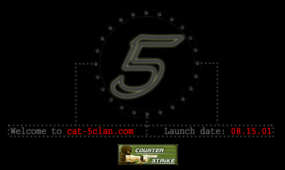
 nomadic — Cat-5clan-Splash
Published: 2001-08-09 07:41:44 +0000 UTC; Views: 321; Favourites: 1; Downloads: 39
Redirect to original
Description
I made this for a website that i am currently in the design proccess for ( [link] Going for a minimalistic look yet still getting the point across somehow. I have positive feedback on this so far and was curious what my fellow deviants thought. Comments are indeed welcome.Related content


Comments: 5

Very dark and you choose red which is a good contrast. Your choice of over all design is good but maby you need some more detail. Too show what your site has to offer. Good work!
::Till all are one::
👍: 0 ⏩: 0

looks pretty cool, the color is a bit off, maybe a brighter green, but the design idea is great, nice work
.:im just another mindless drone:.
👍: 0 ⏩: 0

Nice touch with the dots around the "5" and the like - interesting, I never cared much for CS, but perhaps that will change when I get my 2Mbps fixed wireless connection
-----------------
fuck at&t
fuck sprint
fuck ameritech
i know who my new isp is :}
[excuse my colourful language ]
👍: 0 ⏩: 0

Simple.
But still nice. And fits together well.
👍: 0 ⏩: 0
