HOME | DD
 nomadic — Confusion preflyer v2
Published: 2001-06-25 02:45:37 +0000 UTC; Views: 458; Favourites: 8; Downloads: 49
Redirect to original
Description
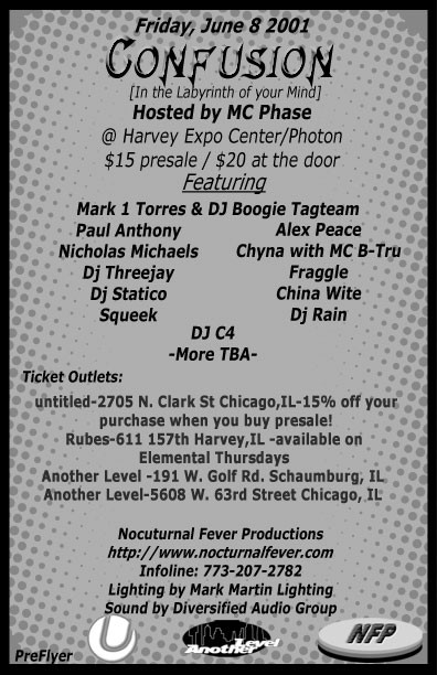
This is the preflyer for a rave called[Confusion] In The Labyrinth Of Your Mind
I was give two guidlines , keep it greyscale and keep it as simple as possibile while still keeping it stylish. The few people that ive shown it to in the 'design community' liked it. Im curious to see what my fellow deviants think.
Related content


Comments: 5


id say give it a thinner border. keep it monochrome, but print it on a coloured, glossy paper. that should work.
👍: 0 ⏩: 0

Very nice. I like the monochromatic sense to it all. Keeps it relativly simple and doesn't distract your eyes to much. It's not to chaotic, but there is definetly a lot of writing there. People might get bored with it. The varying font sizes and blodness is something that gives it a bit of diveristy. I'm just thinking that if you are able to mass print in colour, that i may help bring some more attention to parts, without making it crazy. Overall, it's a very nice design. Good work.
Mathias
http://www.brazengraphics.com BrazenGraphics.com
👍: 0 ⏩: 0

It looks too conventional to me because of the dots and the font selection. The border is too strong to be stylish. I suggest you use a flowing font for the title and thinner fonts for the body text. It could still be simple yet elegant; therefore giving it a really stylish look.
Keep it up!
👍: 0 ⏩: 0

Well the "techno dots" certainly do make it seem somewhat stylish....it has a message to convey and does so in a straightforward manner.
Very effective as a flyer.
👍: 0 ⏩: 0