HOME | DD
 novispoon — Diablo II Battle-net
Published: 2001-06-28 16:47:51 +0000 UTC; Views: 880; Favourites: 3; Downloads: 159
Redirect to original
Description
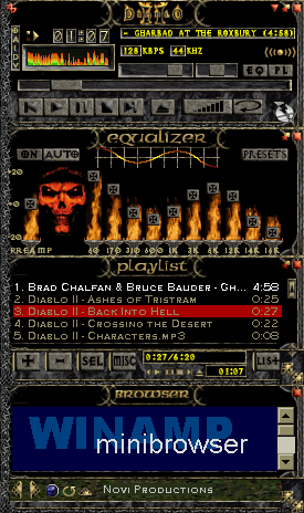
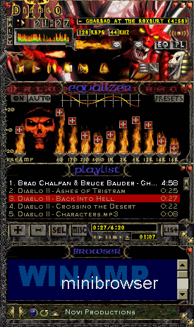
Considering the inundation of derision poured over my previous D II skin, I thought I'd see what it'd look like if I removed the main pic, the blue text, and made almost all windows and buttons look like those in the PL (which is the BattleNet interface). Cohesive and less chaotic, but boring, IMHO.The blue text came from the Battle.net interface, BTW, and I decided that the pic in the EQ had to stay so there'd be something obviously Evil left in the skin.
Diablo II is published by Blizzard Entertainment [link] and much of the imagery is taken directly from the game or from Blizzard's web site.
Related content


Comments: 10

")

Definitely catches the feel of the DII interface. Sweet.
-----
Pookas Does Not Play Well With Others
👍: 0 ⏩: 0

Now this is what im talking about the regular style winamp.
Lots of diablo feeling with this skin, when you got this skin you will never escape hell or something.
the
will bite your toe whahahahahah
👍: 0 ⏩: 0

Me too a diablo fan, ever sinde the first one came out! I'm adding this skin to my collection.
::Till all are one::
👍: 0 ⏩: 0

it's... unbusy.. haha
Sincerely,
Another Pathetic Online Personality
👍: 0 ⏩: 0


nicer, but still not great. Passable tho.
Jstigma
Happiness
-We're all in it together
Http://I.am/jstigma
👍: 0 ⏩: 0

Not bad, keep it up.
--------------
Where the cows goes m00!
👍: 0 ⏩: 0

it looks mutch better now... but I think u should remove the beavél on the main buttons... and only have one color on the graph thing... and also change the close,min hide buttons,,, they don´t match so good... but that just what I think... nice work
::[Jag är Miljöskadad]:: http://www.miljoskdadgfx.f2s.com ::
👍: 0 ⏩: 0