HOME | DD
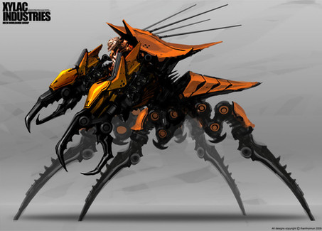
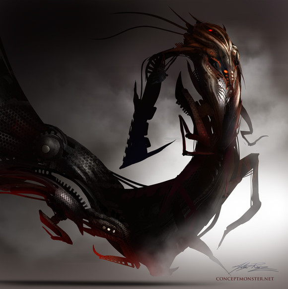
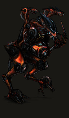
 NuMioH — Space_Bug Red

Published: 2008-05-19 11:58:32 +0000 UTC; Views: 9665; Favourites: 235; Downloads: 334
Redirect to original
Description
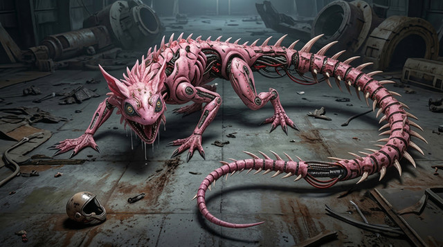
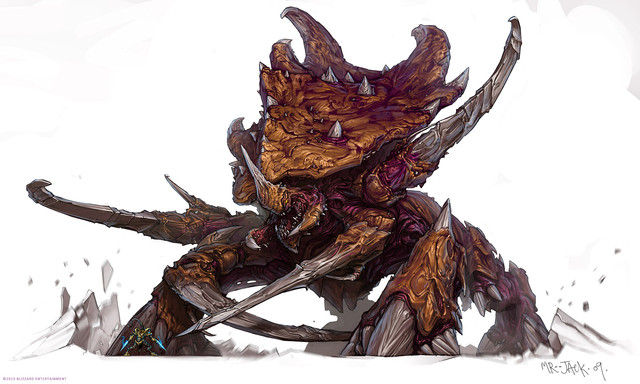
Umm..a quickie.. -__- something's not right bout this piece.. hmm..Related content
Comments: 18

I don't know if you are familiar with the Galaxy Rangers show, but it reminds me of the space cockraoch that Mr. Subtract affectionately named "Crumb".
👍: 0 ⏩: 0

excellent work my friend, muy bien.
were you inspired by the arachnids from starship troopers?
👍: 0 ⏩: 0

You've got pretty good feedbacks there
On design though, i think to make it look more 'cool' and menacing, you can try make the head smaller.. also the 'torso' area does look like a torso, like a rib cage. Intended that?
Either way, whatever the case, i still think it's a great work. Nice going NUMIOH SAN XD
👍: 0 ⏩: 0

The thing that might be "wrong" about this piece is that its either got one leg missing, or is meant to be accidentally asymmetrical in limb configuration, or it lost a leg during a fight or something.
👍: 0 ⏩: 0

It has a Metroid feel in my opinion. Like when you win galleries playing the game and unlock concept art, thats what it reminds me of...
I picture this bug as more of a monster scale, with people being about as tall as a foot spike.
It was mentioned already but I too spot your familiar design elements showing such as the legs and feet, you really are developing your own unique (and recognizable) style the more and more you do things.
The balance issue was mentioned too, but I don't think it ruins the piece at all, personally I think it looks like hes been threatened and raised his arms in defense much like when you poke a sand crab and he acquires that funny posture. I wouldn't redo the piece because of it at all, I think it just looks like we caught the bug in action.
Its interesting how you switch between mecha, aliens in armor, flying vehicles and monsters, they seemingly are all in their own developed worlds or story ideas, I wonder often how much of what you do is from the same conceptual universe or if you do one off creations that have nothing to do with each other.
👍: 0 ⏩: 0

maybe its the back feet, the front feet dont have spikes on them but the back ones do either way though bud this is awesome ^^
👍: 0 ⏩: 0

LOL looks everyone pointed out where it need to be fix already. XD
👍: 0 ⏩: 0

Looks like he's supposed to moving but the posture's wrong... Or maybe the other way around.... uh on, i confused myself...
Anyways, i do like the orange body and green bulbous bits although some of the upper ones look like they're concave instead of convex.
👍: 0 ⏩: 0

pretty nice, but is the five legs done on purpose. it just seems weird, but i guess it is an alien and aliens are weird.
👍: 0 ⏩: 0

damn that is awsome. I love any kind of insect concepts. So very cool
👍: 0 ⏩: 0

It was mentioned, but I believe he is too off balance. Unless he is attacking, which from the pose I deduce it could be possible.
However, yes, the center of gravity falls vertically about where the uppermost spike on his front left leg is, which means he is falling forward ever so slowly...
You can correct this by mirroring the position on the front left leg, so the angle is opposite to it's current position and supporting his weight, this would shift the center of gravity backwards enough that he would support himself without any effort.
The design is really good though. I like the creature. I can still see your trademark leg design in your organic and mech pieces. That's not a criticism. It's a good design. I've gotten used to seeing that design enough now that I could probably look at a piece and, if it didn't have your unique line art to help define it, I could probably pick you out as the artist just from the legs.
That's a good thing!
Nice work!
👍: 0 ⏩: 0

haha robo zergling XD
i think the problem is that you can see 3 legs on his left side but there appears be only 2 on his right did you intend this?
👍: 0 ⏩: 0

Reminds me of the big bugs in Starship Troopers. Also if you took the legs off it would look like a seahorse
Good design though, I can't see anything that might be fundamentally wrong with it.
👍: 0 ⏩: 0

actually, I think it's that he's leaning forward with both front feet at once, and that is kind of unbalanced.
👍: 0 ⏩: 0

is it that the mandibles look like a squarish nose?
no?
guess it's just me, then....
👍: 0 ⏩: 0

