HOME | DD
 nyctopterus —
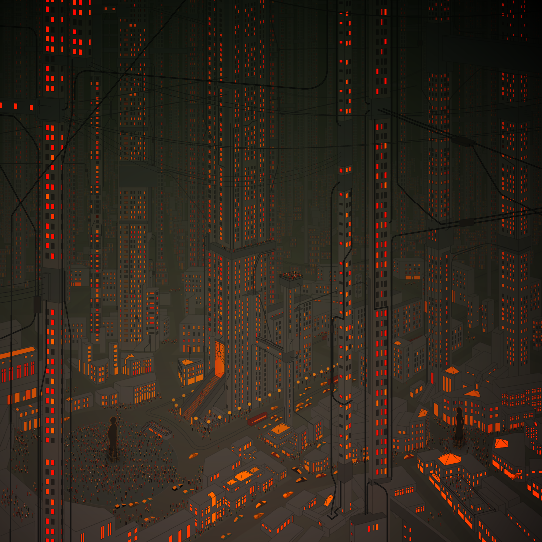
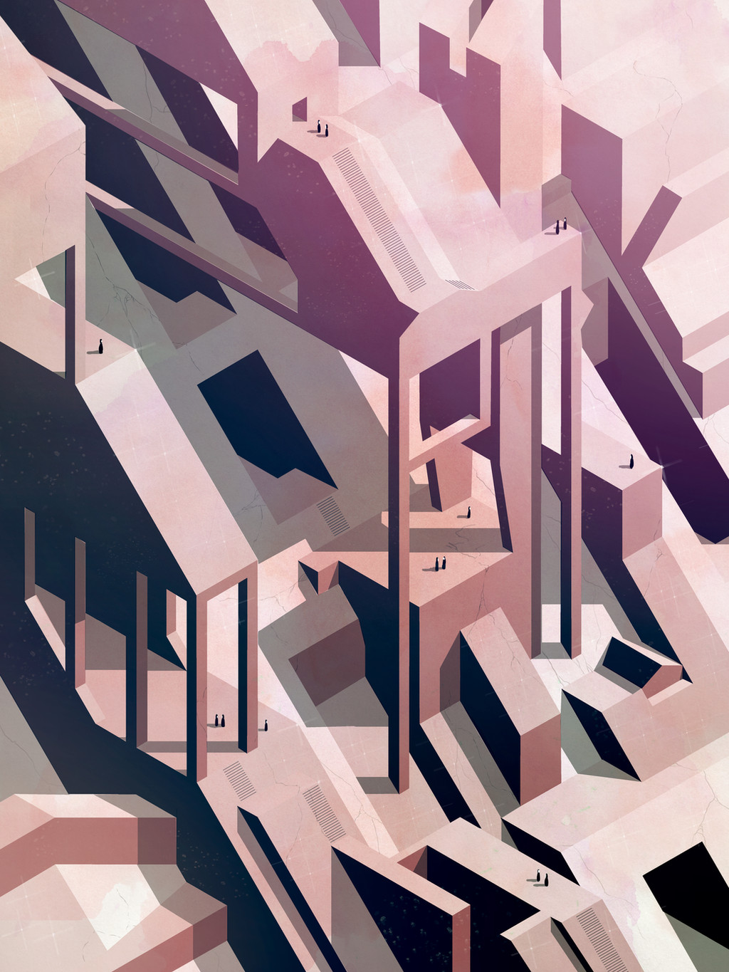
Metametropolis
by-nc-nd
nyctopterus —
Metametropolis
by-nc-nd
Published: 2010-05-02 23:23:02 +0000 UTC; Views: 20980; Favourites: 1099; Downloads: 650
Redirect to original
Description
Their city just kept getting bigger and bigger—and there was only one solution: bigger people.--
Illustrator CS 4
Related content


Comments: 75

It's an awful lot of vector shapes that is for sure, but can't really compare to the work in something like "paper planes" can it?
I agree with ~zedka your artwork descriptions are often works of art in themselves.
I am not sure I really get this image. I like the top half, but isometric feel of the bottom half leaves me feeling a bit blank.
👍: 0 ⏩: 1

There is no perspective in Paper Planes, so the bricks and windows were more easily copied--this required lot of actual drawing, and muck less copying. Perspective is hard! Also, Paper Planes only required a few layers, because the drawing is mostly on one facade, this required dozens of layers to get the overlapping right.
The style was about being a bit retro-computer-gamey pixel-artish, so the isometric bottom half is the point!
👍: 0 ⏩: 1
I am surprised there is no transform/scaling you can do on a completed layer to add the perspective after drawing in plan view.
I get the retro computer gaming thing. If only sim city looked that good.
 (Smile)")
👍: 0 ⏩: 1
Illustrator CS5 has some interesting looking features like that, but CS4s perspective and distort tools are more of a pain than they're worth generally.
👍: 0 ⏩: 0


The image is really great of course, but the description adds a very interesting meaning. Images that make you think are getting rare !
👍: 0 ⏩: 0


whoa. love it...
interesting vision of a city, different from eboy's. a more muted take on a cityscape.
👍: 0 ⏩: 1
i think they're a group of artists
[link]
👍: 0 ⏩: 0


amazing, the depth to it is just so subtle. great choice using a really limited colour scheme too
👍: 0 ⏩: 0


Mmm. That's a lot of windows.
Oranges-on-grey are a nice palette, too.
👍: 0 ⏩: 1
Yeah it took a while... three years in fact!
👍: 0 ⏩: 2

But the finished product is worth it!
👍: 0 ⏩: 0
Heh. I've got a few pieces hanging around unfinished that way myself!
👍: 0 ⏩: 0


Holy S@&T balls that's a whole lot of vector shapes!! Good piece, I like it a lot.
👍: 0 ⏩: 0

The perspective is really stunning, and the softly glowing colors are so beautiful.
👍: 0 ⏩: 0

