HOME | DD
 Nytlin — The Elder Tree

Published: 2011-11-10 07:13:26 +0000 UTC; Views: 541; Favourites: 16; Downloads: 2
Redirect to original
Description
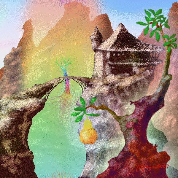
So, i started this piece, with nothing in mind but i wanted a massive tree. i feel i accomplished that. Also i really tried to stay in more of a bright vibrant color spectrum... my normal tends be to darker, or muted tones. so im rather proud of that aspect.Also, the creature was one i created a while and stayed as a sketch ... never figured out the best setting for her until now! ^_^
I learned to import some textures, though... its still hard for me to except using them. i feel like im cheating while doing art. So i played with the textures after loading them anyways lol. o well. maybe one day i wont mess with them and let they be a little bit more.
Also special thanks to my chicky, DinkyTiny, for giving me some insight on finishing this piece! you rock chicky!
comments and critiques are more then welcome! id love some feed back!
Related content


Comments: 2

Hello! I'm popping in from #SeriousArtists for some critique!
(And am rewriting a critique I was just writing because I accidentally pressed the 'back' button in the wrong tab. Woe! o_O)
I love sunset images! The tree definitely looks huge, especially with those tall blue pillar-like rocks and the characters scattered around beneath it, giving us some sense of scale and such! So hooray!
I think that, in the sky, the transition between orange and purple is a bit sudden...! Here's a photo of a similarly-coloured sunset: [link] There's a lot of pink happening between the orange and purple, which creates a smoother colour transition. Orange and purple get a bit 'muddy' when they combine, so you end up with a sort of less-vibrant band of colour between them, but the two colours both blend nicely with pink, creating a smooth bridge between them! It is good that you've kept a consistently warm colour scheme and the environment is all highlighted by the yellow of the sunset! Those tall blue rocks could probably use some yellowy/orangey highlights as well though, since everything else is getting bathed in yellow light...! I don't know if I can back this up with much logic or physics, but I might add sort of a gradient of shadow to the mountains on either side of the image, so they get darker closer to the bottom. I just sort of imagine them receding into maybe some sort of valley area where they might not receive as much light. You could add some atmospheric depth by having those mountains on the right get gradually closer to the colour of the sky the further away they get!
The sun seems like it would be pretty much directly behind the tree, so you could create a bit of a fun effect by getting out a soft brush and adding some subtle glowy spots in places like the gaps between the leaves on the right near the bottom of the leafy section of the tree, and in little nooks and crannies like where the leaves and trunk are at an angle to eachother and stuff. Sort of like this: [link] though maybe not quite as intense...! Those areas would get some extra highlights around them as well due to the light shining through. C:
I love those vines hanging from the tree, by the way, and how there's this sort of grassy, cliffy walkway leading to the tree itself! And the shadowy gaps between clumps of leafy areas!
👍: 0 ⏩: 0

While you are very much out of my skill set, especially when it comes to environments, I will try to give you some critique!
One thing that is throwing me off is the edges of the blue... rocks? There are some bits of dark black that really seem of of place. Also, I was positive they were supposed to be rocks, scrolled down to write some critique, and realized the bottom half (since I am in full view, and therefore cannot see the tops down here) look very much like tree trunks, haha. I am not sure if that is intentional, but now I have no idea if they are supposed to be barren or rocks! And also, on the bottom right of the piece, some of the grass seems to be disconnected from the ground and growing of the the... rock tree. lol
Also, the vines hanging from the tree don't seem to mesh as well with the leaves... they don't have as much depth to me, and I think its because the light/colors don't have 'wrap' around them like the leaves seem to have.
Lastly, the grass in the front most, middle seems to be effected by the massive tree... but the satyr (?) woman is not!
I love the textures you used. The grass and leaves seem especially organic!
👍: 0 ⏩: 0