HOME | DD
 o7addict — COMICSANS MS

Published: 2008-03-31 07:14:45 +0000 UTC; Views: 4806; Favourites: 55; Downloads: 136
Redirect to original
Description
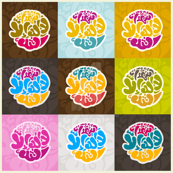
COMIC SANS MS LOOKS GOOD, rite?[link]
fight to the bitter end
Related content


Comments: 66


")
 (Smile)")


ngga daku sering ngaji kok cha.
👍: 0 ⏩: 0

hauhaua.. mana alternative nya? kereen chi!
👍: 0 ⏩: 1
ga ah biarin elo aja yg kliatan serakah
👍: 0 ⏩: 1
beso2 kalo ada deadline kalo bisa langsung jadi sehari. seru kyknya.. haha
👍: 0 ⏩: 1
ga tanggung klo ada yg meninggal hina..
👍: 0 ⏩: 0


Ha! This makes me very happy. I'm going to have to pass this one on to my friends, since this is one of the fonts that we feel is overused to the point of silliness.
The only font that makes me giggle and cringe more is Papyrus, which is apparently suitable when you want to be distinctly anything. Now, think about the phrase "distinctly anything" for a second. Heh.
Anyway, I'm glad I saw this in the "Recent Deviations." Put a smile on my face, and it actually does look very nice, too.
👍: 0 ⏩: 1
im sure i laugh when remember my printed exams ages ago, which is sans always exist on my elementary - jr high school paper cover. but still no reason for me rite now to hate or make it look nasty like many ppl do. how poor them..
thanks so much for ur opinion mate
👍: 0 ⏩: 0
<= Prev |