HOME | DD

oguzhanaydin — oa comm v2

Published: 2004-10-25 11:15:41 +0000 UTC; Views: 6750; Favourites: 49; Downloads: 2284
Redirect to original
Description yapipda acmadigim
Related content
Comments: 18

ma3 [2009-11-18 09:36:29 +0000 UTC]

good work on typography!

👍: 0 ⏩: 0

rickysals [2007-01-03 23:30:31 +0000 UTC]

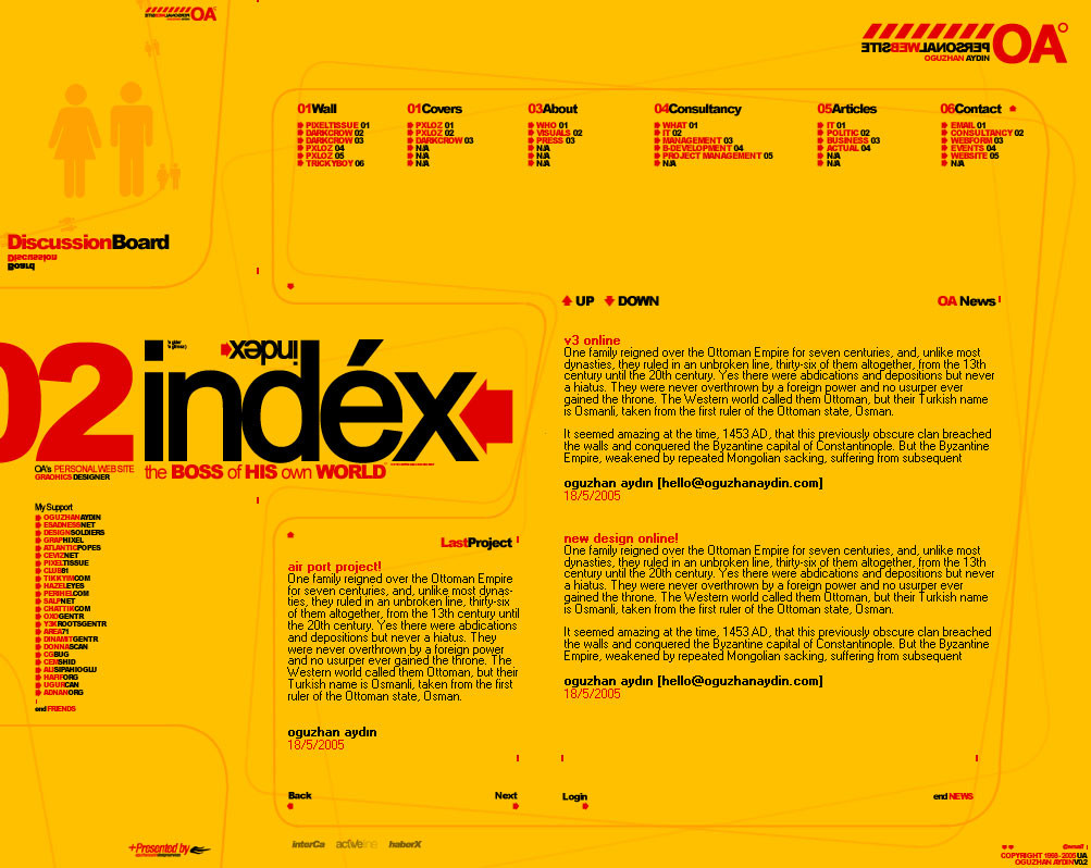
it's very swiss, but on a vibrant yellow.

nice twist.

i like it!

👍: 0 ⏩: 0

m-a-l-c-o-l-m [2006-03-14 23:30:22 +0000 UTC]

MasaAllah, cok guzel olmus. tebrikler.

👍: 0 ⏩: 0

it-i-laf [2005-12-19 19:44:45 +0000 UTC]

olmus bu hocam...

👍: 0 ⏩: 0

poomtang [2005-11-03 11:24:01 +0000 UTC]

Loving the style man, kinda like organised chaos!

👍: 0 ⏩: 0

Suburbanite [2005-10-23 20:24:01 +0000 UTC]

I like it, bold attempt, I wish those colors were used in a newer way though, its just... a kodak moment.

👍: 0 ⏩: 0

gaga25 [2005-05-22 21:54:25 +0000 UTC]

COOOOOOOOOOOOOOOOOOOOl

👍: 0 ⏩: 0

anathel [2005-02-20 05:34:04 +0000 UTC]

Forgot to add a comment. Wicked style xD

👍: 0 ⏩: 0

highone [2004-11-08 12:05:03 +0000 UTC]

tebrikler cok iyi is, larim ama !

👍: 0 ⏩: 0

webPHIX [2004-11-02 07:40:59 +0000 UTC]

this design kicks my ass.

the font used for the body copy doesn't seem to fit, it really takes away from the overall look.

👍: 0 ⏩: 0

hooliganism [2004-11-02 06:57:24 +0000 UTC]

very strong, very eye-catching.
excellent work my friend..

👍: 0 ⏩: 0

mOB-iuS [2004-11-01 19:10:57 +0000 UTC]

+fav

👍: 0 ⏩: 0

starjfil [2004-11-01 11:06:26 +0000 UTC]

impressive layout design and i love the idea how you come out with, it reminds me of yellow pages .

👍: 0 ⏩: 0

DonErnesto [2004-10-27 00:05:54 +0000 UTC]

mmmm TheDesignersRepublic.com inspiration?

👍: 0 ⏩: 0

arc4njo [2004-10-25 19:14:01 +0000 UTC]

that's simply amazing! *+fav* COngrats ;D

👍: 0 ⏩: 0

FataL- [2004-10-25 15:58:34 +0000 UTC]

unique and impressive design, good job!

👍: 0 ⏩: 0

diamondie [2004-10-25 13:54:48 +0000 UTC]

Interesting layout, looks rather original. I like the "childish" colors and the amount of empty space. I think some of the texts are simply too small, they might be hard to read for many people and I consider them too small for me. If I had to use this site, I'd utilize the Zoom feature of Opera, which would make the graphics look ugly.

👍: 0 ⏩: 0

rasice [2004-10-25 11:27:38 +0000 UTC]

stunning design.

👍: 0 ⏩: 0