HOME | DD
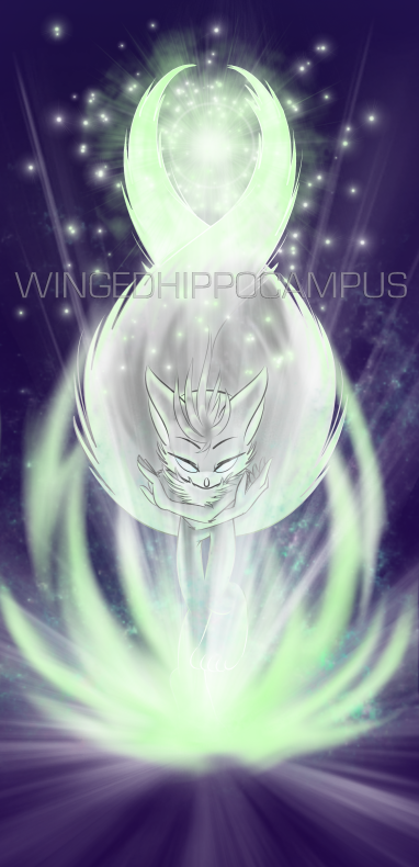
 Omnicenos — Tails: Foxfire

Published: 2008-11-17 18:37:04 +0000 UTC; Views: 7074; Favourites: 238; Downloads: 80
Redirect to original
Description
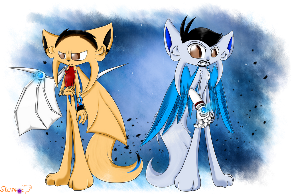
The illustration for this chapter of my fanfiction. [link]Azami demonstrating some foxfire for Tails.
I loathe the blank space above Tails's head, but I couldn't do anything about it. I also wish Azami's ears hadn't run off the page. He looks funny.
Monochromatic compositions are a lot harder than they look. ._.
Tails (C) Other people, art and Azami the Kitsune are (C)WingedHippocampus, do not alter or distribute.
Related content


Comments: 130

Life has been very strange and has pulled me in new directions. I am again finding the parts of my old life that mattered though.... and hope to be here a bit more.
take care!
👍: 0 ⏩: 0

Ooh, gorgeous!
The blackness doesn't look bad! And Tails' awed expression in the blue light was really well done.
👍: 0 ⏩: 1

Don't worry about it, the blank space gives a sense of void, like an anime scene, or even within Tails mind, and the missing ear is almost unnoticeable due to your exceptional use of Color, which I am guessing is blue to symbolize an astral tint or something to that effect.
👍: 0 ⏩: 1

Foxfire is usually portrayed as blue because of its supernatural qualities.
👍: 0 ⏩: 1
Or green in some aspects, but its always in that side of the spectrum.
👍: 0 ⏩: 0

I dunno, I like how the blankness kinda fades into the more complicated areas with Azami's hand and claws and so forth. The fireball looks good too.
👍: 0 ⏩: 1
Azami's name makes sense now, eh? He he.
👍: 0 ⏩: 1

...Well to be honest i don't know to much japanese... >.> so i don't know >.<
👍: 0 ⏩: 0

Indeed they ARE hard, which makes your success here all the more astounding. The composition is really good, too; I like how much smaller Tails feels in comparison to Azami. Plus, another detail you'll only really notice in full-view and which was probably unintentional but nevertheless friggin' awesome is the way the black background subtly swirls around like waves of sand. Good stuff, good stuff.

👍: 0 ⏩: 1
Unintentional, and I messed with my scanner a lot trying to get them to go away. T_T But...you actually LIKE my marker lines. x.x thanks. As for size disparity, well, Azami and the other kitsune are a little on the tall side compared to most other Mobians, and Tails is a kid, too...so...double whammied. XD
👍: 0 ⏩: 1
But...I thought the whole idea of the story is that Tails WAS a kitsune, or at least that's the impression I got from the title. Hmmmmmmmm...did you just spoil the plot? XD
And I think the marker lines work in implying the glow of the fire outside of the two people it reflects on. Plus, they just look real cool. :3
👍: 0 ⏩: 1
You'll just have to wait and see.
")
👍: 0 ⏩: 1

Oo, very nice. The colors you chose really add a level of depth to it. I should read that.
👍: 0 ⏩: 1


Uwaa, very pretty!
But next time, why don't you play a little with the levels on Photoshop so you can get rid of unevenness in the black area? It's very easy and wouldn't change anything else about your piece. Just a tip!

👍: 0 ⏩: 1
I don't know how to use Photoshop. ~_~ I's dumb.
👍: 0 ⏩: 1
Hey, you're not dumb --it took me long enough to learn. Years! And anyway, it doesn't look bad. It's just what I would do in that situation.
If I remember correctly, I think you go to Image>> Adjustments>> Levels... and then play around with them. An easier alternative (though it sometimes doesn't look quite right) is to go to Image>> Adjustments>> Auto Levels. This way you don't need to modify anything else. But sometimes it works right for the colors in your image, sometimes it doesn't.

👍: 0 ⏩: 1
._. I's ascared of that program. But I'll one day get a computer fast enough to run it, a tablet, and I'll take classes on how to use it, promise.
👍: 0 ⏩: 1
I never took classes. As I said, I struggled for years. I don't usually use my tablet either.
Even my cheap, slow, first computer that I got as a birthday present ten years ago could run Photoshop, so yours can't be that bad. If it's because you don't want to use a pirated copy, there's always open source software like Gimp [link] (I've yet to try it, but I've heard it's almost as good.)
In any case, you should work with the tools you like best.  (Smile)")
👍: 0 ⏩: 1
Yes! I like traditional coloring, but I'd love to learn to do special effects in Photoshop. I think it'd really make my work pop. Thanks! ^ ^
👍: 0 ⏩: 0

<= Prev |