HOME | DD
 panuru — Xplicit Content 2.0
Published: 2006-07-04 16:03:05 +0000 UTC; Views: 1031; Favourites: 18; Downloads: 65
Redirect to original
Description
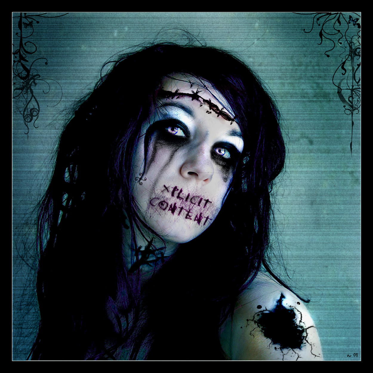
I hated having to delete the original, only because its the one piece I've gotten so much feedback on. But.. it had to be done. Made it bigger, actually didn't lose any quality either, added the borders, touched up some colors. Also, ~sckamb has granted me permission to submit this as a print.")
stock:
Related content


Comments: 25


This one really caught my eye! Very dramatical, love the missing mouth and the words, really sums up the mood. And I absolutely adore what you have done to the eyes!
👍: 0 ⏩: 0

Those eyes are fantastic! really cool work. The missing mouth effect comes accross really well too. The crown of thorns effect looks cool, although the Christ imagery can have an awful lot of different meanings for different people.
👍: 0 ⏩: 0

The color in the eyes is a bit too bright, little bit too neon, and along the left side of her face and above the eyes as well, perhaps dodged a bit too much, but it stands out too oddly against the rest of the picture.
But otherwise great makeup coloring and brush usage. And the composition is good, nice work.
👍: 0 ⏩: 0


Nice work on the safety pins or whatever in the head and all the work on the face. I really like the depth of the eyes.
👍: 0 ⏩: 0


Very nice. i love the textures and the colors. i also love the swirls in the corner. Great manip!
👍: 0 ⏩: 0

I like it is good!!! Only some sharpened areas could be less sharp, for example in the eyes. I'm not shure I understand what you want to say with xplict content instead of her mouth.
👍: 0 ⏩: 0

Although a bit macabre, I like the idea behind it, also liking the whole feeling I get from this piece, the face is great.
👍: 0 ⏩: 0

Arch! Zombie... creature. This is a pretty cool manip.
👍: 0 ⏩: 0

I love your artwork it reminds me of one person on my friends list. heres a link to her page i think you two will get along pretty well [link]
👍: 0 ⏩: 0


Some of the lines by her face really remind me of a bulldog. You might want to change that. Otherwise its pretty good. I really like the hole in her arm, theres a few points wwhere its blended in quite well, but others it just looks like a temp tattoo. Just things you should work on.
👍: 0 ⏩: 0


i find this hilarious 

👍: 0 ⏩: 0

Brilliantly executed, nothing seems out of place. Love the mood & the colors. Excellent work here!
👍: 0 ⏩: 0


i can't get over this, wow!!
👍: 0 ⏩: 0


Nice nice. I like it. Got the message of "explicit Content" across... and the emotion fits the mood. Nice
 (Smile)")
👍: 0 ⏩: 0

very cool
Its so macabre keep up the good work.
👍: 0 ⏩: 0

Reminds me of a song i wrote called "Gimpy". You should check it out.
Nice work although I would kind of suggest something to make it look more natural. Maybe blurring?
👍: 0 ⏩: 0

You know you didn't have to delete the picture, you can click edit deviationg then click on what you want to edit, the image, and upload a new updated one.
Awesome work btw.

👍: 0 ⏩: 0
