HOME | DD
 parash — - Midblue -

Published: 2002-09-07 20:56:09 +0000 UTC; Views: 467; Favourites: 0; Downloads: 26
Redirect to original
Description
thanks to all the tutorials here at DA that helped me create this wallAny suggessions'd be appreciated
Related content
Comments: 13

i love the colors, nice werk. i like the textured look of it as well.
👍: 0 ⏩: 0

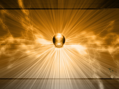
Love the combination of colors and the way they fade. It looks like sun beams shooting through some flourite. Brilliantly done. Really sparks the imagination.
👍: 0 ⏩: 0

very nice dude... the abstractness is overwhelming... and the added dark quality of the pic is actually riveting... very nice piece...
👍: 0 ⏩: 0

whoa! great wallpaper! i especially like 3d shapes and colors! they are sooo neat! i also like the pattern! the only think i don't like is the dimmensions! man, who now use 800X600??? heh... if only it was 1024X768 i would use it as my desktop! keep up good work tho!
👍: 0 ⏩: 0

ooh, I love it- the colours are great- and even though this is kind of like those other trendwhore pieces, I think it's unique.
I would recommend it in a larger resolution though. 800x600 isn't big enough.
👍: 0 ⏩: 0

Very sweet WP man, I love the glass look of it. Tutorials are definitely the way to go for sure. I like the dark feel to it as well, though the pinkish tones on the left hand side distract from the pic I think. Also anything smaller than 1280 x 1024 you will ALWAYS hear "Make a bigger one" guaranteed. I guess some people have monitors big enough to use that resolution out there (sure as heck not me though!)
Thanks for your comment on my latest Terragen - Wish Upon A Starless Night. The support is really appreciated. It has turned out to be my most popular yet with 60 comments!! Just wanting to pay back the favor with a comment or two. I usually give more than one but with that many people to repay I am doing good to find the time to go 1 for 1. Thanks again, and watch for the revision as soon as I get my hard drive fixed!
👍: 0 ⏩: 0

A bit dark, but the colours are well chosen. The transparancy is well designed and I love this glass house effect. A bit more light and a higher res and it would be great.
👍: 0 ⏩: 0

I think it need to fo biger too , but still good colors, and textures
👍: 0 ⏩: 0

Bigger would definately be better.
Other than that, it looks like a great start! Keep it up.
👍: 0 ⏩: 0

completely agree to equus123 !
delete the box texture! and make it bigger.
good job anyway
👍: 0 ⏩: 0

i like that dude. the colors are awesome. i would do 2 things though...make it bigger! and take out the box texture in the background. it degrades the quality a bit....makes the objects less clear/sharp. ya know? other than that, its very good. what tuts did u use? maybe add some shape/line layers over it (in like either multiply or overlay). great job buddy
~me
👍: 0 ⏩: 0

