HOME | DD
 parl-sky — test lab entropy number one
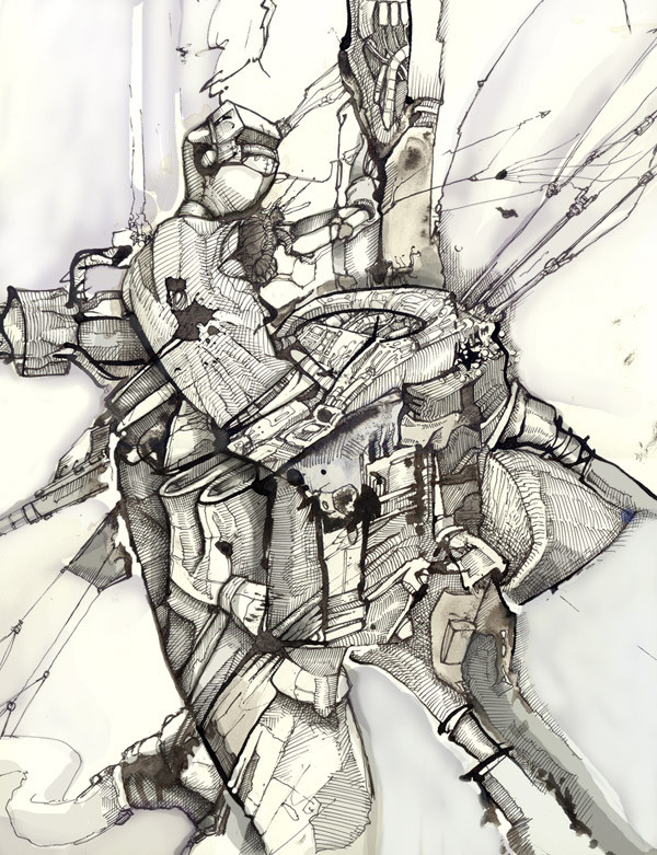
Published: 2002-05-07 01:04:07 +0000 UTC; Views: 3325; Favourites: 72; Downloads: 658
Redirect to original
Description
hrmmmbrush ink conte ps ect
ya, so im colorblind
what of it?
Related content


Comments: 45


oh! great use of creamy style with line! makes for very nice texture combos
👍: 0 ⏩: 0


Incredible work. It's so "flow" and thick. Love the color choices as well. Very earthy pastel ish.
It's definately a
Thanks for watching me as well, and introducing me to your art.


👍: 0 ⏩: 0


this is wonderful and reminds me of a stained-glass design i did many years ago
👍: 0 ⏩: 0

oh shit, forget that 3d abstract this is amazing.....the detail is out of control +fav
👍: 0 ⏩: 0


explosion.. mowing forward to chaos?! a lot to find and a lot to see in your picture, that makes it interactive and explorable!
👍: 0 ⏩: 0

coolness again, although i'm not that sure about the white rounded thing in the middle. it's seems a bit too detailed to match with the overal style of yer piece. anyways, great deviation
::vervain
|[.WE.LOVE.THE.ABUSE._.CAUSE.IT.MAKES.US.FEEL.LIKE.WE.ARE.NEEDED.]|
👍: 0 ⏩: 0

Looks like that guy has a really large control panel in his pants
Nice work!
Linus
👍: 0 ⏩: 0

Super neat! I like the shading style and all the little details.
👍: 0 ⏩: 0

i like it without color. just like that. its like those ink-blot tests; hmm i see a robot about to charge, with its right shoulder bent down and its head leaning forward...
👍: 0 ⏩: 0

Very good work!, you have developed an incredibly original plastic language in this piece. I think that there is a gold vein in this direction!
Keep doing the style! enjoy!
👍: 0 ⏩: 0


i dont even know where to begin looking... awesome job.
👍: 0 ⏩: 0

u ve got a nice style, very clean. liked this, even thou i dont understand but the abstractness is quite amazing.
👍: 0 ⏩: 0

yowch, makes my head spin!
i cant get it even if i tilt my head, but still (or therefore) it looks great.
-----
]narainsbrain[
Do not feed the cannibals.
👍: 0 ⏩: 0


freaking fantastic,
its like some sort of megorical explosion
more please
-----
...
[fiction] [link] [sectae] [link] [raster] [link]
glue fill head
👍: 0 ⏩: 0

great job
I like the details...
continue !!
-----
[link] Support :FlagEU: icon !! [link]
Fear the Froggie !!
👍: 0 ⏩: 0


what a chaotic twist.. mmm... it is quite interesting.... pulling & twisting...
so much detail... it must have taken ages!!
-----
./pwca
👍: 0 ⏩: 0

great! clean but full of details!
-----
[a]-[k]-[h]-[r]-[o]-[d]
my gallery: [link]
👍: 0 ⏩: 0

What is it??? It doesn't matter really, but this is about the most wonderful thing I have come across so far in this junk ridden freehand category of IndyArt. You do an excellent job! Great technique and artwork!
-----
___________
+ + + + +
👍: 0 ⏩: 0

i imagine this being very noisy and stinky, spewing out lots of disgusting waste products.
👍: 0 ⏩: 0

i dont know what the hell it is, but it looks good
-----
We cannot control when we die, only how we choose to face death.
👍: 0 ⏩: 0


Damn, that is like so mindboogling...it hurts...
Kudos
-----
..:: Hyper Psycho ::..
👍: 0 ⏩: 0

another fav
-----
save a tree... eat a beaver
kill you later
worst signature EVER
👍: 0 ⏩: 0


That is the extrememly sweet.
-----
Avalon Sector v5:: [link]
👍: 0 ⏩: 0

Wow. That's a lot of detail and work! Impressive!
-----
Help build up the dA stock photos section !!! Take a look at the stock photo challenge [link] !!!
👍: 0 ⏩: 0

very odd. I really like the style, reminds me of the manga "Battle Angel Alita." Your composition could be better, but the style is just so fresh. excellent stuff.
👍: 0 ⏩: 0

Equisite (?) detail, even if it doesn't make sense to meh.
-----
Kezabelle.
👍: 0 ⏩: 0

Cool Image. The ink work is great.
-----
My Stuff -> [link]
👍: 0 ⏩: 0


I don't know what it's supposed to be, but I'd bet it would make a sweet wallpaper
👍: 0 ⏩: 0


yowza
so much movement! that's real neat
the more I try to break it down the more complex it gets, it's kinda like a fun maze
👍: 0 ⏩: 0

Tha'ts sweet. Amazing detail.
-----
.caustic.
I hate numbers.
👍: 0 ⏩: 0

Wow, I see your style in this a lot. But it is somewhat different from your other work which is cool. so much going on in it, seems somewhat abstract. Cool.
-----
evol e
👍: 0 ⏩: 0