HOME | DD
 peacemaker — Skylined
Published: 2002-01-12 03:05:35 +0000 UTC; Views: 1257; Favourites: 5; Downloads: 420
Redirect to original
Description
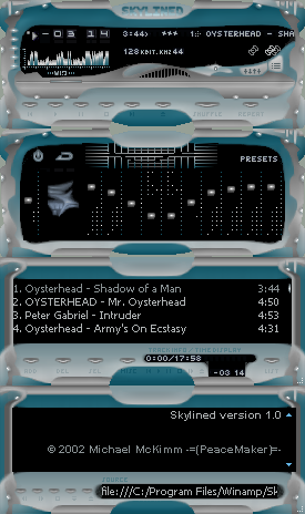
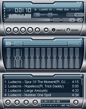
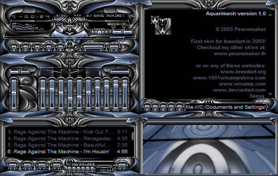
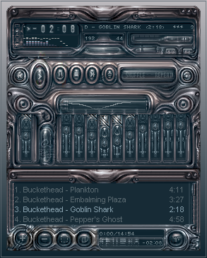
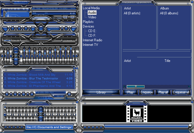
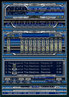
My latest attempt at skinning winamp 2PM '02
Related content


Comments: 15

thanks for your comment.. i'll keep what you said in mind, anyway, this is probably one of the best skins ive seen. i guess the jagged lines in between the eq, playlist and main screen dont look that well
-----
++++++
i dont hate people. i just make fun of them, its more effective that way!
👍: 0 ⏩: 0

I like this one. Original,fresh design. Hope to see more from you.
A man has to know his limitations... Speak softly and carry a big stick
👍: 0 ⏩: 0

Nice and different design, although I don't really like the "bluriness". I'm a fan of sharp & well-defined lines
Good work anyway!
👍: 0 ⏩: 0

looks good. could use some work
(M)ango)(S)quash)
👍: 0 ⏩: 0

this is very nice, but i agree, could use some working
anti-aliasing could be put to work
and the whole "everything fits like puzzle pieces" doesn't work to well for me
this is a very cool skin tho, keep it up
_________________________________
º°¨¨°º© !STYLEZ! ©º°¨¨°º
👍: 0 ⏩: 0


it's nice to see a downlit winpimp skin for a change ... but i'd agree on the need of borders around all those pretty gradients - the lines would define all the details so that the eye of the viewer wouldn't just glide over the nuances, especially when it comes to the buttons.
biopfoten
_______________
didn't bring a gift? take a hostage
👍: 0 ⏩: 0

It could be a little less gradient-y and the lines could be a little better defined ( by adding a 1px border around them )
Nice concept though
👍: 0 ⏩: 0

nice idea, although I dont think its turned out well, the colours dont look strong enough to me
-- Dredwerk
I love you all, appart from the ones I dont
👍: 0 ⏩: 0

Ill just grab a few comments here and there and see what I can come up with for version 2
👍: 0 ⏩: 0

It's nice to see some skins that aren't of a rusty, metallic type. This is a nice concept that could benefit from some more refinement.
The spots around the windows distract the user and detract from the design. Also, the buttons seem a little too small -- like nemoorange said, it does look hard to control, which in turn doesn't give me great confidence in using it.
I'm also not so crazy about the transparent areas -- but that's just personal pref
The volume slider is a definite highlight of this skin.
Kudos for being different (again ) and doing a very decent job of it along the way
👍: 0 ⏩: 0

Very original design, & the colors are cooling. I'd say you'd need some work with the practicle side of things. . .. it looks hard to control & whatnot, but a good job all around.
👍: 0 ⏩: 0

pretty cool design, sure havent seen many like this. i like the volume slider and the eq bars, but not the bg of the eq graph (top middle of eq), thats too 'loud'. i dunno about the spots all over the skin either. still, a good skin with a great concept.
👍: 0 ⏩: 0

The concept is really good, but the eq is a little ugly, and the whole thing needs to be brighter in general. Keep it up.
.: David :.
👍: 0 ⏩: 0

the design is nice but the implementation needs some work. the lines are too jagged around all of the transparent areas- doublesized it looks horrendous. windowshade is really good however- finally someone uses text you can actually read.
i want to die peacefully in my sleep
like my grandfather
not screaming and yelling like the people in his car.
👍: 0 ⏩: 0