HOME | DD
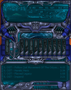
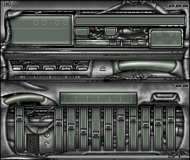
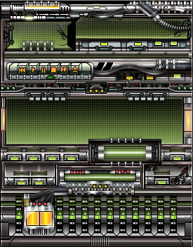
 peacemaker — mainframe

Published: 2004-01-07 14:13:39 +0000 UTC; Views: 453; Favourites: 1; Downloads: 217
Redirect to original
Description
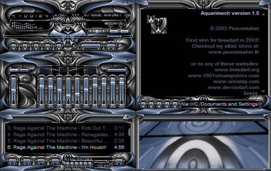
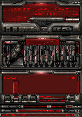
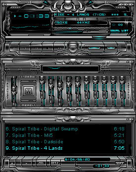
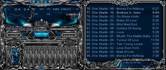
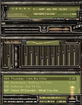
I havn't added much to it, just tidying up a few areas so i can add in a few more buttons soon. I'm thinking of either making the eq integrated as an overlay over the vis on a buttons click, or have it slide out with some other options on a panel.I might also start playing with this other design i've recently drawn, but i'll see if I can put in some colour and fix up the display areas in this skin first..
Related content


Comments: 14

You know what I recommend? I recommend you start sucking real bad, really soon, so I don't feel like my work and all the work I'm trying to do completely sucks ass (which it does). This is one of the best interfaces I have ever seen, and it has the best hilites and shading I have ever seen. I despise you
Great Work.

👍: 0 ⏩: 0

I would like to touch those patterns. Seems very nice. Great airbrushing. Now you have to speed skin this ready so I can use it
👍: 0 ⏩: 0


the upper white part could use some texturing imo... excellent anyway though
")
👍: 0 ⏩: 0

Well, i cant seem to full view it but it looks real nice nonetheless. U'll definitely be putting colour on it so i don't need to mention that  (Smile)")
👍: 0 ⏩: 0

nice but is it just me or are the edges a bit blurry in places (like top left corner?) and i think if you enhanced the highlights and shadows on the top left park to make it look like that part reaches out an overhangs the text more it would look sik
keep it up!
 (Wink)")
👍: 0 ⏩: 0

Yeah, like blueballs say; i hope it get some color, but you have probably thought of that already. Starting too look seriously good
👍: 0 ⏩: 0

u always come out with the most original stuff.
sorta looks like it's melting. interesting so far, keen to see where you take this baby
👍: 0 ⏩: 0

Hm, I like it but I believe it deserves to have more color. I'm figuring you're intending on that anyway though. Methinks I'll use it, it's nice and small. I hate those big WA skins.
How come you haven't been on MSN lately, buddy?
👍: 0 ⏩: 0

ignore those knuckleheads...i love it! Keep it nice and dark. Metallic + color is done all the time. Just keep it dark
")
👍: 0 ⏩: 0

Great work, but I wouldn't call it " simple"
Don't forget to add some colour here and there...
👍: 0 ⏩: 0

its hard to say why, but i dont really like the style of this skin. sorry man
👍: 0 ⏩: 0