HOME | DD
 pete-aeiko — Graphique

Published: 2007-03-08 20:46:01 +0000 UTC; Views: 85503; Favourites: 1994; Downloads: 4567
Redirect to original
Description
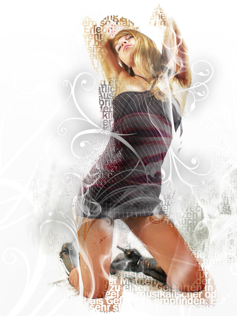
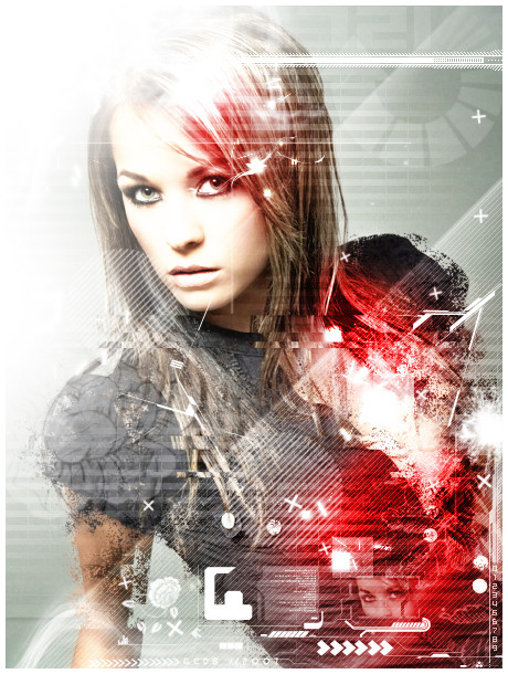
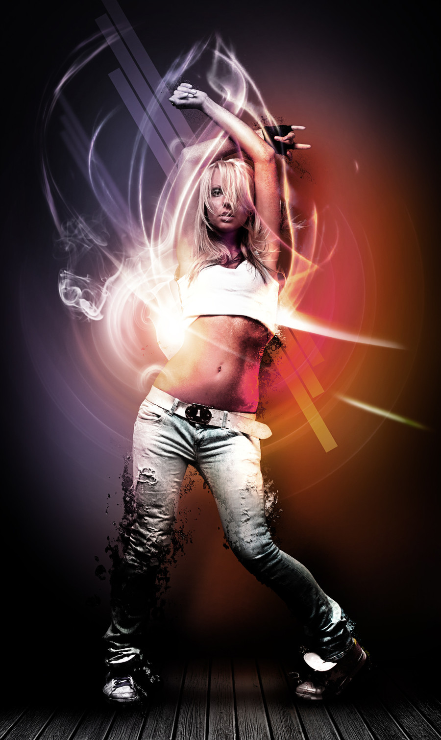
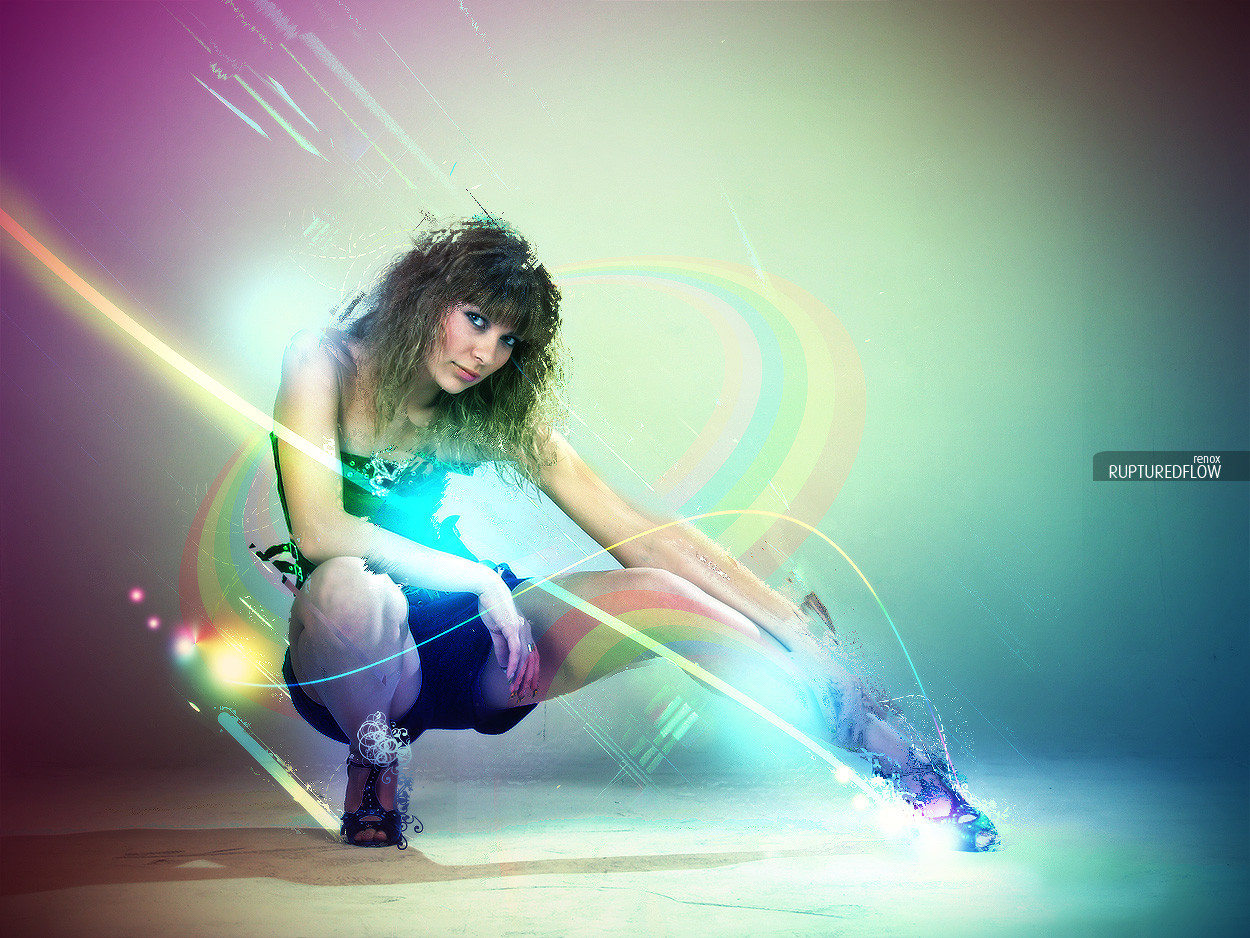
Pete Harrison vs Colin Lee
Sorry for the lack of updates recently, lots of new stuff flowing now, so stay tuned
 (Wink)")
Related content


Comments: 274


")


Normally I don't like this kinda pics but this is awesome. Nothing wrong in it, everything fits.
Definitely 
👍: 0 ⏩: 0

don't know what to say!
The style is just magnific, i love that one, the colors are amazing, also the typo u user, very very very great!
ME Likes a lot!
👍: 0 ⏩: 0


Damn man! I really love your work! 
Been paying attention to your work! Though some really great inspiration for my schoolwork, as well as I've used your things for my background on my laptop for ages.
Keep up the good work, I really love your things!
👍: 0 ⏩: 0

KICK ASS WORK!
I just love the vibrant color and the flow in the lines and the letters...
WELL DONE!
👍: 0 ⏩: 0

Lots of energy going around in this one. I'm especially enjoying the subtle details, for example how it seems as if she's on a rounded plateau. Great typographical additions as well, it really strongens the overall vibe and gives it this elegant/glamorous look.
Pete, Collin you've got yourselves another winner
👍: 0 ⏩: 0


to pimp for my eyes.
a real harrison one, and damn lee did some great touches too!
the explode effect makes this one imo.
👍: 0 ⏩: 0

lovely colors and atmosphere there.
Lovely work at the typo
Good job m8.
👍: 0 ⏩: 0

i'm always loving this style...
great as always
👍: 0 ⏩: 0

awesome stuff, I really like the glows that you give for ur artwork, good job mate
👍: 0 ⏩: 0


niiiiiiiiiiice
j'aime bien, si dès fois ça frôle l'utilisation d'une technique au dépend de l'image, là ça la porte. c'est bien l'effet est sympa on a un "renvoi" des zones surexposées dans l'image même avec les lunettes de soleil. Bonne image  (Smile)")
+1
👍: 0 ⏩: 0


Wow, really can't think of anything to say... I just want to sit and look at it forever, haha!
👍: 0 ⏩: 0


hey man, i have time so if your still up for that collab id love to get that goin
hit me up on MSN
👍: 0 ⏩: 0


Beyond excellence. Glad to see some new stuff coming out again.
👍: 0 ⏩: 0

i totally love it! awesome work!! its sublime!!

👍: 0 ⏩: 0

I observe the consistency used in your colors - it had become somewhat of a trademark
👍: 0 ⏩: 0

both your styles, mixed like a good pancake!
👍: 0 ⏩: 0

Its a very, very beautiful and amazing colors ..
👍: 0 ⏩: 0


just smooth. you guys have type/illustrator/photo down pat!
👍: 0 ⏩: 0


freakin sweet dude.. is this all in just photoshop?
👍: 0 ⏩: 0

Very nice, but I would personally move the bright spot on her knee just a few pixels lower so it would look better. (But hey, that's just me vs you and you probably know best hehe.) Once again, very nice!
👍: 0 ⏩: 0

Very nice, keep it up. Oh yeah, where's the stock from?
Well done
👍: 0 ⏩: 0


<= Prev | | Next =>