HOME | DD
 pete-aeiko — session.50K
Published: 2004-01-30 15:51:03 +0000 UTC; Views: 6628; Favourites: 142; Downloads: 6039
Redirect to original
Description
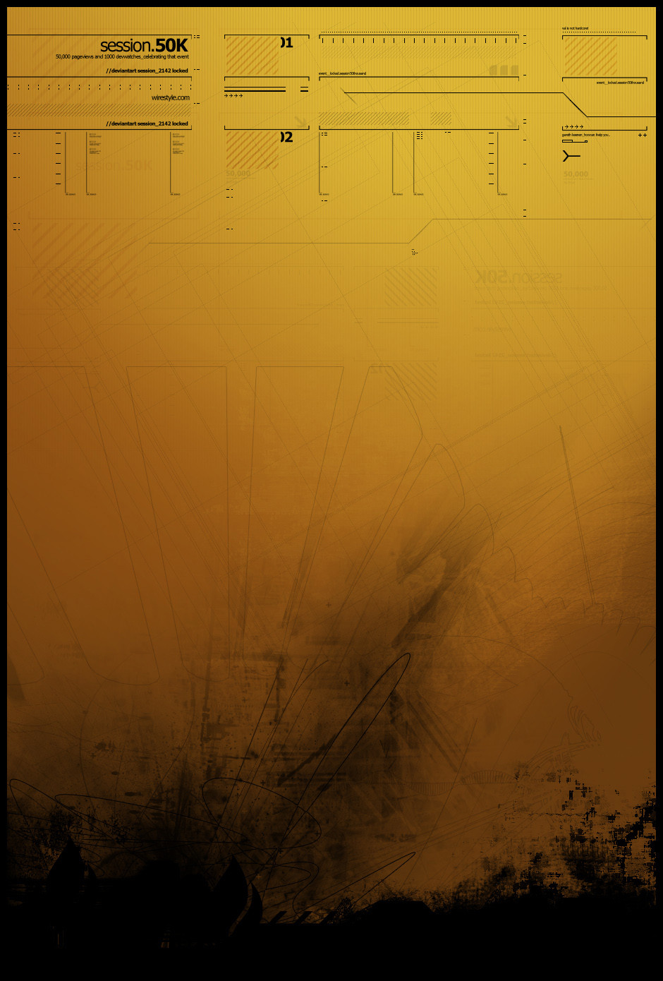
__celebrating 50,000 pageviews.taking me through, progression has been made.
dedicated to whoever gets the screenshot
 (Wink)")
Related content


Comments: 176


hey cool, look like some kind of old tech maual. The yellow color fit very well.
👍: 0 ⏩: 0

I don't think it's impressive at all. Typography is rather nice, but that's it.
👍: 0 ⏩: 0


cool, grats, whatever, ur not gonna read this anyways ")
 (Smile)")
👍: 0 ⏩: 0


dOOD that is awesome
the whole grunge effect and like, really faded is super original, to me at least
its really good effects and color choice
👍: 0 ⏩: 0

excellent job,
i detect a hint of ~smashmethod in some of the lighter vectors there, no?
👍: 0 ⏩: 0


Love it. For some reason, it reminds me of old, thick paper being burned from the bottom up.. Deserves a favorite, yes it does. ^^ --favs--
👍: 0 ⏩: 0


you are really really impressing me at the moment
")
👍: 0 ⏩: 0

Great work bud
I think its funny when you get so many favs over a piece that looks really simple. Kinda hurts me too

👍: 0 ⏩: 0


Everything looks great. Except maybe that dark spatter on the bottom right.
👍: 0 ⏩: 0

woah. really nice 2d mixing with the smooth colours and black grungy stuff on the bottom! AHHHh SO NICE!
fav dude
and congrats for 50k
👍: 0 ⏩: 0


sexy colors and i love the grunge work
awesome 2d esp the balance
congrats on the 50k its a real achievement
👍: 0 ⏩: 0

wow yo this looks like a map from darkness to light, from failure to success, from sanity to madness, from a to b
awesome job...
👍: 0 ⏩: 0

Keep it up Pete 
")
👍: 0 ⏩: 0

love the black terror in the bottom...how could i say more....
👍: 0 ⏩: 0

very cool, as a grunge artisit i'm glad to see you taking your shot with this style. Very impressive to seeing your breaking out of your usual shell. Shows that you are a true artist.
👍: 0 ⏩: 0


Awesome! 
👍: 0 ⏩: 0

The thumbnial looks like a close up photo of someone's groin.
👍: 0 ⏩: 0


your skills are just mad nowdays, and you can apply your style and get so many different results!
👍: 0 ⏩: 0

This isn't normally my kind of "thing". What do you call this, abstract art?
But this one really just caught my eye. The grungy, scratchy, dirty feel of it (in a positive way, naturally). The colors are absolutely beautiful, especially mixed with the "technological" aspects, reminds me of something so familiar which I simply can't put my finger on.
I assume you used brushes for this? Where did you find them or did you make them yourself?
👍: 0 ⏩: 0

Gratz on the 50k,nice 2d,i know it's a tribute to 50k/1000 watchers,but you can do so much better,and sorry for saying it,but not worthy for a DTF imo.
realization.
👍: 0 ⏩: 1

I know I can do better, this was an experimental piece and I didnt spend long on it. A lot of stuff isnt worthy of a dtf but it still get on there.
👍: 0 ⏩: 0

I like the transition between the organic and mechanic. Very nice. This looks like it took a good deal of time.
👍: 0 ⏩: 0

excellent work
a beautiful juxtaposition of chaos and order
👍: 0 ⏩: 0

hell yes, this is som nice shit...great color-scheme and the 2d is just lovely
👍: 0 ⏩: 0


pretty simplistic but i love the style...
great colors.. it's got a nice grunge look to it.. very kewl.
2d rawks as always. nice piece bro.
congrats on 50k that's amazing! i've not even got 5k lol
mP
👍: 0 ⏩: 0

Wow, that is absolutly gorgeous....I love your style.
👍: 0 ⏩: 0

Ok well i take it youve gathered from all of the other comments that this is rocking, but i thought id add my praise and worship, love the eclectic mix of styles you have going on here, and congrats on the 50k
👍: 0 ⏩: 0

i always love how you handle ur type or text
👍: 0 ⏩: 0

the 2d finishings/text at the top i can take or leave, i don't think it really does much, but the black form(s) at the bottom is quite excellent and your color choice is superb. this piece shows real maturity compared to some of your other pieces and da's abstracts as a whole.
👍: 0 ⏩: 1
wow cool bud, thanks a lot for the positive comment
👍: 0 ⏩: 0


Dude, that is awesome. It all looks so great. Very nice job
👍: 0 ⏩: 0

Thats cool, I like how you combined grunge and technical 2d.
👍: 0 ⏩: 0
| Next =>