HOME | DD
 PicklePieCow — sleuth squad
#hardyboys #nancydrew #joehardy #frankhardy #picklepiecow
Published: 2022-07-04 20:12:50 +0000 UTC; Views: 1378; Favourites: 8; Downloads: 0
Redirect to original
Description
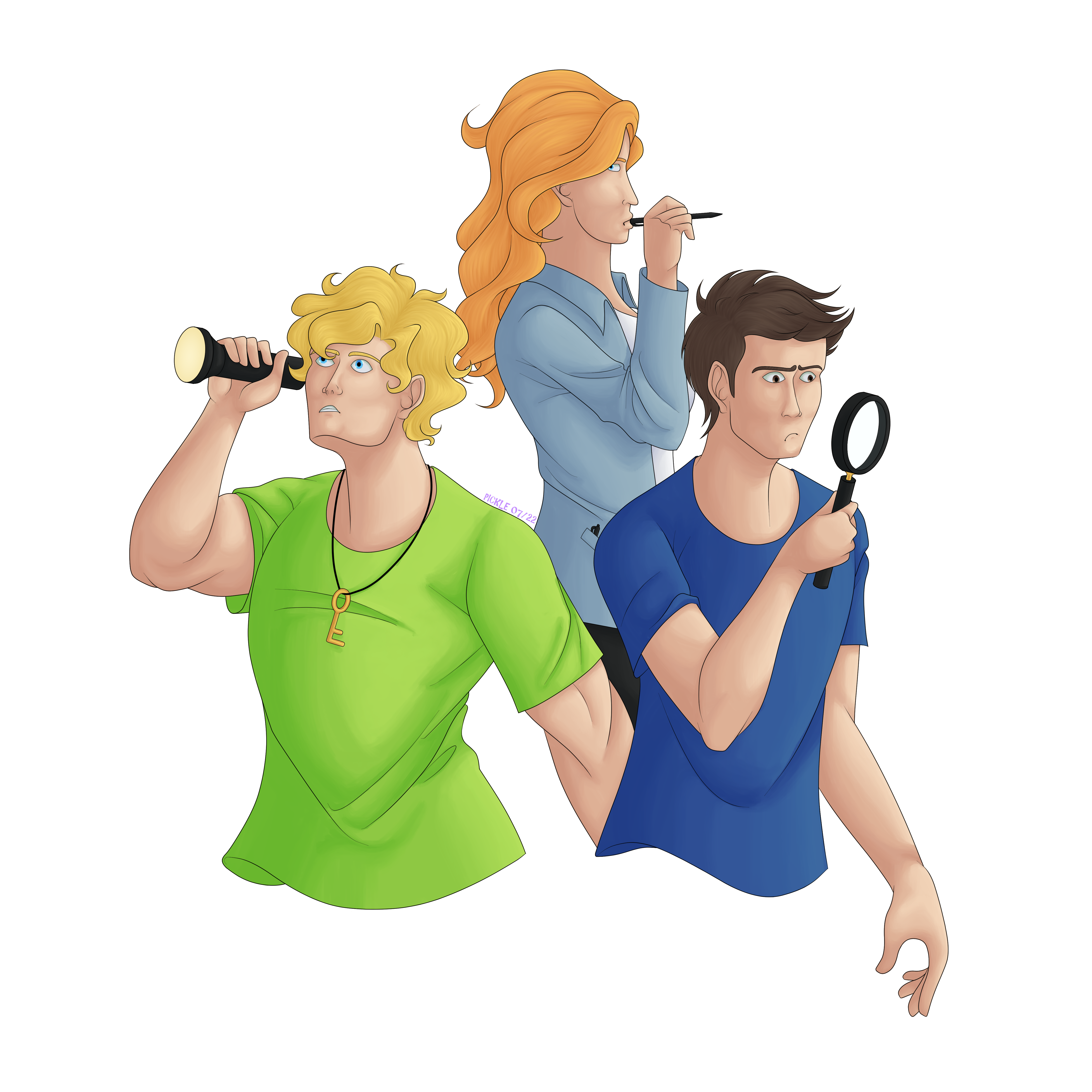
Reblog this on Tumblr!So I put out a pretty ugly drawing of Nancy Drew and the Hardy Boys in 2016 and a bunch of people have been faving it recently...so I decided to put out a slightly better one for them lol. No the colours are not what I wanted but I give up already.
I spent a weird amount of time picking colours. I should've just put Joe in red and Frank in green because I've done that before and I know they look nice that way, but I'd already really committed to that green shirt of Joe's--which I regret because it gave me the most trouble out of all the colours he looks like a neon sign--so after spending a million years trying to find something nice for Frank, I just chucked him in dark blue. Suits him. Nancy is supposed to be wearing a denim jacket, which I now realize I have completely forgotten to give any denim texture whatsoever, but I need to be done with this so it's just a cotton jacket or something now. She's also supposed to be holding a notepad in her left hand but if I can get away with not drawing something, I absolutely will. Might not get away with Joe's arm...it's pretty obvious I was trying to get out of drawing a hand there...but it's my drawing and I can do whatever I want. Joe's arms are such a pain anyway lol I try to give him some muscle but I gave him a bit too much in the sketch imo and had to try and shrink that arm down a bit. He's supposed to be a muscley lad but he's also a teenager and not a professional bodybuilder lol. It still looks weird. But oh well. Frank's face is kind of ehhh overall but I do really like how his nose turned out. And as for Nancy, it's anyone's guess why I keep making myself draw profile views. I hate doing it and yet...I do like her hair though.
Kinda regret giving Joe a flashlight but by the time I realized that was going to make the lighting really annoying (not that the shading was going to make sense anyway knowing me), I'd already started colouring and couldn't really think of anything else to put in his hand. The magnifying glass for Frank is already kind of lame and cliche. I'm not as creative as you'd expect for someone who has spent her whole life drawing and almost twelve years posting it. But hey.
The boys were originally going to have legs, but Nancy's legs behind them looked weird and I hated them so I decided to cut it off this way instead so that none of us would have to look at them. I definitely didn't love the choice when I was first colouring, but it's grown on me. It would work well for a sticker or something if the art was better. It didn't turn out as nice as I was hoping but it's still so much better than the one people have been faving recently and I don't hate that people are seeing it so it's already doing its job LOL. I've been on a big Hardy Boys nostalgia trip lately so it's nice to draw them again.