HOME | DD
 Pimmy — OR: Chpt2 Pg3

Published: 2010-04-07 07:36:44 +0000 UTC; Views: 15505; Favourites: 188; Downloads: 54
Redirect to original
Description
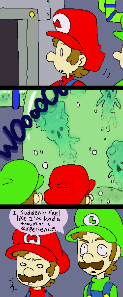
HRRGGGGI wanted to try digital and after a billion hours of struggling with both comicworks, photoshop, and mangastudio, this is what happened.
Opinions? Should I stick to pencil? I have no idea if this was any easier.
Chpt 2 Page 2: [link]
Related content


Comments: 145

haha thanks!
lol I'm so terrible at sfx but at least people get a kick.
👍: 0 ⏩: 1

Yer welcome!
And you're not terrible at them, I don't really see how anyone can be.

👍: 0 ⏩: 0

Lol classic! xD
Love this, been waiting for it so long. xD
👍: 0 ⏩: 0

Either or is fine but if I had to pick one I'd go with pencil.
👍: 0 ⏩: 0

this is a lot neater it looks great, but i like the detail in pencil so I can't complain either way
it looks like it took ages though...
 (Smile)")
👍: 0 ⏩: 0

This looks really nice! 8D But which ever way is quicker.
👍: 0 ⏩: 0

XDD;; there is always the option of doing panels on the computer, then hand drawing the rest of the comic? XDD;; I agree with what alot of others were saying, too, but this is what I'd try if I found myself in that same position XDD;; (all my ocmics look like crap unless they were done by hand... )
👍: 0 ⏩: 1
That's a good idea! though theres the risk of being unable to edit the panel shapes once it's printed.. and the inaccuracy of how the paper is lined up and bordered.. bleh, darn technology! Since I have a tablet drawing on the computer is only marginally harder.. but we'll see how things go lol
👍: 0 ⏩: 1
XDD indeed! hopefully you cqan come up with something! ^^
👍: 0 ⏩: 0


The print-manga look is really well done, but the penciled pages have their own charm.
If I had to choose, though, I think I like the former.
👍: 0 ⏩: 0

to answer your question, i prefer your pencil work. both this and your pencil stuff looks awesome though. idk, maybe after a few pages i will get used to it ^^. btw I love your comics, keep them comming!
👍: 0 ⏩: 0

This is nice, I suppose, but I prefered the pencils. Clean or not, I just like it more than this digital style. Has more heart in it, y'know?
But whatever you choose to do, I cannot WAIT until the next page comes out. I've fallen in love with this story.
And possibly you, but I won't mention that in this comment because that'd just be creepy, right?
👍: 0 ⏩: 1
Sorry bromeo, I'm taken!
thanks for the input, I'm not sure how much more heart I put into either medium, but we'll see how it works out XD
👍: 0 ⏩: 1
*snaps fingers* darn.
XD Nah, I'm joking. The digital stuff just seems TOO perfect imo. It makes me forget that this is a fan-comic I'm reading, so it loses part of it's charm. But again, the choice is yours. Either way, I'm still gonna read.
👍: 0 ⏩: 0


Wow, this does indeed look very nice. I know from personal experience though that while a digital peice may look better on some levels, it can lose a personal touch and it also takes an ungodly amount of time. I prefer when artists do it by hand, but that's just me.
Also, it's funny to see your take on the effect on Mario's psyche that being without Luigi would have. Obviously if the twins were together the whole time, at this point Mario would be scoffing at Luigi's fear and going almost fearlessly into the dark... I like it, to tell the truth
👍: 0 ⏩: 1
Thanks! I'll probably try digital for a few more pages (with more effort) and see how things work out.
I'm glad someone picked up on that sort of thing, I've been thinking pretty hard about how I want to develop the two as they are in this AU.
👍: 0 ⏩: 1
It's the little things that show how the bros are different in this universe, and I'm sure more people than just me appreciate that kind of effort in a fan-work. In most AU works people either keep Mario and Luigi acting the same way despite being in a completely different situation, or have them act in ways that wouldn't suit their base personality at all. Your hard work shines though
👍: 0 ⏩: 0

This looks great in digital, but I prefer the pencil style, it looked better in my opinion
👍: 0 ⏩: 0


I think I prefer the digital style better but what I really mean is "I prefer whatever style makes it easier for you to do this". Because this is great and I want to see more of it okay
👍: 0 ⏩: 0

If it's a little too complicated, you can always stick to traditional pencil, but if you wish to continue mastering the art of digital art, then keep up the good work.

👍: 0 ⏩: 0


The pencils had a more natural feel to the linework, which really fits how more lifelike you draw the characters than as they're typically drawn. Still, I'd be a hypocrite if I said "stick with pencils" because I eventually had to give up on pencils in my HiEx comic since I draw small and it's too tedious cleaning up every spot with a kneaded eraser. XD
I am so jealous of your skills, you don't know!
👍: 0 ⏩: 0

Hmmmmmmmm...
The digital comic pages certainly look more polished and professional - like a manga Nintendo would greenlight for publishing! : D
But, at the same time, it takes away a little of the warming charm that comes with the hand-drawn style. There's just something nice about hand-drawn lines and cross-hatching.
I guess its not very helpful, but I'm gonna stay neutral on this one. Either style would be just as enjoyable.
👍: 0 ⏩: 0


I think the digital looks very good! You did a nice job with it!
👍: 0 ⏩: 0

lol i'm with Mario and toad on the whole AAAAUGH! deal.
👍: 0 ⏩: 0


Finally! Been forever since I last fave one of these pages. 
👍: 0 ⏩: 0

It's hard to judge by this page because the lighting is probably meant to be dim. But I think if you want to stick with digital you should look into more contrast, and bringing back all those nice implied shadows you had in your pencil works.
This page is extremely flat in comparison to past pages, because you lost the shading really.
I think you should keep working with both as it meets your fancy, and maybe try doing a hybrid between the two to see if it'll make certain things easier.
👍: 0 ⏩: 1
I had implied shadows? (haha)
The problem with comicworks is that i can't figure out how to get tones deeper than 40% gray outside of gradients. Cus certain things would definitely be a lot darker if I could, so I was force to go lighter.
I see what you're saying. I could probably spend more time on the tones, I actually avoided shading much cus I worried it would be too MUCH compared to my other pages! I guess I miscalculated.
A lot of my earlier pages were a hybrid.. but I had to filter the heck out of the large area shading to avoid it clashing with the pencil look. Hrm.. how would you suggest a hybrid? thanks a lot for the insight
👍: 0 ⏩: 1
You did indeed have some implied shadows, whether from hatching in certain areas, drawing a line where a shadow might be or soft shading (which may entirely be accidental just from your pencils smudging some 
It is worth noting as I saw you mention Tracy Butler further down that her work is a hybrid. She does everything in pencil, yes she cleans it up and changes it to sepia digitally, but she leaves alot of her construction marks behind which helps give volume and shading. She also probably fiddles with the values a bit.
What I had in mind mainly if you do a mix is to help you with straight lines by doing those digitally.
If you stick full out digital, I think a good way to offset how dark this page is compared to others is don't obliterate the white entirely just because you can more freely tone things digitally. I can't give a whole lot of advice on toning because I have only ever done it once, for a single small icon. But if you have any comics lying around that are toned like this study them. (study a couple of different toning styles too to see if you can find anything you rather like). And see if you can find ways to make your characters less flat.
👍: 0 ⏩: 1
ah, I see what you mean. I think in the future I'll be more loose with digital inking, because the effect is surprisingly similar to pencil!
Yeah, her pencils are super nice looking, I hope if I work at it I can do stuff as smooth and detailed. Hmm that's a good point. I think I want to try to selectively place tones more next time, like actually block out shading with them. I always felt like the previous pages had too much white, but yeah balance is good. This chapter is unfortunately pretty dark in nature.
thanks very much for the long comments!
👍: 0 ⏩: 1
You're welcome, I'm glad I was able to give some useful feedback.

👍: 0 ⏩: 0

Personally, I like how scanned manga (like those in like online manga readers) looks as supposed to the use of this style.
Perhaps it's cause there's those patterns that show up or that there's too many varying shades that in my eyes, are somewhat distracting.
Though I really enjoyed your full-pencil style cause seeing something in clean-pencil (or full dynamic color) is what usually inspires me to draw.
...Oh and sorry for not posting my fan-fancomic. ...I have this ability... to draw 1 page of a comic in 3 months time ")
....
....
...good pic though! ...
👍: 0 ⏩: 1
Actually scanned manga gets those patterns too, depending, but I see what you mean.
lol "clean" pencil XD my pencil is messy messy
thanks!
👍: 0 ⏩: 1
")

This style looks more polished, but I personally enjoy the vibrancy of fully hand-drawn work, which is fairly uncommon in comics... Maybe you could take the color fills here and incorporate that into your penciled comic style, which I think has just a bit too much white.
Both look great, though! It's really about what's more comfortable for you. Can't wait to see the rest!
👍: 0 ⏩: 1
Yeah, my main troubles with the pencil comics are:
-hard to get them all size properly
-cant guarantee straight lines
-hard to make large fills
-hard to make large digital fills that don't clash with pencils
And yeah, basically the whole first chapter was on a "one a day" schedule, so there's lots of white. I think this way could reduce white as well... but who knows XD I love the imperfection of pencil but I also hate it, haha. I wish I could do it like TracyJB! but thanks! gives me stuff to think about.
👍: 0 ⏩: 0

<= Prev |