HOME | DD
 PizzaPotatoNBacon — Arrival
Published: 2013-09-10 11:52:14 +0000 UTC; Views: 914; Favourites: 38; Downloads: 5
Redirect to original
Description
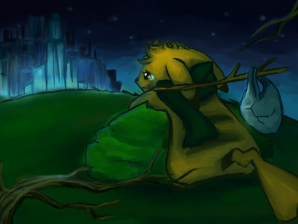
I'm finally home....Does anyone miss me?
...Does anyone remember me?
Is there still someone who cares?
Here's a really full-assed piece by yours truly.

I worked with no breaks at all!
 I really worked hard on this piece, which I admit, was just made to cool off my head after I felt gloomy.
  It's fantastic that I felt so much better after finishing the piece! That surely goes to show how much relaxing and relieving making art can be.
This piece is kind of me at the moment. You know those times when you leave a place you love so much, for just a while? And when you come back, it's like nobody remembers you or misses you? When you feel like you're lost and need to catch up again? When all of your friends there have forgotten you still existed? I tried illustrating such a feeling in this piece.
 (Of course, this couldn't be my current situation at DeviantART, considering the fact I never really "left" during my Fluffy "Hiatus".
  )
)I usually don't post fan art nowadays, so this was a rather refreshing piece to make! This is my Pokésona (Pokémon + Persona), Xuis the Pikachu. i fahking forgot to draw her cheek pouches and remembered at the last minute Her cheek pouches are sort of hidden by her green scarf.
")
As you can see, I was practicing color palettes in this artwork.
Heh, this was also a great way to practice my brush strokes. While drawing, my tablet's pen sensitivity went off (Chibi Paint does have pen pressure sensitivity) and kapoosh, it was a challenge making this picture without it. I'd like more feedback on this! For those of you who are willing to offer a critique, here are some questions I have for you.
 What mood/feeling does this piece give you? Is it strong enough to keep your eyes on the artwork? What concept/message did you receive on first sight [before you read the description]? If there is room for improvement, how can I fix it?
 ") How is the color palette? Does it look pleasing to the eye? What mood does it give you? Did it work well with the composition and the subjects? If there is room for improvement, how can I fix it? Is the composition decent enough? Is it interesting or bland? Does it go well with the overall concept and message? Does it go hand in hand with the colors? If there is room for improvement, how can I fix it? How about the subject (Pikachu)? Is the expression pulled off well enough? How about the pose- is it expressive? Is it appealing? Does it go with the piece overall? If there is room for improvement, how can I fix it?
How is the color palette? Does it look pleasing to the eye? What mood does it give you? Did it work well with the composition and the subjects? If there is room for improvement, how can I fix it? Is the composition decent enough? Is it interesting or bland? Does it go well with the overall concept and message? Does it go hand in hand with the colors? If there is room for improvement, how can I fix it? How about the subject (Pikachu)? Is the expression pulled off well enough? How about the pose- is it expressive? Is it appealing? Does it go with the piece overall? If there is room for improvement, how can I fix it? Of course, you don't have to answer one or all of these questions.
If you have anything to say about the piece, like a mistake here or a suggestion there, let it out! I may be BatFluf, but I can't improve without constructive feedback, y'know? Edit 9/11/13 - Tried all the lovely suggestions offered! Wow, this piece looks much better.
 (Smile)") Thank yous to all who've given me constructive feedback.
Thank yous to all who've given me constructive feedback. Edit 10/16/13 - Changed the contrast and colors for maximum effect. Suggested by ~DTKinetic
More Pokémon Fan Art you should check out!
Tumblr | Twitter | My gallery
 More of my Pokémon Fan Art
 Made With:
Chibi Paint Java Applet (Bulbagarden Oekaki)
Time Taken: 1 hour & 47 minutes
...Interesting.Brushes/Tools Used:
Chibi Paint Java Applet - Water Color Tool, Pencil Tool, Pen Tool, Air Brush Tool, Eraser Tool
Posted on September 10, 2013 7:51 PM PHT
Art © Me, fluf-studios, Alex R.
Pikachu, Pokémon and its concept © Nintendo, Gamefreak
 Do Not use outside of DeviantART Without Permission From The Owner. Do Not Repost Within or Outside of DeviantART Without Permission From The Owner. Doing so is a violation of DeviantART ToS and the Law.This work may not be modified/altered at all. You are not permitted to use this for commercial purposes. Under no circumstances, can you reproduce, copy, edit, trace, publish or reupload this work.
Arrival by Alex R. is licensed under a Creative Commons Attribution-NonCommercial-NoDerivs 3.0 Unported License
Related content


Comments: 54

What mood/feeling does this piece give you? Is it strong enough to keep your eyes on the artwork? What concept/message did you receive
on first sight [before you read the description]? If there is room for improvement, how can I fix it?
(It's fukcing sad. I got that it's fukcing sad. Add its stripes 
How is the color palette? Does it look pleasing to the eye? What mood does it give you? Did it work well with the composition and the subjects? If there is room for improvement, how can I fix it?
(sexy, yes, sad, yes, add the stripes.)
Is the composition decent enough? Is it interesting or bland? Does it go well with the overall concept and message? Does it go hand in hand with the colors? If there is room for improvement, how can I fix it?
(yes, interesting, yes yes yes yes yes yes yes yes yes eys eyes eye yes, add the stripes. XD)
How about the subject (Pikachu)? Is the expression pulled off well enough? How about the pose- is it expressive? Is it appealing? Does it go with the piece overall? If there is room for improvement, how can I fix it?
(yes, yes yes yes. stripes.
Remember to include that Neccers shouldn't critique your stuff.
👍: 0 ⏩: 1

I always forget the stripes, dammit.

👍: 0 ⏩: 1
