HOME | DD
 plan-b — UrbanStructures Preview

Published: 2002-08-30 04:02:54 +0000 UTC; Views: 1264; Favourites: 6; Downloads: 122
Redirect to original
Description
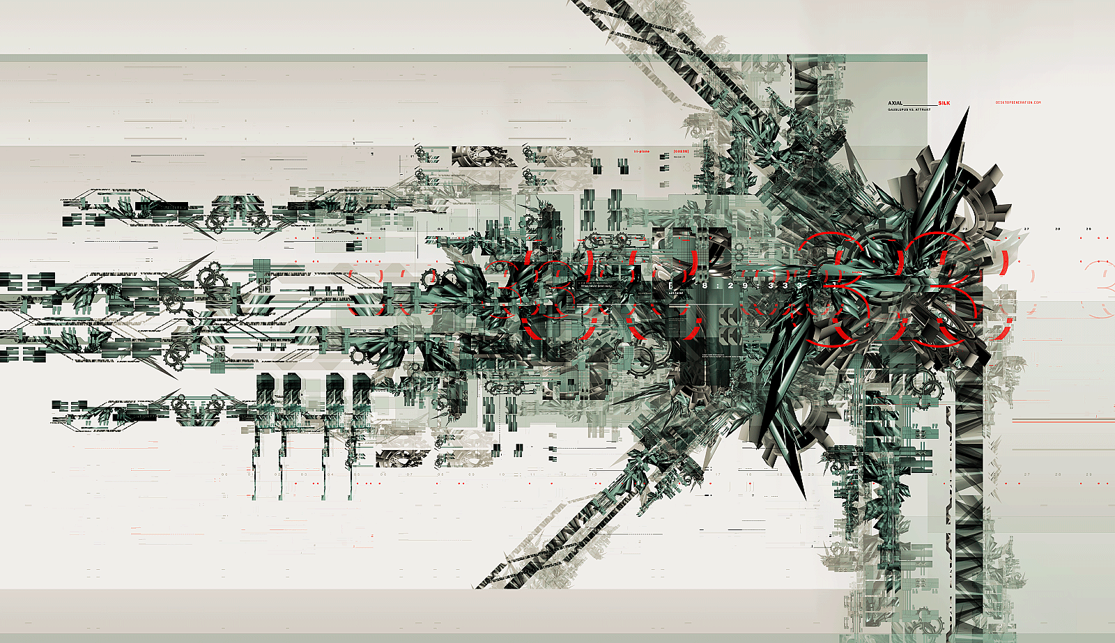
A rough of a design competition entry. it is yet uncompleted but i wanted fellow deviants thoughts. The piece looks for organics in urban places.Typography needs to be worked on i know, the background reds feel disjointed from focal point.
Comments and thoughts for impovement would really help.
Related content


Comments: 13

amazing concept, I think it may be prove to be an inspiration for some of my future projects
👍: 0 ⏩: 0


for some reason, this doesn't strike me as the typical abstract 3d trendwhore WP's do. i like it.
👍: 0 ⏩: 0


i like the soft typo work.. the bold red choice really draws your eye....i think you are on the right path
👍: 0 ⏩: 0

By far the most powerful and nicest designed in the piece is from the 12 o'clock position on the left side to the 3 o'clock position. The small box in the background behind the center glob as well as the diagonal from the box appear to lack direction and a point. The box itself seems to simplistic for the piece. Perhaps widen it with a thinly layered 3D effect with every concentric rectangle becoming deeper. Just one suggestion out of an infinite. The diagonal coming from it should probably go to the edge. It looks unfinished and dangling and makes the box stand out more. But overall, I'd say make the box more complex or less prominent.
From 12 o'clock to 3 o'clock I like even the text, how the small text is unreadable and even the arrows. Pretty much everything from 12 to 3 I like except the previously mentioned dangling line. Now, the glob in the center, I understand is meant to be organic looking. It does look that, but the fuzzy contrast appears out of balance with the rest of the picture. Perhaps the fuzziness should be in its organic nature, not in the clarity of its resolution. A nice clear but abstract form might be better.
The red coming from the glob diagonally to the upper left of it, at 10 o'clock might be more powerful with just a beginning of the detail or etchings you have on the other large red diagonal at 2 o'clock, but only as it begins to go off the picture. A trace, leading the viewer to use their imagination to fill in what comes after that.
Finally, just two things. The clarity of the small red rectangles that vertically appear on the left side of the piece and the one on the bottom right corner might be better off more defined. If not, then the words above them probably should be to keep the balance.
Last, the white space on the bottom right is pretty powerful. I can't say what exactly should be there, but something, maybe jutting out from the organic glob in the center and then curving back fairly soon, to imply that there is something in that quadrant of the picture, might give it better balance. I understand that balance is the key and that the white is probably on purpose, however, I see it as being a bit too much.
Really nice beginning though.
Applebrown
👍: 0 ⏩: 0


looks pretty good to me. im not a big fan of a white background..
👍: 0 ⏩: 0
