HOME | DD
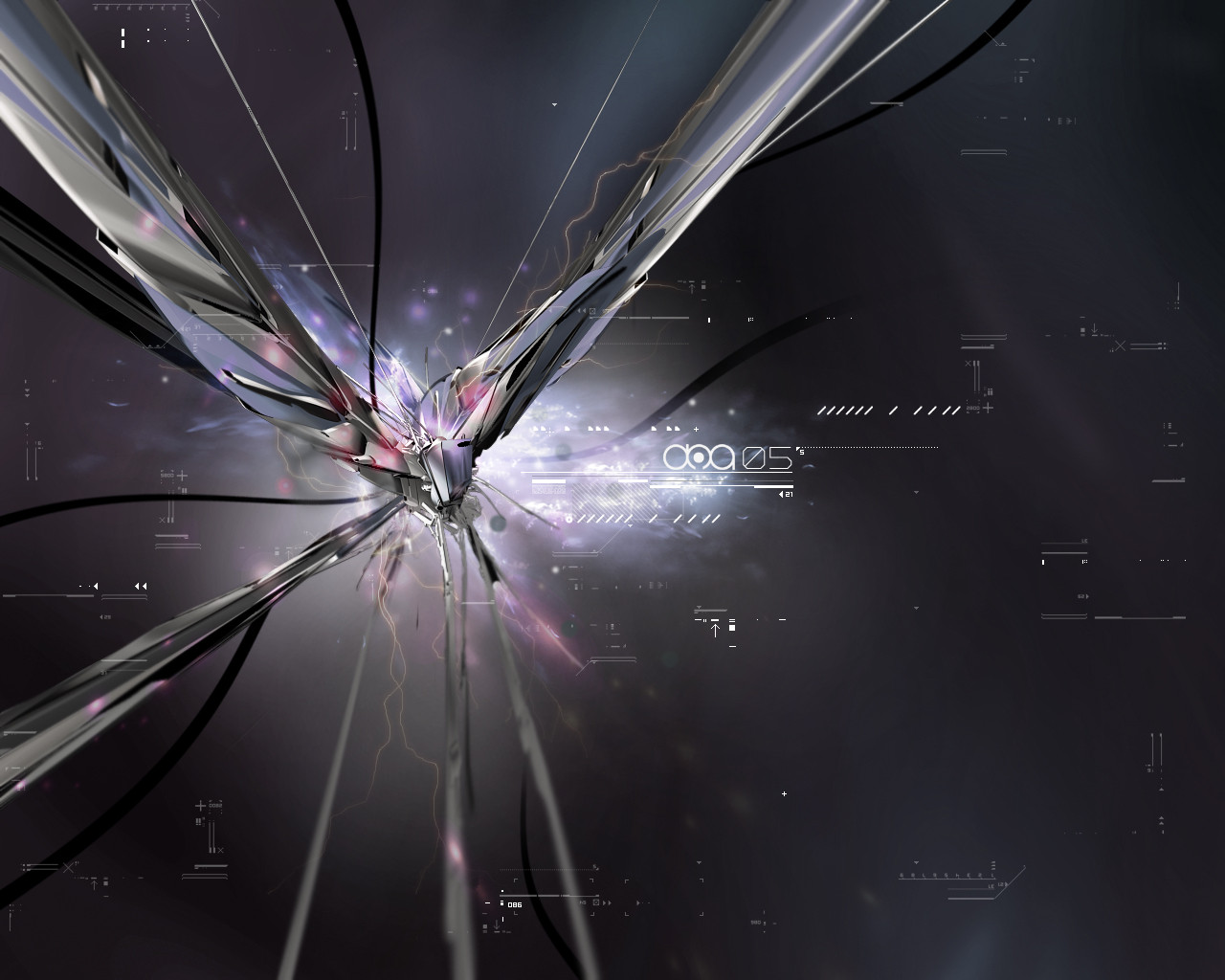
 polyphobik — phobik v2 remixed
Published: 2004-01-14 00:52:12 +0000 UTC; Views: 1876; Favourites: 36; Downloads: 1799
Redirect to original
Description
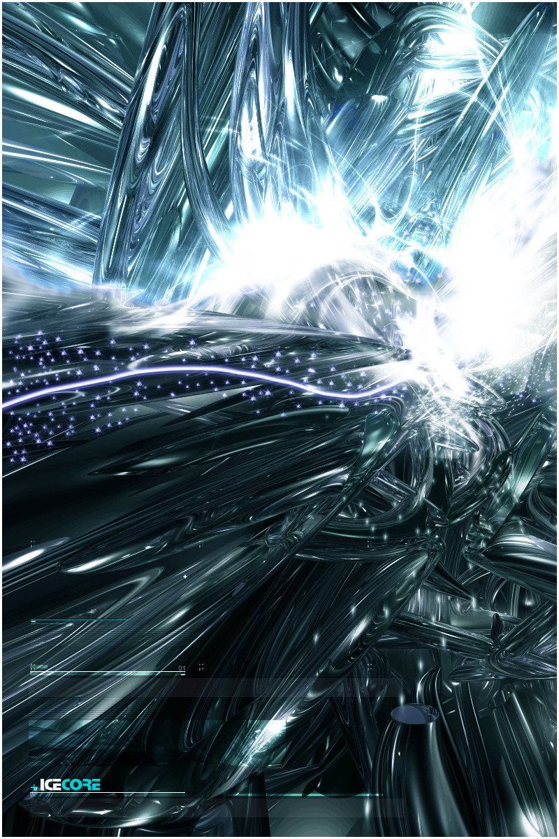
Acting on previous comments regarding the typo and lack of 2d work. Changed the colours to match the scene better.What do you think?
Related content


Comments: 38


wow! looks amazing! great render and cool brushing. nice background too. i really like it

👍: 0 ⏩: 0

Awesome work my friend, really really awesome! Nice play with the colors! 

 (Smile)")
👍: 0 ⏩: 0
Awesome work my friend, really really awesome! Nice play with the colors!
👍: 0 ⏩: 0


wow thats beautiful love the great style u use on this pic....very very nice colors 2d lights and render!
👍: 0 ⏩: 0

wow this is truly good, though the main thing I dislike is the Blur at the bottum. Nice work tho. keep at it.
👍: 0 ⏩: 0

this one is really nice,
Great lighting and colours.keep up the good work.fav+
👍: 0 ⏩: 0


I Cant see the image in Full View!!!!!!!!!!!!!!!!!!!!!!!!!!!!!!!!!!!! !!!!!!!!!!!!!!!!!!!!!!!!!!!!!!!!!!!!!!!! !!!!!!!!!!!!!!!!!!!!!!!!!!!!!!!!!!!!!!!! !!!!!!!!!!!!!!!!!!!!!!!!!!!!!!!!!!!!!!!! !!!!!!!!!!!!!!!!!!!!!!!!!!!!!!!!!!!!!!!! !!!!!!!!!!!!!!!!!!!!!!!!!!!!!!!!!!!!!!!! !!!!!!!!!!!!!!!!!!!!!!!!!!!!!!!!!!!!!!!! !!!!!!!!!!!!!!!!!!!!!!!!!!!!!!!!!!!!!!!! !!!!!!!!!!!!!!!!!!!!!!!!!!!!!!!!!!!!!!!! !!!!!!!!!!!!!!!!!!!!!!!!!!!!!!!!!!!!!!!! !!!!!!!!!!!!!!!!!!!!!!!!!!!!!!!!!!!!!!!! !!!!!!!


👍: 0 ⏩: 0

WOW! That looks great. Great 2D and render.
👍: 0 ⏩: 0

This is really nice... the 2d, typo and brushing are good, just doesn't seem to meld together too well. ")
👍: 0 ⏩: 0

if you were standing in front of me i would tell you that "i like this peice", but you are not standing in front of me so i guess i will just type it: i like this peice
👍: 0 ⏩: 0

awsome work
--------------------
My mind is wide asleep,
My consience deep awake...
👍: 0 ⏩: 0

THis one is really cool
Great lighting and colours
very nice work again
👍: 0 ⏩: 0


besides my comment on your main page i only have to say one more thing.... you are going to be featured on my journal and im going to spread the word on you! how the hell did u model this????? damn! it's good! when u have time plz drop by my page and check out my latest so that u can give me sum advise on it. anywayz your on watch and im gonna stalk u like crazy

👍: 0 ⏩: 0

Looks very nice. Love the render and the 2d is perfekt
👍: 0 ⏩: 0

yeah looks a lot better like this... im glad you replaced the sweetdna typo for some other 2d... looks way better... keep it flowing
👍: 0 ⏩: 0

aaaaaah
you followed my advice -_-
looks 10 times better stuart.. :L
👍: 0 ⏩: 0

hmmm, its odd to say wich one looks beter
i really like the yellow in the first version
and the second version has much more 'tech' 2d
i can't really tell wich one is better
so to me, they both kick ass
👍: 0 ⏩: 0


wow you actually changed it cos of my comments..
now it looks loads better
+fav
👍: 0 ⏩: 0

someone else already put it best: "kicks the old versions ass" most definitely, +fav.
👍: 0 ⏩: 0

i think its much better now, really excellent stuff.
👍: 0 ⏩: 0

Thats cool!I'm learn the design now...maybe I coul learn from you!
👍: 0 ⏩: 0

this is a whole lot better than the first. the 2d adds a whole lot. same with the colors
👍: 0 ⏩: 0

aye... indeed this is a huge leap forward form the first... althgouh i liked the type in the previous... this type actually walks hand in hand with the render. great upgrade... good to see ur so intent on getting it to click for ya- shows serious dedication to the project.
👍: 0 ⏩: 0


nice .. although i liked the original a lot, this one definitely kicks its ass .. great work
👍: 0 ⏩: 0

this is NICE i love that render and the subtle lighting. nice work man.
👍: 0 ⏩: 0

nice! i like this alot better, its really pretty
kinda looks like a metal phoenix busting out of the sky to me
👍: 0 ⏩: 0
