HOME | DD
 pondis-dant — Keep on running
Published: 2014-07-08 19:33:53 +0000 UTC; Views: 1933; Favourites: 185; Downloads: 63
Redirect to original
Description
SONG ====> www.youtube.com/watch?v=tOeYVB…Related content


Comments: 13

Overall

Vision
Originality

Impact
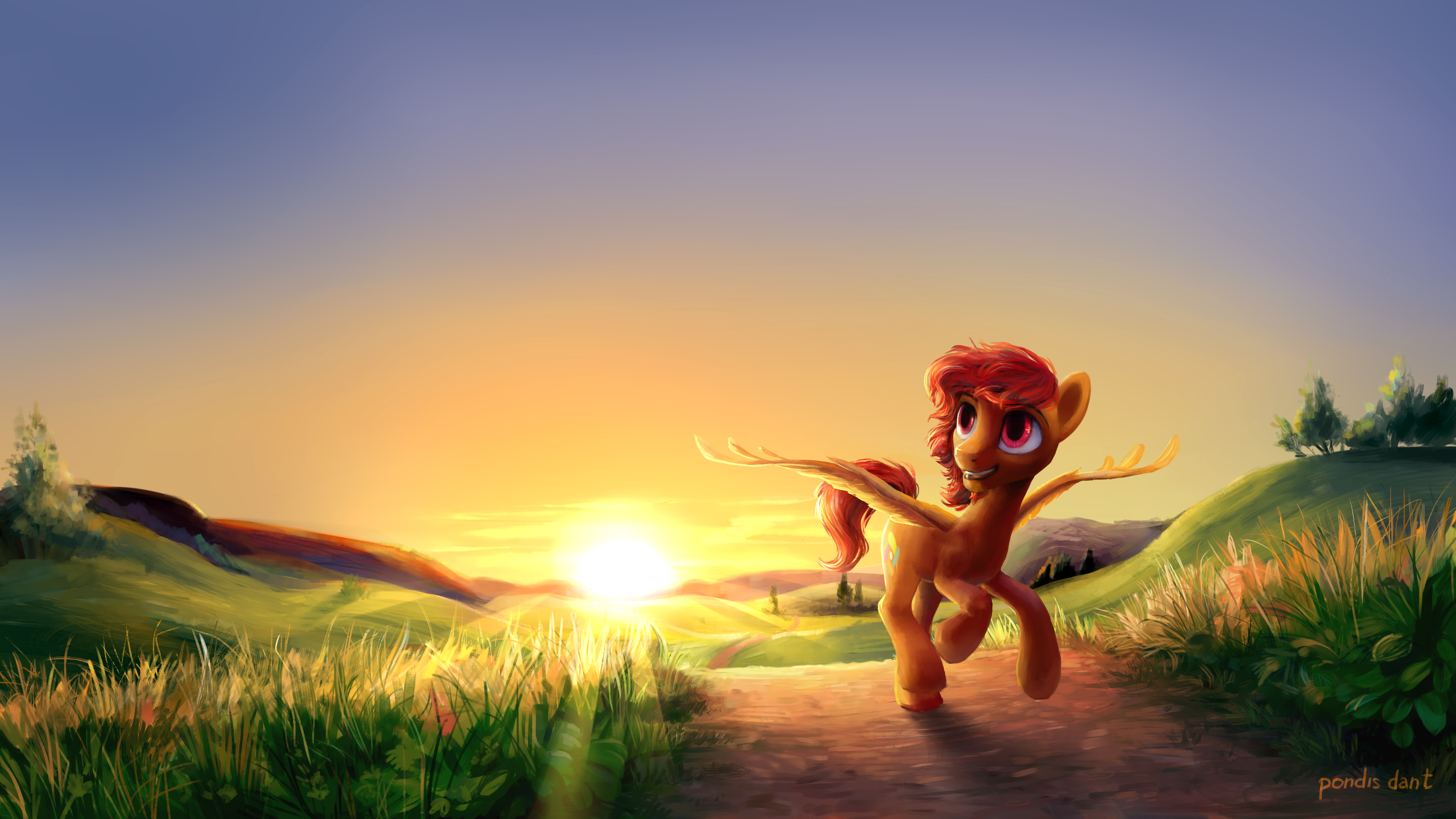
First off, excellent rendering of the scenery. The smooth blending of the brushes on the hills and fuzzy light-touched blades of grass give this an impression of serene warmth; the dynamic lighting of the setting sun and it's fiery palette tinges the work in beautiful shades of orange and yellow.
And yet, there is an awful lot of empty space in this work. The cloudless sky is one thing, but the fact that the sun sits nearly in the center and the pony is close to it leaves a lot of plain space that could be cropped out easily and improve the piece as a whole.
One way aside from cropping it is to adjust the amount of space between the pony and the sun. Imagine a tic-tac-toe grid overlaid on top of this; the places where the lines meet are key places to put beings and other things on interest. The eye is naturally drawn to these intersections,; the pony meets the lower right intersection, but the lower left is around where that orange-tinted hill is. Placing the sun there would make this more effective as a work of art.
The lines of this grid are useful to align the horizon line with. In this respect, the horizon does line up precisely. The amount of space in the sky left by this does contribute a fair amount of the "empty" feel I'm getting. A few clouds or even embellishing the horizon a little would help that emptiness.
👍: 0 ⏩: 0

Overall
Vision
Originality
Impact
I really like this piece! I really think you did an awesome job with the background, and the perspective is spot on. It really does remind me of a corn field! I love how you drew the pony. The eyes really stand out well, and the anatomy is wonderful. I do have a suggestion though. I would have keep the wings down at the pony's side. It would have made it look like it was walking, not flying. Other than that, everything is okay! It's a really nice piece if I say so myself. Keep up the great work and never stop what you do!
👍: 0 ⏩: 0

I wish BroniKoni would come to America. I'd love it if they performed at next year's Bronycon.
👍: 0 ⏩: 0


Красотень! Хотя, скорее, красосвет :3
Похоже на стиль AquaGalaxy, мило)
👍: 0 ⏩: 0

This is absolutely awe-inspiring and beautiful!!
👍: 0 ⏩: 0


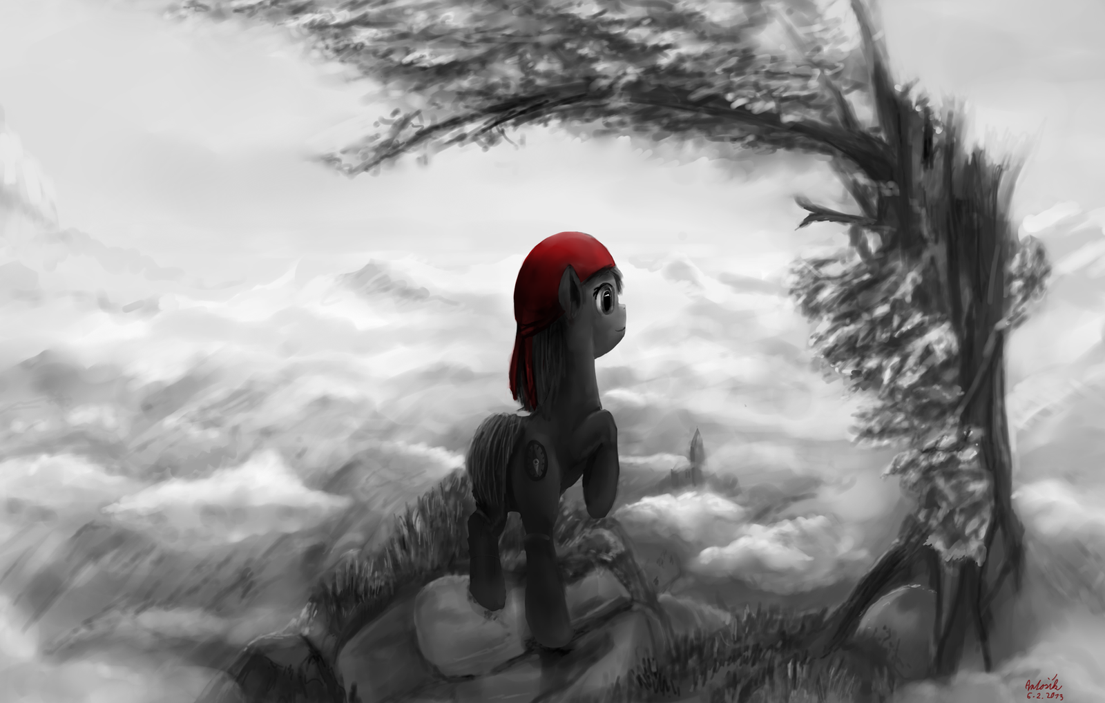
The pony you drew looks good but that background is breathtaking. Great work.
👍: 0 ⏩: 0

naaaaaaah... im too lazy... let this handsome pony run... ill be sitting doing crap
👍: 0 ⏩: 0
