HOME | DD
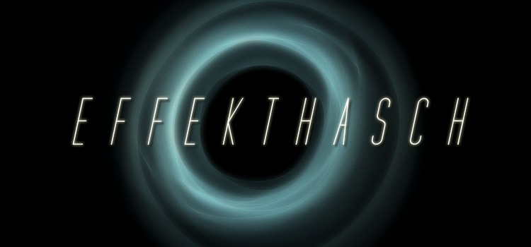
 precurser — endeffect logo
Published: 2002-12-07 01:23:20 +0000 UTC; Views: 1080; Favourites: 1; Downloads: 407
Redirect to original
Description
new endeffect logo.Related content


Comments: 7

Plain and simple. Exactly how a logo should be, great work
 (Smile)")
👍: 0 ⏩: 0


Not bad. Doesn't seem up to your usual standards, but i think we all know that they're pretty high.
I like the mousepad idea too. or maybe as a front logo on an EE t-shirt.
👍: 0 ⏩: 0


Just my first thought, didn't change that much but I like it better
👍: 0 ⏩: 0

