HOME | DD
 Prince-of-Powerpoint — PowerPuff Pg8

Published: 2007-04-16 06:59:41 +0000 UTC; Views: 15845; Favourites: 99; Downloads: 179
Redirect to original
Description
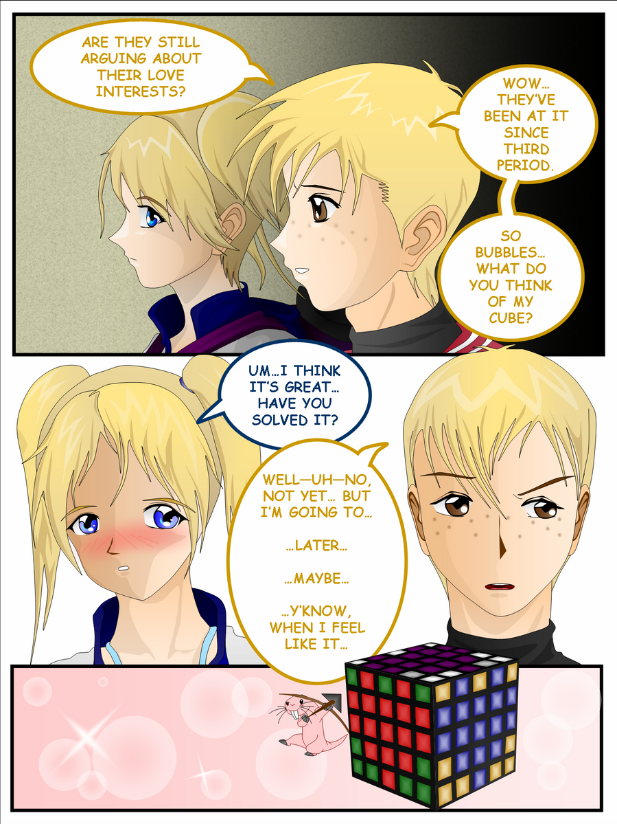
Done purely in PowerPoint.This is my eighth comic page.
First Page: [link]
Previous Page: [link]
Next Page: [link]
People have been raring for some action and I haven't been granting it them for a while. So here, I reward your patience by killing off a character you probably assumed to be here the entire comic.
 And yes, "OMFG", he IS dead.
On the up side, I hope the other three characters I revealed here will suffice the remedy to your sorrow.

Related content


Comments: 112


OMGIGOD!!! O.O the killed him!!! noooo >.<
👍: 0 ⏩: 1

They're so evil!!
👍: 0 ⏩: 1
i know!!! lol
👍: 0 ⏩: 1

Blanke In reply to ??? [2007-04-16 10:38:58 +0000 UTC]
Did the RowdyRuff Boys just kill Samurai Jack? XD At first I thought it some panels looked empty without any sound effects, but then I realized that Jack never said anything, and it made sense. I also really like the gradated metallic look the sword has, it looks very sharp. I don't have too much to critique on this page; just a couple of minor things:
1. I just think that the sword's point looks too angular and artificial in the 3rd panel, because it's a straight line; the tip of a katana is generally more of a curve going to a point.
2. The way the blood comes out as the sword is removed looks good; I just think that the blood itself looks too light and too thin, so it looks a little more like red Kool-Aid to me.
👍: 0 ⏩: 1
1) On my first try, I was saying the same thing to myself. But then, actual research revealed that the Heaven-Earth sword really was angular. But I agree with you. It would look much better curved. Oh well..
2) Haha, yeah? I didn't want to put too much blood, so that's what happened. ...and I hate Kool-Aid... So, what do I do Blanke-sempai?
👍: 0 ⏩: 1
Blanke In reply to Prince-of-Powerpoint [2007-04-16 20:32:18 +0000 UTC]
1. Oh.
2. I understand wanting to avoid excessive blood. I'd recommend making the blood a lot less transparent than that; red on white just looks like red; any difference between the stained color and the original isn't going to be too noticable. And dried blood looks darker than when it is still wet; that's the only advice I can really give, and what tone you pick out for blood is up to you.
👍: 0 ⏩: 1
*Smacks head* Oh yeah!!
👍: 0 ⏩: 0
<= Prev |