HOME | DD
 projectc — in motion - revisit
Published: 2003-04-01 09:38:51 +0000 UTC; Views: 500; Favourites: 1; Downloads: 100
Redirect to original
Description
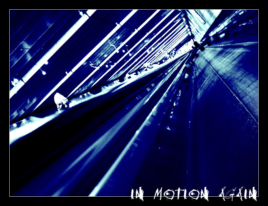
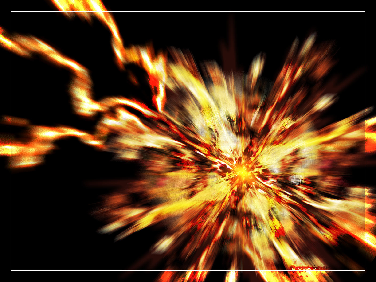
My 4th shot submitted from the Atlanta Airport. This time I was trying to improve on people in motion , as this was shot in the same manner. The focus is better, and there is less of a blur to it then before. I took a lot more aggressive approach to this in both the color and the angles though. I think I might have gone a little much with the blue tone, but oh well. I kinda like a usual passive color blue has turned aggressive here.thoughts?
Taken with my Sony cyber-shot and level/color adjustment in Photoshop.
Related content


Comments: 12

Nice work, i really love the color and the perspective.
nice work
~stas
👍: 0 ⏩: 0

I almost thought this was a 3d graphic when I saw the thumbnail...I would've never known until your description. I like the idea...I like the harsh blue tones. What I don't like, however is the scratchy font...I think you meant it to compliment the photograph, but I think it's competing against it. I'd either change the font...or if you want the font that bad, maybe place it outside the border so it's not competing against it.
👍: 0 ⏩: 0


the blue tone is great and the angle is perfect
👍: 0 ⏩: 0


very nice work I'm really liking the tone and how the blue contrasts well with the white. The perspective is really good and is what makes this shot. Nice depth to it as well. Good work
👍: 0 ⏩: 0


almost abstract... i love it
blue being my favorite color doesnt hurt either
👍: 0 ⏩: 0

dope picture, it makes a pretty tight background too! +fav fo shizzle haha
👍: 0 ⏩: 0
