HOME | DD
 protocol4 — Code Reversion

Published: 2002-03-20 23:54:28 +0000 UTC; Views: 1055; Favourites: 2; Downloads: 30
Redirect to original
Description
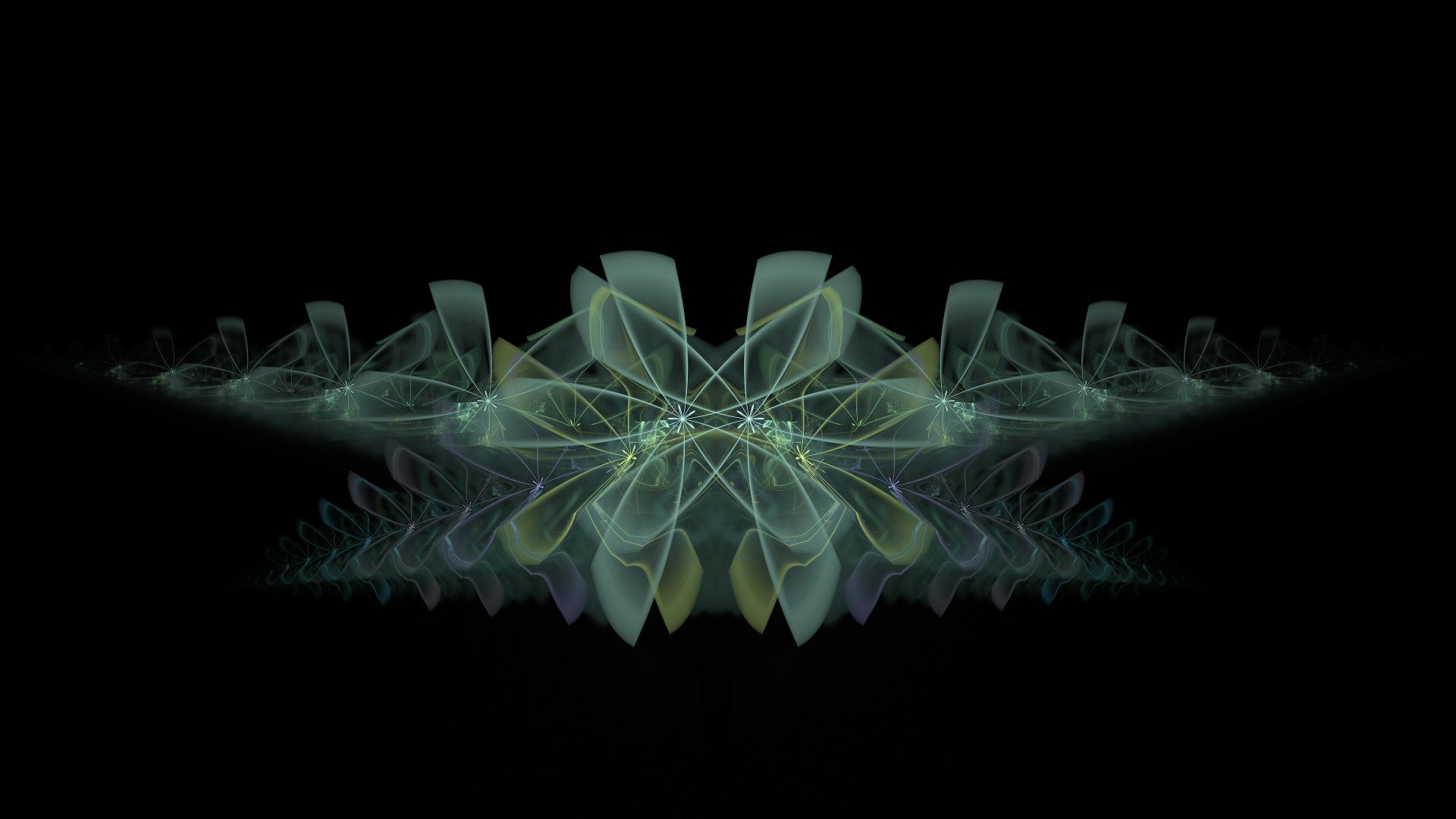
if u spot a jaggie in there i'll kill myself. really...Related content


Comments: 13


These are so cliche , i've seen a million of em
-----
: : : : l a n t h a n o i d : : : :
👍: 0 ⏩: 0

Hey I found a jaggy right next to the....just kiddin....i like this one, its shiny
👍: 0 ⏩: 0

I like it, looks cool! Is the "Code Reversion" font Verdana? Looks similar if not...good job!
👍: 0 ⏩: 0


cool shit maby make kore of those blur things going around
-----
-------------------------------------
up..
👍: 0 ⏩: 0

very very awesome....definitely in my fav's and on my background later~jeremy
-----
and i run away.
my bkaro: http://www.bkaro.net/me/jeremy.html
👍: 0 ⏩: 0

very nice bro. What font is that "Code Reversion"?
-----
_-¤ http://solacedeviant.cjb.net ¤-_
::][solace][::
👍: 0 ⏩: 0


Not bad. I would like to see more colors on it though. And I agree with renderdude.. the design should be flipped.
Looks really nice anyway.
-----
.[link ]. Stachtus and Erevus -unfinished-
.[link ]. As Close As We Could Get
.[link ]. Gallery
.[link ]. Adopt a Deviant.
· You believed in all your lies, didn't You? Didn't You? ·
👍: 0 ⏩: 0


kinda nice design even if it is a very milked out style. The thing that I must commend you on it not using any arrows in it, way to stay away from peer presure!
-----
------
The Key to this inner world is imagination, which gives expression to those intuitions that mark each persons unique being.
👍: 0 ⏩: 0

nice work... however maybe you should flip the design since people tend to keep all their icons on the left side of the screen... but good job...
please check out my work as well... comments greatly appreciated...
-----
I am a jeedai... http://trilineargraphics.com
👍: 0 ⏩: 0