HOME | DD
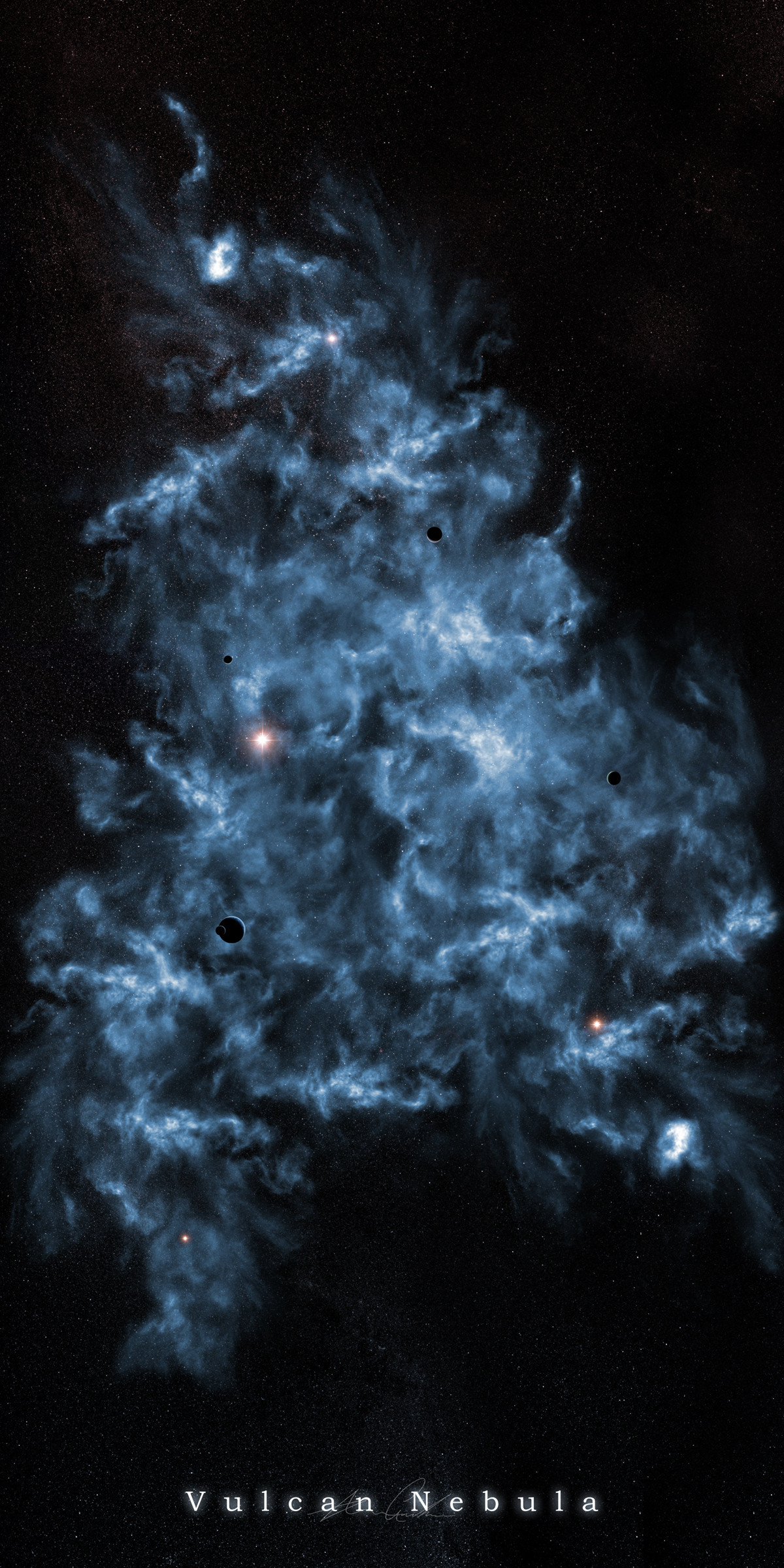
 psamtik — Vulcan Nebula
Published: 2004-06-20 02:13:48 +0000 UTC; Views: 1902; Favourites: 27; Downloads: 567
Redirect to original
Description
Print AvailableThis is my first proper attempt at creating a nebula. I was trying to think of some spacey name and the vulcans came to mind. I spent about 6 hours all together on this, basically just brush, smudge, brush and smudge constantly.
I'm sure to develop, again this is my first submitted nebula so give me some slack
 (Smile)")
Zazzle [ Print / Poster ]
Related content


Comments: 35

Looks extremely real to me. Like gas which is what a nebula is.
👍: 0 ⏩: 0


You put the Hubble to shame my friend ")
-Manta-
👍: 0 ⏩: 0


Very nice work. I like the shape of it, and how its so irregular. Very good for the first try. they can only get better now.
👍: 0 ⏩: 0

nice smudge work for sure, alot of intresting shapes, looks kinda 3D'ish
keep workin at it
👍: 0 ⏩: 0


*mumbles* mmm not bad, a bit noisy but i guess it makes it feel genuine  (Wink)")

👍: 0 ⏩: 0

Pretty cool. Not your best work, but good none-the-less. The lensflares are a bit too... separated from the rest, but I really like the way the edges change to empty space. Anyways, a good work dude.
👍: 0 ⏩: 0


hmmm, bit chaotic and there is not really a focus point. there also is not a lot of depth, try working more with shadows and bright light
👍: 0 ⏩: 0

Alright man, sorry but you're not getting slack on this.
The design kind of lacks diversity, as well as brightness/contrast portions, you could have got a dark texture brush and took out a few central areas a bit. But you're brushing does look good, it has a lot of nice waves in it, noce job with that.
The colour sucks, sorry man but it's just a straight blue, and blue is even my fave colour. You need some variation in there, maybe throw in a bit of purples or greens?
Over all size is a bit massive for my liking, but thats opinion based. Could use some larger flares for a bit of brightness conrast a bit.
But i'd say for a first try, you did good. It's not one of those trendy cloud nebula's you see all over. Great work man.
")
👍: 0 ⏩: 0


hmmm it's nice, i think it needs more variety shapewise though.
👍: 0 ⏩: 0

MY pic m8
👍: 0 ⏩: 0

great piece - two things:
1. the depth in this one is awesome - this is why I like really big space works... here it fits very well
2. stars are a little too noisy - I guess they would look better if they were sharpen...
👍: 0 ⏩: 0

looks good man.. good brushing.. not liking the star field you have over it though..
a couple probs with the nebula:
1. Its too uniform. all the different areas look the same really, not much variation
2. Its all exactly the same colour. not always a bad thing but when u have different colour lens flares dotted in it, its kinda ruined the colour scheme
3. your scale and perspective is wrong if you are going for reality. but it makes a nice piece for art
anyway.. not too bad man,. keep it up
👍: 0 ⏩: 0


I really really like it, but its too monochromatic. Take some other blue hues and lightly brush over the nebula and set it to "overlay" or "soft light" to add different ranges of colors.
Also the nebula is a bit random and a bit everywhere. If there was a strong light comming from the nebula that followed a distinct path throughout, it would help the viewer look at everything.
Its good, but it has more potential. Good first try.
👍: 0 ⏩: 0

 (Cool)")

awesome brushwork..... looks great
although the density of the stars could be less
👍: 0 ⏩: 0

very nice brushwork here... however in some places there seems to be a little too many stars and it kinda dulls our the nebula ie the top part of the nebula... and then nebula kinda seems to look all the same in the centre, the top and bottom parts of it are quite good but the middle seems to be lacking diversity... or something... mabye a focal point...
apart from that great nebula

👍: 0 ⏩: 0

i want to use this as a background for an image i'm creating
")
👍: 0 ⏩: 0

Damn better than anything I can do, try and work more color into there next time. Also, try to make duplicates of it, place it on different laye rblend modes, things like that. I always try doing that.
👍: 0 ⏩: 0

Looks like sumthing from NASA.
Great work, awesome quality.
👍: 0 ⏩: 0

My only crit would be that the lens frlare thingys tend to stand out too much from the pic. Other than taht i like the brush work executed here...
👍: 0 ⏩: 0


