HOME | DD
 psychox — PsychoX vs DA Main
Published: 2002-12-04 23:28:17 +0000 UTC; Views: 1518; Favourites: 1; Downloads: 83
Redirect to original
Description
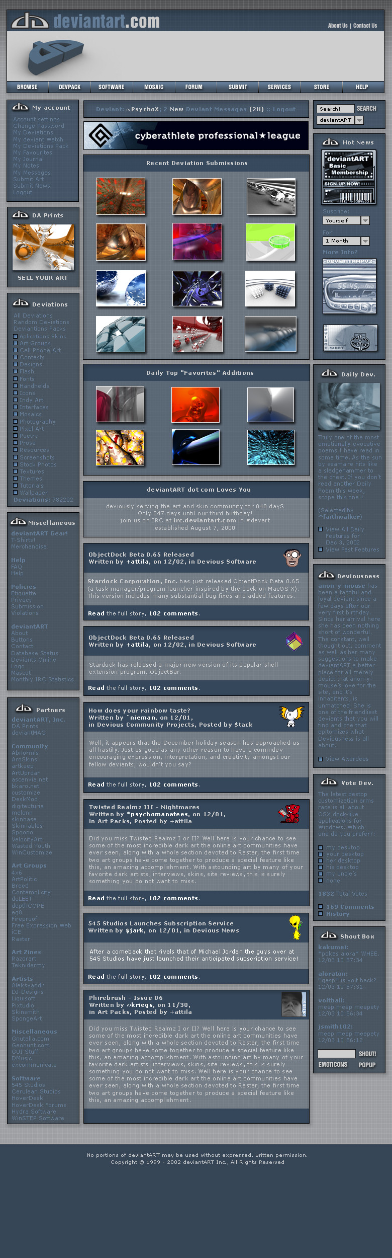
Just wanna say: sorry for the size...Report me of any bug you will find.
Leave your comment if you like it.
Here is the link to the user page: [link]
Thank you.
Related content


Comments: 25


I like this one. I wish you luck. The blue is a good choice and I like the layout.
👍: 0 ⏩: 0

here it is the link to the user page: [link]
thank all for comments
👍: 0 ⏩: 0

be sure to do a user page as well, otherwise you'll be disqualified
👍: 0 ⏩: 0
this is beyond hot
i like this alot, keep on perfecting it.
and take heed of the deviantMessages
right now
Admin ^delici0us (Subscription); 7278 New deviantMessages (455C:6823D) :: Logout
that's me.
and you
Deviant ~PsychoX; 2 New deviantMessages (2H) :: Logout
you can see the difference
👍: 0 ⏩: 0

my only question is, how is fella going to look :
👍: 0 ⏩: 0

Now this, I like! Very kickass feel to it even tho it its the same arangement like the current page... very nicely done ...
👍: 0 ⏩: 0

Very clean and professional. Great colors and everything. Nice..
👍: 0 ⏩: 0

Very nice, clean, and professional looking without loosing the ease of functionality that the current site design offers. I would (will) definately use this template. Great work.
👍: 0 ⏩: 0

Crazy, best submission until now, i think!
Great color theme...
Keep on designing, wish you success.
Cheers,
employa
👍: 0 ⏩: 0

I like this a lot. It makes everything pop. Nice and clean.
👍: 0 ⏩: 0


I love it, but you should consider the fact that your:
'2 new deviant messages (2H)'
could end up as:
'397 new deviant messages (114 D, 200 N, 83 H,)'
and then there would be no more room in that little box..
In my humble opinion, you need to fix this.
Aside from that, I absolutely LOVE this design!
If DA looked like this, I would come here ten times a day!
Clean-cut and nice! Solid! Awesome..
👍: 0 ⏩: 0

yea fav so far! but i think u should develop it even more. there should be a good contrast between v2 and v3.
👍: 0 ⏩: 0

yup, just as good as the user page, I still think controls (listbox, textbox, etc) should match the blue scheme more. Same with the header, I dont like the gray that much. The rest is great though.
👍: 0 ⏩: 0


i still like the black one better but this is hot too
👍: 0 ⏩: 0

The headings on the news items are better than the last one and the top menu (browse, devpacks, etc) is a LOT better, but I prefered those little dots (::.) to the blue squares. Good job!
👍: 0 ⏩: 0

these are great! keep it up!
i love the design & colors!
👍: 0 ⏩: 0

this is my favourite design so far!!
why because it still incorporates all of the details of the current site and just adds more style to it
nice job:d
👍: 0 ⏩: 0

THIS IS AMAZING! This is 5 times better than your black one!
👍: 0 ⏩: 0

Is it safe to assume that the adverts would be placed within the header region on the right?
👍: 0 ⏩: 0

both this and the user in the same color are very nice. the header works especially well with the layout.
though, i think that you may be over-using the da logo in the layout. it's certainly distracting on the userpage, and i don't think it's needed so much on the main page either.
👍: 0 ⏩: 0

wow very good, clean layout. great placement too!
👍: 0 ⏩: 0