HOME | DD
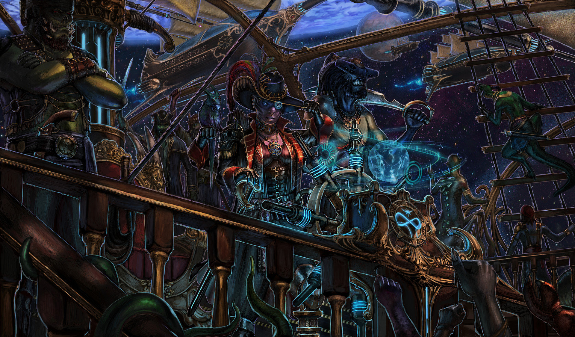
 R-Tan — Out of the Mist

Published: 2010-09-03 14:44:10 +0000 UTC; Views: 23996; Favourites: 921; Downloads: 0
Redirect to original
Description
Inspired by the tales of Beowulf. I thought of the deep ocean really frightens me. Corel Painter 11(06-2010)Related content


Comments: 104


This is a fantastic panting! i love the use of depth of field, and the angle of the image really adds the the force and feel of the image. i think the archer on the left has very good position gives the picture and added feel.
Whats the mosters name???
👍: 0 ⏩: 0


I hear ya, who knows what the hell lurks in the abyssal depths! Great image!
👍: 0 ⏩: 0

The angle is outstanding, and it adds to the action and intensity of the scene.
👍: 0 ⏩: 0


Amazing! They are in for a rough ride! I love the world of the old Scandinavian mythology
 (Smile)")
👍: 0 ⏩: 0


")

Incredible stuff... and the monster's enough to put anyone off going to sea!
👍: 0 ⏩: 0

Congratulations! Your entry has been level up to BRILLIANT gallery at keep up the good work!

👍: 0 ⏩: 0


Really well put together piece of work here. The story is well driven, there's a great sense of impending action and the perspective you have chosen has worked really well. Good stuff
👍: 0 ⏩: 0


Goddamn this is fantastic, why is it not getting more attention? The details in the crew are great, I love how diverse and colorful they are compared to the MISTY DEPTHS OF MONSTER.
👍: 0 ⏩: 0


Man, I loved this before I even saw the rest of the creature in the background, but now it's DOUBLE awesome! great piece
👍: 0 ⏩: 0


Hi,
I thought this was really good so I moved it to featured
👍: 0 ⏩: 0


Wow, very amazing. Gotta love those back in the day stories of legends and monsters clashing against one another. Like Beowulf
👍: 0 ⏩: 0


Awesome work! Looks a lot alike my Fyorian Sandworm except mine has 3 jaws.
👍: 0 ⏩: 0

And then came from the depths of this storm, the most foul sea beast you have ever witnessed... and they tried to bring me under
👍: 0 ⏩: 0

As Zeus says: "Release the Kraken 

👍: 0 ⏩: 0


Great work!!!! Did you do a pencil base before the colour, or just used the tablet all along?
👍: 0 ⏩: 1

Tablet only. The last drawing I did on paper was when I was still in school about ten years ago.
👍: 0 ⏩: 1
wow!!! The linework on the foreground is really great, with nice anchor scale and contrast, amazing!!
👍: 0 ⏩: 0

This reminds me of a bad scifi film... but in a good way.
👍: 0 ⏩: 0


wicked AWESOME composition! I was blown away by this from a thumbnail and now that I see it bigger, I might piss myself. The gestures are solid and the depth of field is good. I'm really taken with the muted palette. Good stuff man
👍: 0 ⏩: 1
Thanks, the muted palette was what I was planning from the beginning.
👍: 0 ⏩: 0

Glad you like it. This was one of those rare pieces where everything fell into place without any issues. Most of my other work I have to struggle with one thing or another whether it be composition or color. This piece did not change much from the original idea, except I had the boat much larger initially. I went with a smaller boat just because it seemed more viking like and added more tension.
👍: 0 ⏩: 1


👍: 0 ⏩: 0


| Next =>